In the summer I wrote a post vaguely complaining about the deterioration in the design of Barack Obama’s campaign website.

Here is the site when it first launched early in 2007:

I liked this. The design was clean and the site was really easy to navigate. After initially launching this version, the campaign spent a few months developing tons of great new features which they didn’t really have a place to put.

By July, the site looked like this:

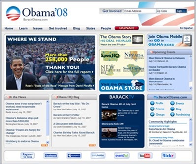
This is what I had to say at the time about the evolution of the site.

The Barack Obama campaign has been rolling out new features on its website at an impressive clip. A campaign timeline. Headquarters pages for each of the early primary states. A mobile program. Good stuff and they are clearly doing a wonderful job online.

But in the process of launching this stuff, they’ve turned their clean, nicely designed homepage into a canvas on which to cram as many banner ads as possible. On launch, they had six distinct content areas on their homepage. Today they have eleven elements stuffed into the same space.

Last week, the Obama folks launched a brand new design. You can see a screenshot of it here:

obama

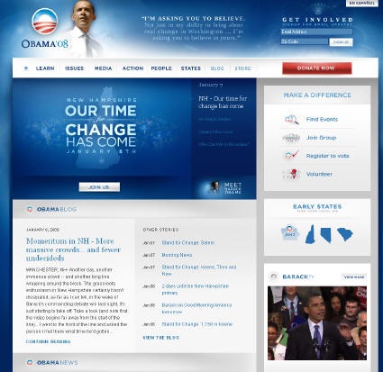
I like the new site a great deal. Some more comments:

  • The site has a sort of ethereal look to it, which I think fits in well with the campaign’s message of hope. On a personal level, all the gloss turns me off a bit. It is just a little to Web 2.0 for my personal taste.
  • The Obama campaign went with a layered top story area for the site (this can be done in Flash or in javascript/Ajax). This allows them to feature different headlines without cluttering up the design too badly. Just about every campaign this cycle is using these types of pieces in some form (Edwards, Thompson, Paul, Romney, etc.). This has become a standard feature.
  • The new design is extremely clean and offers the user very clear choices. New site is easier to navigate than previous versions.
  • The design of the site is very blog-inspired. It features two main columns and isn’t afraid to make people scroll to find content.
  • The new site features a lot of very subtle design touches that are going to be lost on people with older monitors. The site is beautiful when browsing on an LCD monitor. But when I look at it on an older laptop that I use I completely miss some of the design elements and find some of the text hard to read/see. To get an idea, check out the site background image (via Patrick Ruffini).
  • This site is going to load slowly for some people. When I first loaded the homepage it was around 1.2 MB. For the sake of comparison, Hillary’s homepage is 422KB.

Like I said, I really like it although I think all of us designing these sites may be going a bit overboard with the files sizes resulting from using a lot of Flash and/or Ajax. Never underestimate the value of a quick loading site.

What do you think of the new site?

Disclosure.

About the Author
Todd Zeigler
Todd Zeigler serves as the Brick Factory’s chief strategist and oversees the operations of the firm. In his sixteen year career in digital, he has planned and implemented campaigns for clients including the Pickens Plan, International Youth Foundation, Panthera, Edison Electric Institute, and the American Chemistry Council. Todd develops ambitious online advocacy programs, manages crises, implements online marketing strategies, and develops custom applications and software. He is bad at golf though.