The Starbucks logo switch that had Christian groups up in arms was only the first in a line of logo switches to make the Starbucks coffee brand appeal as a luxury item. Next in line: Ethiopia.
Yes, Ethiopia, a country known more for its famine and pestilence than its luxury items, recently went to a branding firm where they received three logos to test out. What was their goal? To make Ethiopian coffee appear as a gourmet item as opposed to something war torn and violent. Below is the ‘winning' new logo:
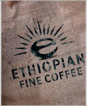
In all seriousness, the new logo looks more like it belongs on the can of the new super-high-octane energy drink more than your grandmother's cup of Starbucks that she gets down the street. The ‘E' creepily reminds me of a Pac-man that has had one too many power pellets and is going to haunt me from under the bed if I turn out all the lights. In addition, I love the contrast between the radical, sunshiney ‘E' and the drab, boring letters underneath. The logo seems to say, "Hey look! We changed the entire culture of Ethiopia, just don't look too far down on the page, y'all!"
Sign up today to have our latest posts delivered straight to your inbox.