Pelicans are the inglorious flying garbage-trucks of the water-bird kingdom and as such are despised by man, fish and God. Violent, hateful missteps of nature, they fly with the grace of downed aircraft before zeroing in on their prey and skewering it with their beak/spears before stowing it to die slowly in their giant, obscene gullets. It’s a sight you don’t want your children to see. A quick search on YouTube reveals pelicans attacking or eating the following menu items:
So, when I read that the New Orleans Hornets changed their name to the Pelicans, I (rubbed my eyes with my fists, mouth open, then) assumed the branding would be a challenge. Of all the mascots in sports, this could be the toughest to transfer successfully into a logo. I remember that the Mighty Ducks’ logo was a goofy hybrid of Disney and those Friday the 13th movies.

That was somewhat close to what I expected here. A composite of a friendly (please), silly bird and a saxophone over a Mardi Gras theme. I’ve seen a number of talented designers submit their Pelican logo designs to various publications and although most are very professional and pretty well thought out, none are as successful as what was introduced yesterday as the official logo.

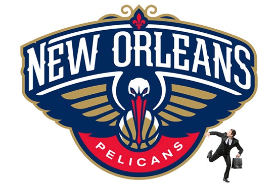
Tada! Finally, the real face of a pelican. Red eyes. Wings in full attack posture. Surely on his way to spearing a wayward puppy or slow-moving reporter (please go to YouTube).
The NBA seems to demand that a basketball be in the main logo of every team and while that’s clearly insane, the design here incorporates it with little trouble. The font is right on the money, the fleur-de-lis is a cool touch up top and the palette seems close enough (I might have adjusted that red to a weirder Mardi Gras color). Graphic Designer Rodney Richardson took a graceless fiend of a mascot, an animal New Orleans is unlucky enough to saddled with and made a superior logo. With typical and unnecessary first impression comments like “Color me a little disappointed… Basically, the designers didn’t need to make the pelican look angry” from sports blogger Kelly Dwyer floating around, I thought I’d weigh in just as quickly with an opposing take while also educating you on the perils of pelicans in the wild.
You’re welcome.
Sign up today to have our latest posts delivered straight to your inbox.