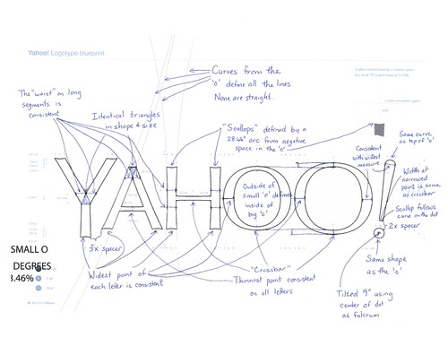
As I’ve mentioned more than once, designing logos is an awful way to spend your time. There’s no hiding. You’re out there in front of the client with your brilliant idea on a white sheet of paper as the marketing director and his recent and eager grads wait to ask probing and pointed questions about things they read concerning logo development last night.
I’ve always thought the best way to solve the logo question was to get an honest and trustworthy designer to provide a handful of strong concepts, let he or she present them without interruption and choose one. I’m in the minority with this approach and I know it. Creative types like to let other creative types do their jobs and be left alone. We also would take 6 months to design those logo ideas if you let us, so I understand why I’m in the minority on this. Even so, the more isn’t the merrier in these cases.
Yahoo CEO, Marissa Mayer unveiled the new Yahoo! logo yesterday with more explanation than I thought we might get. Or deserved. Or wanted, really. We also were treated to a really well produced quick video of the creative process, although I believe it’s just an after the fact marketing fluff piece. Cool though.

The new logo is an updated version of the old logo, not a redesign. It’s a good upgrade and needed I suppose after (Google tells me, let’s see…) 18 years. It is beveled though and that’s just weird. Marissa calls it chiseled, but it’s beveled to anyone who’s familiar with Photoshop, which is just about 100% of Yahoo! users. The font bevel is the hard-drinking wingman of the font drop shadow, but Yahoo! didn’t take the bait and double down, thankfully.
Like all modern logo reveals, Yahoo! and Marissa had the uncomfortable job of explaining what we were seeing, because logos are art and art requires some deep background before commoners like us can understand it.
Some highlights include:
She nailed it. Nothing says whimsy like an exact 9 degree tilt.
So that’s a pretty impressive load of hogwash, and it’s only a small sample of her creative vision. She included this phony little gem as well; as if it was discovered in some darkened conference room on a whiteboard next to other great ideas like talk to Jerry about hygiene issues and casual Friday does not mean you don’t come in.

So congratulations to Marissa Mayer, her new logo and the weekends she spent with her logo team. According to her it was “a ton of fun weighing every minute detail”. Logo team members have not been heard from.
Sign up today to have our latest posts delivered straight to your inbox.