With so many articles griping about the bad font choices that new web designers use, it seemed appropriate to write one that didn’t end with an ode to your top seed, Comic Sans. Instead, I’ve completely disrupted that trend by placing it at number 3. Here are 10 fonts that hurt my feelings.
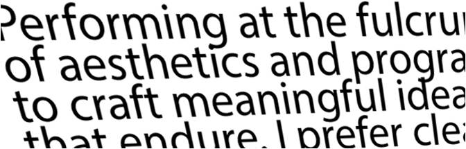
It’s that Adobe system font that shows up unannounced and unwelcome in the resume you’re secretly typing out between soul-eating budget meetings. Described by the people who designed it as having a warmth and readability, the truth is not so generous with the flowery jibber-jabber. The font looks every bit like a system font that you’d quickly replace with…
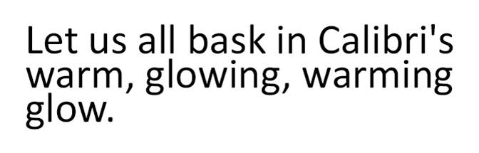
The king of the system fonts for Mac and Microsoft designed by Dutch font hero Lucas de Groot! I’m typing in it (with it?) using Word currently and I’m struggling to feel the “warm and soft character” it is said to be graced with. If this font and Myriad Pro were in a police line-up, I couldn’t tell them apart. I might just point to one and say he did it though because these fonts are guilty of something.
Too soon.
I understand that you have an invitation to baby Colton’s 2nd birthday to design and he’s a unique personality and therefore the invitation needs to be unique as well, but no one can read this font at any size and that kid of yours just threw up and yes, looks like he’s eating it.
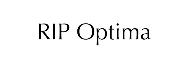
How a German named Hermann Zapf designed a font that was used in every shampoo label in the 1970s remains a great mystery to me. Of note…the font was inspired by a gravestone.
As a younger, naive designer I may have used Impact more than I should have. I also used bath salts more than I should have. That’s a joke, we didn’t know about bath salts back then. The point is both should be avoided unless used properly. Impact only for your bowling league flyer and bath salts for … baths.
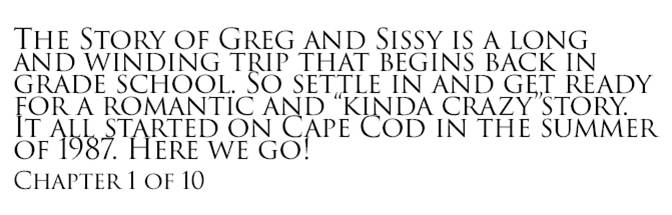
Trajan looks great on a coliseum but less grandiose on your wedding site. Reading through how you two met is fascinating enough without fighting through a font that doesn’t include lower case characters. Cruelly, Trajan comes with all Adobe products so get used to reading yourself into a migraine for years to come.
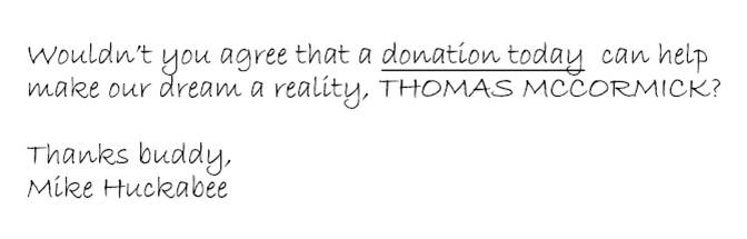
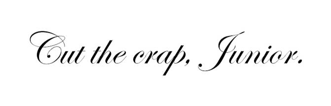
Do you really think in 2016 you’re fooling anyone with that phony signature? The hand-written font is also the go to for political direct mail pieces. Someone in a lazy design agency thinks a scrawled “we need your help now more than ever, TOM MCCORMICK!” is going to be the little personal push needed to get that five bucks out of me. Nice try, Huckabee.
Like a case of Pabst Blue Ribbon in a roomful of thin, bearded millennials, Comic Sans has now reached cult status and is somehow now acceptable to some. Please join me in continuing to reject Comic Sans, Pabst and 19th century beards.
Consider that even your mother stopped using this weird icon font strategy before you ever scroll down the font menu this deep. Emojis make you mad, don’t they? Well, they should. These are less cute emojis for old people. On a side note, don’t use emojis.
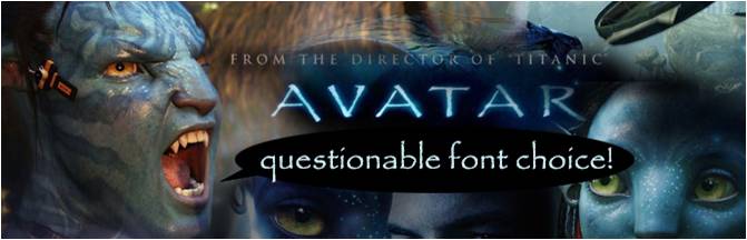
The hated and overused font choice of overblown Hollywood darling, James Cameron, as well as the go-getter sitting in the cube next to you working on logo ideas for the local artisan fish co-op. The font was created in 1982 and sure looks every bit like it belongs on a Reagan era album cover. The bad news is that there are between 3 and 5 more Avatar movies in the pipeline and that weird branding is already in place.
Sign up today to have our latest posts delivered straight to your inbox.