A few weeks ago I wrote a post about changes we have made to our Brick Factory design process over the last few years. Check out the full piece if you have time, but the gist is that we haved moved away from designing pages and towards creating systems. We are trying to design overall styles and repeating elements that make up the pages, instead of the pages themselves.
Showing is always better than telling, so I wanted to write a follow up post using the Annual Report micro-site we built for the International Youth Foundation as an example. What follows is an explanation of our design and build process for the project, with actual deliverables included to make things more concrete.
—————————————————
The International Youth Foundation (IYF) works around the world to ensure youth develop the leadership, technical and life skills to earn a livelihood. A long-time client, IYF hired the Brick Factory to build a micro-site for their 2015 Annual Report. The project had a tight, one-month timeline.
IYF planned to draft all report content themselves, and provided us sample copy and photos during our initial kick off discussion. The actual, final copy wouldn’t be ready until about halfway through the project. Given the tight timeline, we wanted our initial design deliverables to achieve two overall goals:
We decided to provide a wireframe to demonstrate our approach and a mood board and section cover concepts to show visual style.
We recommended the Annual Report be built as a micro-site with links throughout to content to the main IYF website. To demonstrate the approach and the content structure for the site, we created wireframes for the main site page and the menu system. These wires essentially functioned as a visual outline of the micro-site. Here is a screenshot from the site wire.
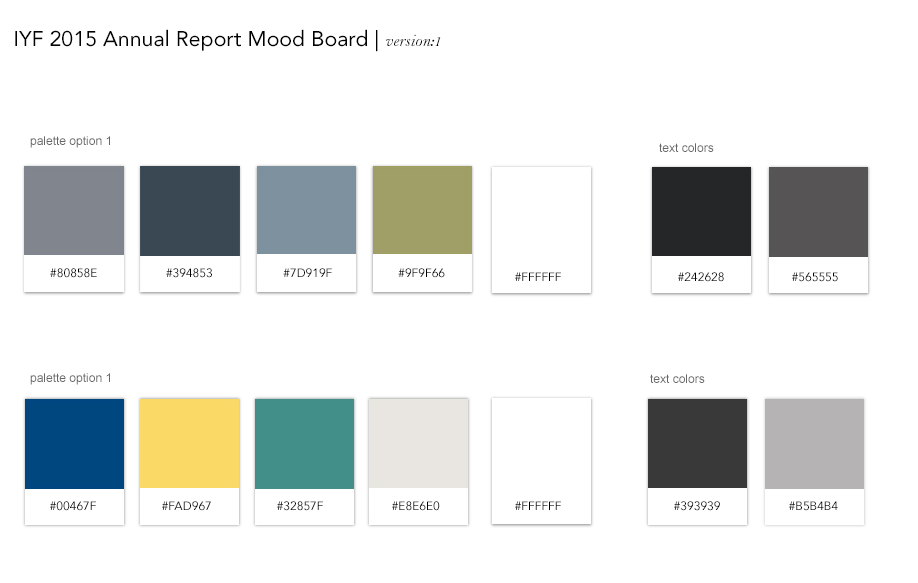
Defining palette and typography is a critical part of any project. We have found mood boards to be a useful way to start thinking about look and feel prior to producing full design compositions. For the Annual Report, we created a relatively simple mood board that provided a few different font and color options for IYF to react to.
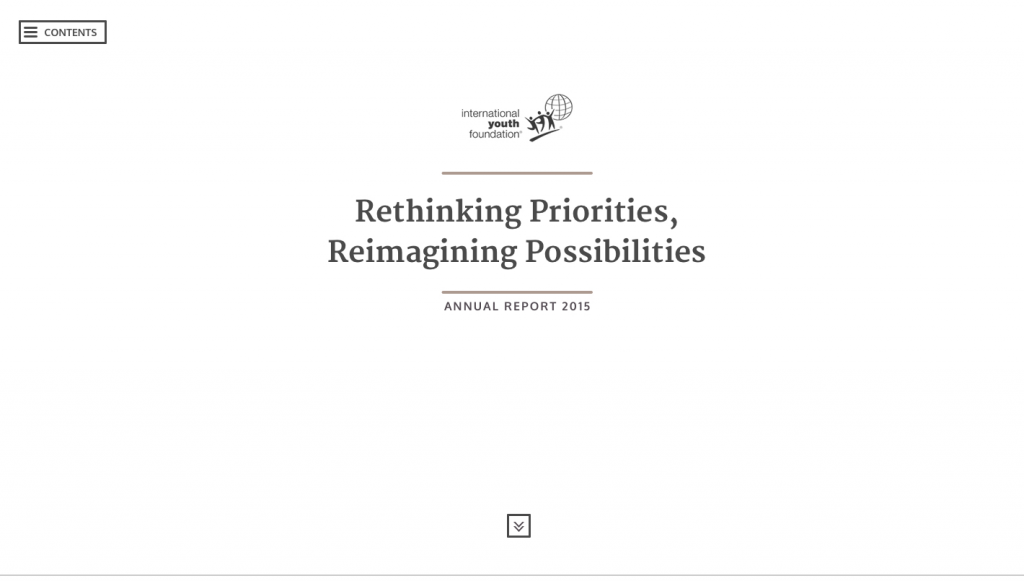
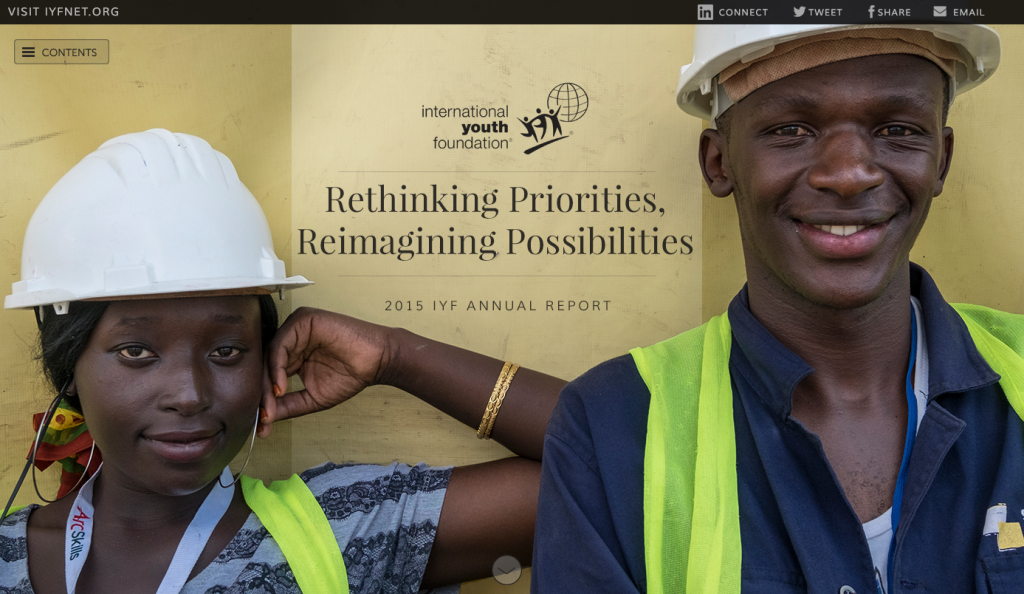
In light of the tight timeframe, in addition to the mood board we also produced a few design options (1, 2, 3) showing the introduction area of the annual report. With some minor tweaks, option one eventually became the introduction to the site. Here is a screenshot of the original report comp.
The client provided quick feedback on our initial wireframes, mood board and cover page comps. After a round of edits, we got approval to move forward with our next set of design work.
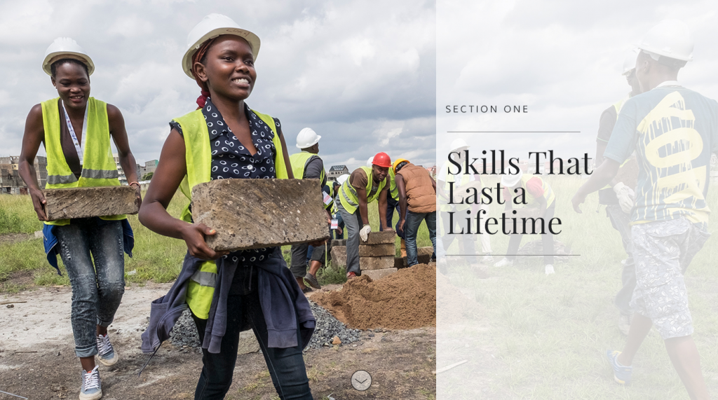
While the report consisted of six sections and was pretty long, the content of each section was consistent in approach and style. Given that, as a next step we decided to further explore the design by producing comps of a few of the components that would be repeated throughout the piece. We produced a second version of the overall site cover, a design for the menu system, a section cover (pictured below) and a presentation style for text and links.
The goal of this round was to simultaneously confirm with the client that the visual style we had developed was correct and to further build out the style guide for our internal implementation team.
After receiving feedback and approval on the component comps, we we put together a working prototype of the report introduction section, which represented about 20% of the full site. There were a few reasons we wanted to produce a working prototype as opposed to more static comps:
You can view the prototype here.
We received minor edits to the prototype from IYF. By the time we addressed this feedback, the finished copy was ready. As a next step we dropped in the real copy and produced a complete draft of the micro-site that we sent to IYF for review. Due to the process we established, nearly all the edits were tweaks to copy and images as opposed to changes to functionality.
You can view the finished site here.
With the proliferation of screen resolutions and the increasing sophistication of interfaces, designing websites has gotten really complicated the last few years. Given how hard it is, even the smartest, most well-intentioned designers and developers will fail if they don’t have good processes in place.
The IYF Annual Report project went smoothly because we focused on small, lightweight deliverables that did a good job of communicating our vision for the site. We used wireframes to demonstrate the structure of the site and our overall approach. We used a mood board and component comps to define the visual style for the site. Then we used a prototype to get initial feedback on the site’s responsiveness and animation styles prior to building out the full piece.
You can read a case study about the project here.
Sign up today to have our latest posts delivered straight to your inbox.