Part 2 of my presidential campaign site review series (Hillary was the first) finds us staring into the guts of the Edwards effort. We have clicked through the initial splash page, dodging the listserv sign-up and chose instead to enter the site.
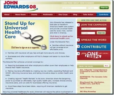
I’m puzzled at the lack of photography on the main page. No John Edwards picture to be found. He’s the pretty boy of the group, and he is notoriously absent. Because of that, my eyes go first, to:
The logo.
Using what has recently been a Republican treatment, the font is sans serif and devoid of anything cute. Wait. Is that swinging star followed by a green trail? I get it. Green means environmental. And the star means…fancy. Even with the unnecessary mark, I like the logo as it works well within this site and has a contemporary feel. It also does not rely on any ponderous emblems or flags (looking at the giant O in the striped farmland, senator…).
The structure of the page is solid, but I am not really pulled in any direction. The big pull here should be the Universal Health Care plan, I’m assuming, but because the palette of the site is very closely adhered to, I pass by the big title image and move horizontally to the right-hand navigation. I do like the way these elements are put together though. Each action item (sorry) is given enough real estate to be seen and considered. The design style/font choice/minimal drop-shadow works well here. I was compelled to click on the One Corps logo thinking it was some type of Marine Corps charity/information. It wasn’t, and it locked up my browser.
The universal navigation across the top of the page is also a little buggy in IE7, but the drop-down menus are succinct and very easy to read and navigate.
Below the fold contents include his latest video, some platform issues highlighted, blog headlines, press headlines, testimonials and quite a few social networking options.
Whether or not users will scroll that deep on the home page is a concern, and I think the design has crammed as much as possible into this first page.
Click on the screen image below and rollover the numbers for further comments.
Sign up today to have our latest posts delivered straight to your inbox.