A few weeks ago the New Orleans Hornets underwent a rebranding, unveiling a new name (the Pelicans) and logo. Given the catty nature of the Internet, it comes as no surprise that the logo had its share of critics. I , for one, love the Pelicans logo as does our CCO Tom McCormick. Tom wrote a post explaining why he thinks the design works.
The conversation about the Pelicans rebranding got Tom and I thinking about which of the major U.S. pro teams had the best and worst logos. Following is our list of the five best logos from the NBA, MLB (AL and NL), NFL and NHL, along with witty and insightful comments from Tom and I. The list of the worst will follow later in the week (Update: our post featuring the worst logos is up.
5. Detroit Pistons
Todd
If you look through all the NBA logos, you’ll see the Cleveland Cavaliers, Detroit Pistons, Los Angeles Clippers, Los Angeles Lakers, New York Knicks and Philadelphia 76ers all have similar ball-centric logo layouts. They are all good, but the Pistons logo is the best of the genre. I love the colors, typography and relative simplicity. This updated version of the classic Pistons logo is a huge improvement over the weird horse thing they had going on from 1996 to 2005
Tom
I don’t really know what a piston is. If the mechanic tells me I need some type of piston replacement or maintenance or something, I will nod my head and say, “yeah, I assumed that was the issue, but I don’t have a lift so I need you boys to take it from here”. The mocking, as usual, would begin as I was just out of earshot.
awkward transition
What I like most about this logo is the clear nod back to the ABA. Big, bright and fun without having to play tough guy with some goofy, menacing mark. It’s not like this is the Paris Pistons. It’s Detroit. We know you’re tough.
4. Texans
Todd
When I started out reviewing the logos I never would have though the Houston Texans would make my top five. The logo just wasn’t on my radar. But the more I looked at this mark the more I appreciated it. In addition to just sort of looking cool, as a Texas native I like how it evokes the horns from the University of Texas logo and the star from the Dallas Cowboys logo. It nicely creates a new brand while tipping the hat to the long history of football in the state of Texas.
Tom
I’m sure Todd’s heart is fluttering at the horns here, and would love them in orange, but for me, it’s just a flat out perfect logo. Red, white and blue with a star is easy to screw up. I’ve done a ton of campaign logos to prove that, but here the colors are not traditional 4th of July, they’re a bit cooler. If I were some hillbilly from Texas and 25 years younger I could see this as a tattoo. Not on me of course. I was thinking Todd.
3. Nets
Todd
I love the shield concept for the logo and the use of black and white. That is also a great font they are using.
Tom
The black and white is instantly cool and the font is right on the money. I was surprised when it came out, and even more surprised at the backlash it received. Weird, but expected these days.
2. Yankees
Todd
The Yankees are a bit confusing, as officially their logo is the ball/bat/hat thing that I don’t love. This brilliant mark is still used on their uniforms and caps so we’re counting it. There is something really confident (arrogant?) about this logo, which is pretty much what the Yankee brand is about.
Tom
The weird N Y design was created in 1877 for a medal to be given by the New York City Police Department to Officer John McDowell, the first NYC policeman shot in the line of duty. That’s a pretty decent back story. The mark itself is the most iconic in sports. Simple. Immediate. Perfect.
1. Raiders
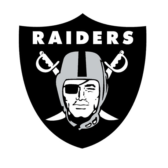
Todd
The branding here is so good that Oakland fans have devoted themselves to looking as depraved and frightening as the raider in their iconic logo.
As an aside, you think the Nets design team might have been a bit inspired by the Raiders?
Tom
Somehow this incredibly old school, macho, insanely cool logo hasn’t been upgraded ever, as far as I can tell. One of the few things Al Davis didn’t get his hands on.
Update: Check out our list of the worst logos.
Sign up today to have our latest posts delivered straight to your inbox.