As an experiment Signs.com recently had over 150 people draw ten famous logos completely from memory. The study found that while people are certainly familiar with these ubiquitous logos, the details are quite fuzzy. Check out the full study as it is fascinating.
After reading this article, our team decided to perform an experiment. So, we asked three members of our staff who have serious drawing skills, and Gary (who agreed to this but claims his “drawing skills are terrible even with a perfect memory”), to recreate the logos from memory.
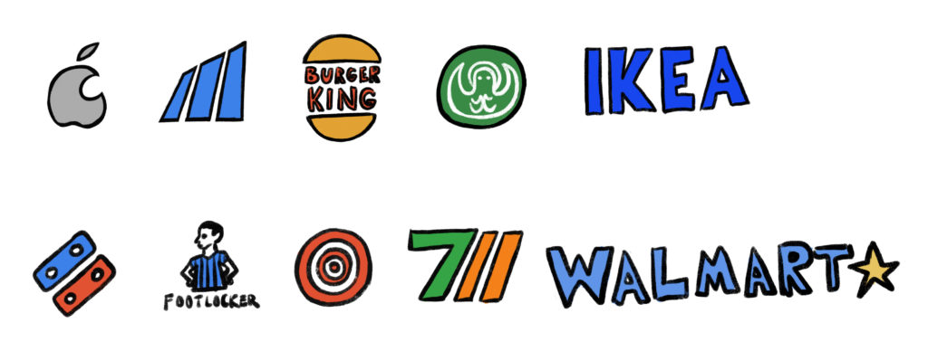
Here are the logos we asked our team to draw to help spark your own memory.


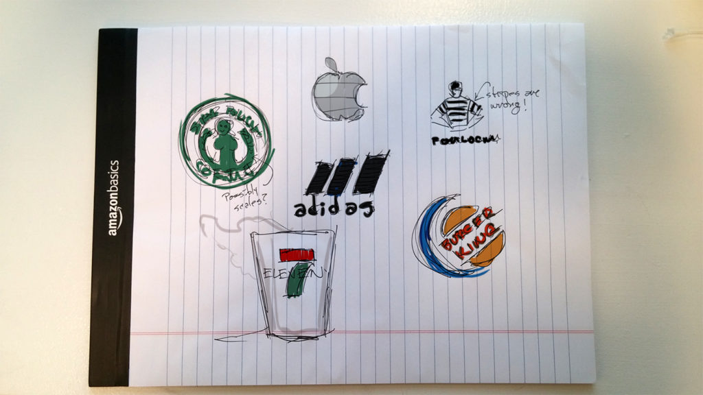
The first submission came from our Chief Creative Officer, Tom. Tom nailed the overall color schemes and concept of the logos while missing some of the details. So, even though the Starbucks mermaid looks an anchor with swollen lymph nodes, I knew right away that this is the place I get my coffee in the morning. Nice.

The next set of drawings came from Jei, one of our Senior Designers. Jei remembered the color schemes and the actual logo designs. Impressive.

Then we have Teddy: a Front End Developer who also illustrates children’s books. (Talk about the duality of man.) I personally think his the 7/11 logo beats the original. And the Starbucks logo – very avant-garde. Teddy also had a knack for color-memory more than anything else.

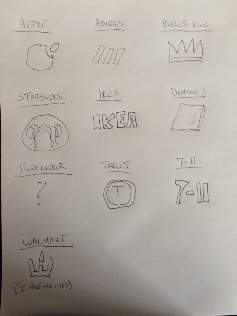
Last (but not least) we have Gary, who is our Director of Web Development. When it comes to designing a sites architecture, he’s Henri Matisse! But art class was never his thing.
Nevertheless, his logos weren’t too far off. The adidas logo is basically there, and he did remember the Starbucks logo includes a lady. Also, Ikea is flawless – which led us to believe that perhaps text logos stick best in the memory…until we saw his Walmart drawing. (Maybe Gary shops somewhere else.)
Sign up today to have our latest posts delivered straight to your inbox.