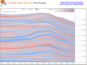
If you have a thing for cool graphs and trivial information, you might want to check out IVillage's Baby Name Voyager. This Java-enhanced graph displays alphabetically the 1,000 most popular names for Americans since the 1880s. Any name that ever made into the top 1,000 is on this list, and you can see in what year the name was most popular, as well as each name's highest rank.
Take a look at this screenshot.

Each "stripe" on the graph represents one name. The thickness of the stripe indicates the name's popularity, and the color of the stripe indicates not only whether the name is for boys or girls, but also the name's popularity in 2005. As you scroll over each stripe on the graph, all the corresponding name is highlighted with a text box showing the name's popularity in a certain decade.
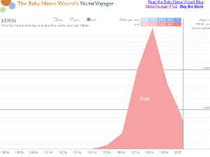
At the top of the graph, you can type in a name and view only that name or similar names in an enlarged form on the graph.
For example, I did a search for my name, Erin, and found that it ranked #28 in the 1980's, my name's most popular decade. Go figure. I was born in 1983. No wonder 10 other girls in my high school class were named Erin.

This graph was a unique design made for iVillage. I think, however, that it would be fantastic if more graphs looked like this. For example, if Google Trends got its hand on a graph app like this one, their service could be much improved. It could be interesting for politics, also: we could alphabetically list all the presidents or politicians and find out when their popularity ratings were the highest within their terms. It could be handy for electronics companies or for industries with a lot of consumer reviews. This graph could definitely help consumers track which products and get better rankings.
Graph technology like this has a lot of potential uses. I think it is particularly interesting how this technology is able to integrate complexity and organization: it displays a massive amount of information, yet is in no way confusing.
Sign up today to have our latest posts delivered straight to your inbox.