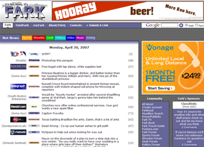
Along with Slashdot, Fark is sort of the granddaddy of social news sites like Digg, del.icio.us and Newsvine. Launched in 1999, Fark lets users submit story links which are then reviewed by editors. The best submissions make the Fark homepage. Digg is essentially Fark (or Slashdot) with user voting in place of the editors. Fark is focused on offbeat news with clever headlines, and, after being around for eight years, still gets a ton of traffic and has an extremely active community of users.
I used to be a daily reader of Fark back in 2001-2002 and probably check in once or twice a month these days. The site hasn’t changed much over the years. The owners know not to mess with their formula or upset their community. Fark launched an extremely subtle redesign on April 25th, and to the surprise of no one the users seem to hate it. There have been two threads about the redesign, one attracted over 3,700 comments and the other over 2,000.
Here are some of the more amusing comments:
Make it stop!!! Ahh, my eyes.
im scared. someone hold me?
my eyes! the goggles do nothing.
What the fark???!!!!??!?!?!?! My world is shattered.
MAKE IT STOP! Did you hire some 12 year old off of myspace to code it?
Thanks for all the white. Reminds me of staring into a lightbulb.
I just threw up in my mouth a little bit. Seems like the Fark crew is trying to jump on the “Web 2.0” style bandwagon. Teh suck.
I like the new “randomly crashes when viewed with Firefox” feature.
This is example #1,254 of people reacting negatively to a website change. The initial reaction is almost always to hate the new design. As a web developer, you’ve got to just take the initial reaction with a grain of salt and try to find the constructive criticism that is mixed in with the vitriol. One Fark commenter pretty well describes the cycle:
Change pisses me off! Until a few weeks later and I’m used to it, then hate the old way.
Sign up today to have our latest posts delivered straight to your inbox.