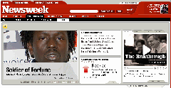
Newsweek unveiled a redesigned site yesterday. The new site looks nice; although it still crams a bit too much information on the page than I would like, it does so in a much more organized manner than it did.
 One of the new features that really caught my attention is the homepage header that can appear on any page. It is, of course, on the index page, but is also available on individual story pages. This is an interesting way to better coax a person who has come to the site through a link to a specific page to other pages.
All one needs to do is to click on a arrow button that lies between the site's main navigation and the headline of the article — in a box with a Top Story, Latest News item, and Video item — on the page. Once this is done, the homepage header is unfurled in all of its grandeur: a rotating image centric box that scrolls through six items on the left, the latest headlines above a tidbit from the magazine's Conventional Wisdom column in the middle, and access to multimedia items on the right.
This is a lot of content to present in one feature, but the site lists it in an attractive manner. If one doesn't want to see this section, they can simply close it by hitting on the same arrow button to close it; there is a corresponding text tab on the lower right of header that one can use to open or close it.
Perhaps the best thing I can report about the homepage header feature is that, at least for me, opening and closing it has not noticeably affected the site's performance.
Great job, Newsweek.
Sign up today to have our latest posts delivered straight to your inbox.