CNN.com is the main national type of news site I visit on the web. I do so out of habit and because I really dislike the websites of alternatives like MSNBC and Fox News.
But they are starting to lose me due to the way they are using video.
(1) Our office is an open space and so to watch videos I either have to annoy my co-workers or unplug my headphones from my iPod and plug them into my computer. And that's when I don't have my computer muted.
 Due to this I really don't watch many videos during the day. I'm going to CNN to read news articles, blog entries and such. For text.
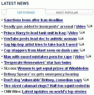
So what's the problem? CNN is now all about video and its hard to find the text. Of the items on the homepage, roughly 50% are web videos (see graphic on right for an example).
I don't mind that they have lots of video. That's great. But I wish it all wasn't so intermingled. Having to scan and discard 50% of the content is not a pleasant user experience. I'll probably switch.
(2) CNN is still displaying videos in Windows Media Player format (which means I've had problems playing them in Firefox). And they are still popping up their videos in controlled windows using javascript. I hate that. Please switch to Flash (which more people can see anyway) and stop using pop up windows. You just shouldn't do that stuff anymore.
CNN isn't the only one making this mistake. The John McCain for President site does as well by devoting pretty much its entire homepage to video clips and surprising users with video on what look like normal buttons/links at the bottom of the page (you are either muted or yelling at my whole office dude).
In summary, I think people are going a bit too far in an effort to embrace the whole web video thing. Video is a great and powerful thing, but not all the time and not in every circumstance. Please remember that sometimes your users just want to read some text and move on. Video should always be opt in.
Sign up today to have our latest posts delivered straight to your inbox.