The 2008 Barack Obama web program was the most successful online campaign in history. And its not really close. Given its impact, it is no surprise that www.barackobama.com has quickly become the most borrowed from design in the history of politics. If you pay attention, you’ll see echoes of it everywhere.
Most designers take inspiration from great designs like the Obama site, using it as a jumping off point for their own work. Others simply steal aspects of the design whole, either out of laziness and lack of inspiration, or in a concerted effort to associate their candidate with the Obama brand. Following are examples of elements of the Obama design that, to varying degrees, have been appropriated by other candidates. Note the examples mentioned range from some pretty blatant copy jobs to more subtle use of similar colors, fonts and drawing styles. Thanks to my colleague Kodi Seaton for the accompanying graphics.
(1) Complete Rip Off
Current Israeli Prime Minister Benyamin Netanyahu website is the most blatant Obama rip off I’ve seen. His site steals the Obama design lock, stock and barrel.

(2) Splash Page
The Obama campaign (and now Organizing for America) used splash pages to great effect as a way of recruiting volunteers. Illinois Governor Pat Quinn and New York Gubernatorial candidate Rick Lazio have implemented splash pages on their websites that are remarkably similar in design and layout to the Obama splash page.

(3) Site Header
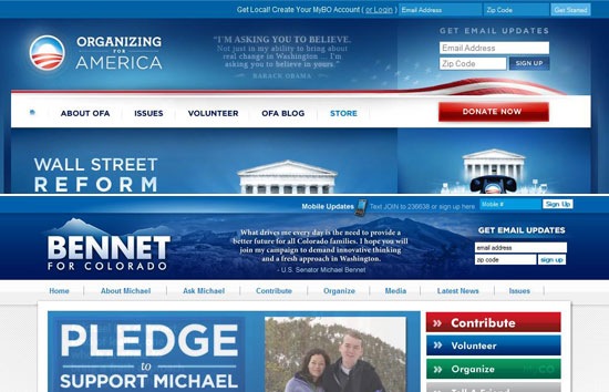
The Obama site has a unique header, with a logo, quote and email sign up appearing beneath a call to sign up for MyBarackObama. Colorado Senate candidate Michael Bennet liked it so much he replicated the header pretty much exactly on his website.

(4) Red Donate Button
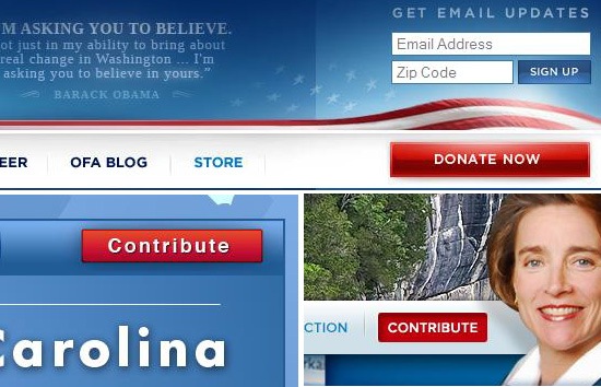
Obama was certainly not the first candidate to bring attention to his Donate section by making the link to the page red to set it off from the other navigation elements. But the campaign executed it better than anyone else, and candidates like Blanche Lincoln and Kay Hagan have mimicked the Obama button design.

(5) Site Background
One of the more distinctive elements of the Obama site is its blue background (if you look at the background image directly you’ll get a sense of the detail involved). Candidates such as John Oxendine and Brian Sandoval have implemented similar blue backgrounds with subtle detail on their sites.

(6) Top Story Style
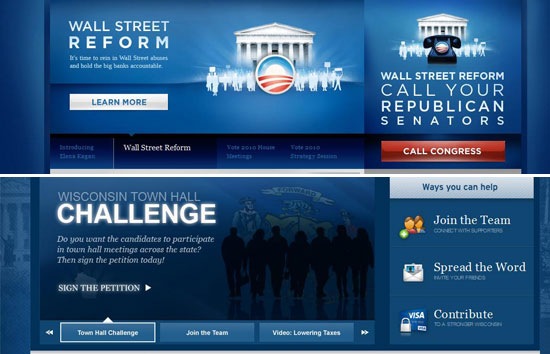
Another distinct feature of the Obama site is the style of the rotating top story area on the homepage. The designers behind the site take great care to use consistent drawing styles and fonts for every single item they feature in that space. Wisconsin gubernatorial candidate Mark Neumann mimics this style quite closely on his site.

(7) Sidebar Element Styles
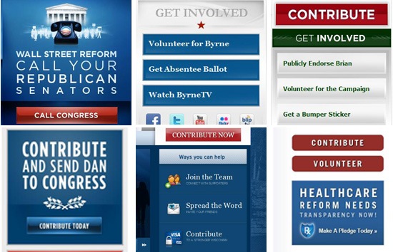
Like the Top Story area, consistent fonts and drawings styles are used for the sidebar graphics on the Obama site. Current candidates Bradley Byrne, Brian Dubie, Dan Seals, Mark Newmann and Bill Binnie have mimicked the Obama sidebar style to varying degrees on their sites.

(7) Use of Inspirational Stripes
The Obama logo features three red stripes, and the campaign uses the stripes repeatedly on the site to convey inspiration and progress. A variety of candidates use similar striping on their sites, including Connecticut Senate candidate Linda McMahan on her splash page.

(8) Home Button
One of the subtle touches of the Obama design is the use of a distinctive home icon to indicate to users how they can get back to the site homepage. While Obama certainly didn’t invent the home icon, he certainly popularized it. We’re seeing similar icons pop up on the sites of other candidates, including North Carolina Senator Richard Burr.

Sign up today to have our latest posts delivered straight to your inbox.