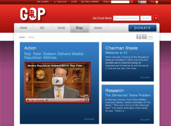
I gave the new www.gop.com a mixed review when the RNC first re-launched the site in October 2009. A few days ago the RNC launched a new version of their flagship site, so I figured I’d take a fresh look at it. Overall, I think it is a nice improvement, although naturally I find a few things to pick apart. Following is the Good, the Bad, and the Ugly of the redesign.
The Good
(1) The use of space on the homepage for top stories/headlines is much more logical and cleaner than the previous site. I particularly like that they removed the giant Facebook fan box that took up way, way too much real estate for a questionable payoff in the old design.
(2) Under the prior navigation structure, there were an overwhelming number of drop down options, which I suspect lead visitors to be confused as to where to go. The options now are much clearer, and I like the use of primary and secondary navigation elements.
(3) In the previous iteration, users had to click a button in order to sign up for email alerts. I wrote at the time:
“The main call for users to sign up for email updates is hidden behind a click. While I appreciate this as a user who is already on their list, as someone who builds sites for a living I would never want a user to have to click more than once to give me their email. I’m a firmly believer in making the sign up process as simple as possible.”
This has been fixed and you can now sign up without a click.
(4) I like the little take action option that appears on the left side of the page, mostly because it is different. I do vaguely worry that it is a little too cute and that some users will simply not see it.

(5) I like the idea of having a list of Trending headlines on the homepage. However, I wonder if these items are handpicked or chosen based on an algorithm given the content featured (links to YouTube videos, external sites, etc.).
(6) The Volunteer Match tool looks really interesting. Curious as to whether it works.
The Bad
(1) The Issues section needlessly uses Flash – I presume in a misguided effort to mimic iTunes Coverflow. It is really clunky, and I think a more traditional presentation would have been much more effective and helped with SEO. They over though that section.
(2) The Blog section is also a little too cute. The RNC has nine different blogs, and in an effort to highlight all of them they developed a layout that is a bit overwhelming. I think they would be better served aggregating the latest entries and presenting them in a format that actually looks like a blog (basically one blog stream). A presentation like GigaOm would have been much more effective. As it is now everything is too compartmentalized.
(3) The RNC’s social network, Our GOP, continues to strike me as not very user friendly and not up the standards of the rest of the site design wise. It also doesn’t look to have gotten great traction, with around 10,800 users according to this page.
(4) It has been almost a year since the launch of the original site, and the design didn’t change much until today. I think the RNC should be iterating and improving constantly instead of holding back from these big release once a year.
The Ugly
(1) The new site allows you to change the background color from red to anything you want using a color picker. This allowed me to change the background to a sort of fushia/purple and add a pattern. The result of my artistic expression is below.

This strikes me as silly. It is the sort of thing that seemed cool back in 2002. Plus it isn’t implemented very well. If you change your color, the original color will flash briefly every time you navigate to a new page.
More importantly, if I’m the RNC I’d want to control my brand and present the site as the designers intended. Team Obama certainly wouldn’t have let me change www.barackobama.com to fuschia.
Sign up today to have our latest posts delivered straight to your inbox.