Think back to the last time you went to a museum.
Did you walk away changed? Inspired? Disappointed? Maybe you felt the millennially-ingrained desire to express those feelings to your internet following a la Twitter or Facebook. These companies have acquired valuations in the billions due to their ability to capture user feedback and translate it into advertising dollars. 
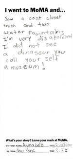
So, how can a place like a museum or historic site do the same? For an organization like the Museum of Modern Art, the answer lies not in monetization but in exploring the reactions visitors have to their hallowed halls. They’ve achieved this with their “I Went to MoMa And…” project. The virtual “wall” of “messages, drawings, poems, and ideas”, built in Flash, allows the user to casually peruse the way that real people have interacted with the museum. There are messages in differing languages, messages with unintelligible scribbles, messages of praise and messages of criticism. This honest showing of creativity, critique and humanity perfectly expresses the mission of the museum and the experience they want their users to have online. Many organizations strive to find the perfect blend of functionality, advertising, and viral capacity. With these individual notes being share-able (and currently spreading like wildfire), the MoMA has capitalized on their opportunity perfectly.
We often tell clients that a website should include participation. Sure, everyone knows that social media is a must, but if you can include some element of feedback in your site, users will respond. The Web 2.0 movement has changed the way that we interact with websites; but more than that, it’s changed the way we interact with the physical, real-world places that we go. Creating an area of your site where users can directly view their own submissions or the left-behind messages of other users opens your web presence up from a static advertising board to a truly human area of discussion.
You can see a live example of a project The Bivings Group has done that incorporates this idea at Wearegolf.org, the home of the Golf industry online. You can add your name and your “tee” to a nation-wide map and share the way that golf has impacted your life.
So, the next time you’re thinking about how to get users not only onto your site, but IN to your site, try and find a way to let them show you, rather than trying to take their opinion from them. You may be surprised by what you find.
Sign up today to have our latest posts delivered straight to your inbox.