I’m happy to say we’ve been pretty slammed here at the Brick Factory, so there hasn’t been much time for blogging lately. But I did want to quickly share some cool digital campaigns I’ve come across the last few weeks that inspired me (or more accurately, that I want to rip off in some way). Here goes.
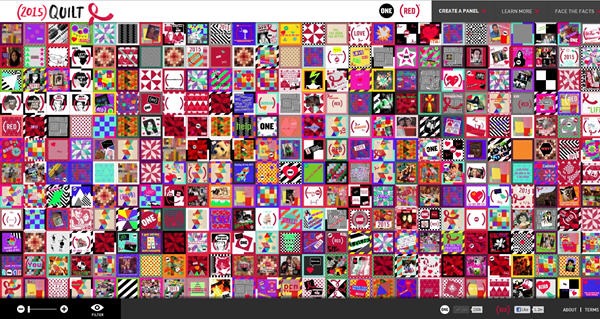
(1) 2015 Quilt > live project

Developed by One.org, 2015 Quilt let’s visitors add a panel to a virtual quilt as a way of support ending AIDs by 2015. Executed in a way that really encourages exploration.
(2) Tumblr SOPA Petition > live project
The micro-blogging service Tumblr recently launched an online petition to fight against the Stop Online Privacy Act (SOPA). They spread the word about the petition by “censoring” posts on users dashboard, which was really clever. However, what I really loved was the petition site itself, which was powered by Mobile Commons. Simple and straightforward, the set up begs you to fill out the form. And it worked. According to Tumblr the petition generated over 87,000 calls to Congress in one day.
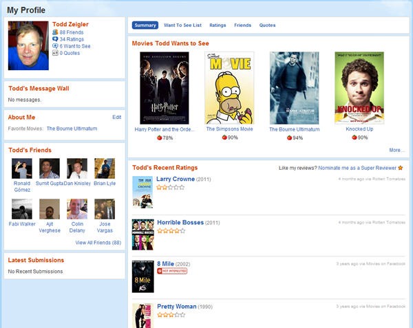
(3) Rotten Tomatoes Facebook Integration > live project

As Facebook’s API has become more robust, the opportunities for using it to add social layers to traditional websites have become pretty limitless. Rotten Tomatoes has a Facebook integration that is well done, and a little frightening. If you login to the Rotten Tomatoes site via Facebook, the site automatically adds your Facebook friends as “friends” on Rotten Tomatoes as well. Rotten Tomatoes also automatically pulls in data about movies you have liked and rated on Facebook, as well as your favorite move quotes. It basically piggy backs off Facebook data to create a social network about movies on www.rottentomatoes.com. Smart.
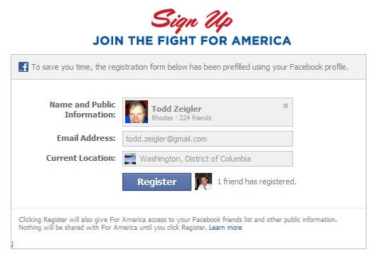
(4) For America Facebook Splash Page > live project

This is an example of a group taking the time to get the details right. On the conservative group For America’s Facebook splash page, an email sign up is featured prominently. In and of itself this isn’t anything special. Lots of group ask for emails on Facebook splash pages. But instead of just encouraging people to type in their email address, For America auto fills the form based on data the user has already entered into Facebook. Really smart.
(5) Lings Cars > live project

The website for Lings Cars takes every bad web design convention of the past 15 years and combines them on one awful website. The site is so purposefully tacky that it is fascinating, and ultimately effective.
Sign up today to have our latest posts delivered straight to your inbox.