The homepage slider has been a design staple in the political and public affairs space for the last half decade, at least.
For those not familiar with the concept, a slider is an area of a website that allows visitors to scroll through different options like they would a Powerpoint deck. In the politech space, these sliders are commonly used as the central element of a site’s homepage. Here is an example from the current www.greenpeace.org. The Greenpeace site allows you to scroll through the slides using the little arrows and dots in the bottom left.

Sliders have become popular because they solve a common problem. Organizations want their site to make a strong visual impact while at the same time they want to feature a gazillion different pieces of content. Sliders allow you to have things both ways.
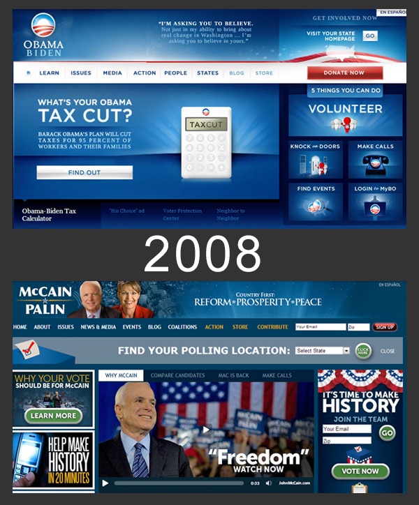
The concept was all the rage in 2008, with both the Barack Obama and John McCain sites featuring similar tab based sliders. Here are screengrabs of both sites at this time around four years ago.

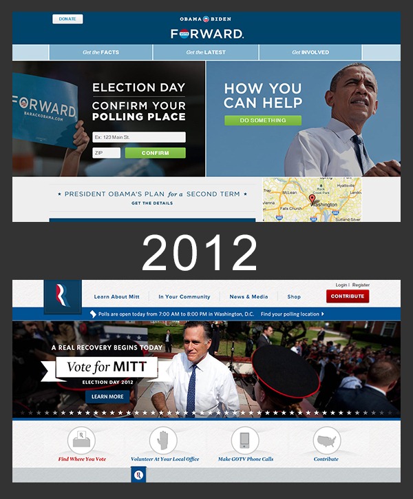
In 2012, both the Obama and Romney campaigns have abandoned the slider and gone with a simpler, more streamlined approach. Screenshots below.

As I’ve watched some large sites abandon the slider approach, I’ve started to look at the data and think about whether sliders are the best approach in our own work. From my perspective, there are three main reasons I see organizations moving away from sliders.
So should organizations abandon the homepage slider?
I would not go that far.
But I do think most organizations are using them in the wrong way.
Too many are burying critical site information in the third or fourth slide of their homepage slider, insuring that the majority of visitors will never see the content. If you use a slider, think of the information presented on slides 2-5 as bonus content for visitors that take the time to explore your site. Think of the slider as a way to add a little interactivity to your site as opposed to as a critical part of your content delivery strategy. Don’t use the slider as an excuse not to make editorial decisions about the content on your site.
If you do implement a slider and want people to actually see your content, don’t use little dots and arrows as the only navigation tools. Give people a hint as to what they are getting into. The charity:water site has a great, usable slider on their homepage. It works because they don’t surround it with clutter and the headlines/thumbnails below give users a clear idea of what they will get when they click.

In the end, I think sliders can still be used effectively. They just need to be thought through strategically, and designers and content creators need to understand their limitations.
Sign up today to have our latest posts delivered straight to your inbox.