Yesterday, Tom and I brought you our list of the best logos from the four major North American sports leagues. Today, we bring you our list of the worst.
Before diving in, we would just make the point that the people who actually designed these logos are likely not to blame for the end product. These logos reek of design by committee, where the best options were likely discarded and various concepts were merged. No matter how talented a designer you are, it is nearly impossible to design something good for someone with bad taste.
5. Anaheim Ducks
Todd
Mistake Number One: In the spirit of “marketing synergy” you name your newly formed hockey team “The Mighty Ducks of Anaheim” after a Disney movie franchise starring Emilio Estevez.
Mistake Number Two: You somehow create a logo that is even more ridiculous than the team name.
Mistake Number Three: In 2006 you finally decide to rebrand, but you inexplicably keep the “Ducks” name and create a logo that conveys absolutely nothing.
Tom
The palette here is an improvement. Gold is a big color in Florida. Every other Chrysler you see in Florida is gold (and is moving at 32 mph in the freeway passing lane). The biggest issue with this logo is the readability. Actually, no. It’s the duck foot. That’s a duck’s foot for the D. How dare you.
4. Minnesota Wild
Todd
This one just sort of left me confused and angry. I don’t get it at all.
Tom went to art school or whatever, so I’ll let him try to make sense of this one.
Tom
Let me help Todd and you with what you’re seeing here. A stream inside a forest with a shooting star under a full moon all inside a coyote skull. This has client interaction written all over it. Imagine the hateful creative meetings. The resentment. Sadly, the designer hanged himself minutes after approval.
3. Miami Marlins
Todd
I’m from San Antonio and have been a Spurs fan all my life. Back in in 1989, the Spurs abandoned their bad ass black and white logo for a “fast breaking Fiesta” version that supposedly represented San Antonio’s multicultural identity or whatever. I immediately purchased a bunch of t-shirts and hats featuring the old branding and never bought a single piece of merchandise featuring the fiesta logo. The Spurs finally killed the fiesta colors in 2002 for an updated take on the classic original logo.
The Marlins new logo reminds of those bleak “fast breaking fiesta” days for the Spurs. If there were any Miami Marlin fans out there, I would feel sorry for them.
I actually think the logo itself might be ok if the palette was good. But the palette isn’t good. It really isn’t.
Tom
Todd’s heart-warming story of that festive Spurs logo falls by the wayside to this unfathomable acid-washed jean clothing label from 1985. Baseball logos on the whole are so much better than any other major sport. Where’s the baseball? Where’s the retro type face? Pitchers and catchers reported Monday. Grown men are wearing this Crockett and Tubbs-inspired disgrace right now as you’re reading this.
2. Vancouver Canucks

Todd
Nothing screams “Canuck” like an angry whale breaking out of a letter C that has apparently imprisoned him (her?) for years. Damn you, letter C. I will have my revenge.
Wait. What just happened?
Tom
Very angry, very tough and I’m guessing (but I don’t feel like googling) the whale is from some Canadian totem. This is pretty dismal as a logo and even as something you might recognize as a C. With that fin sticking down it’s an E. The most basic challenge of the assignment was missed.
1. Toronto Raptors
Todd
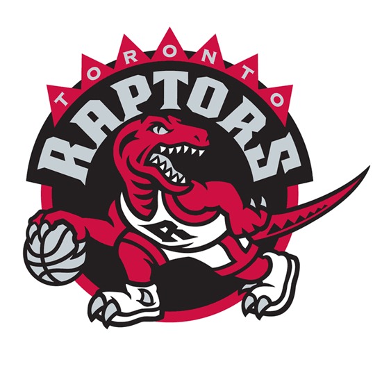
The Raptor is wearing basketball shoes that have special holes cut in them for its claws.
Tom
I remember when this nickname was conceived and at the time I figured it was in reaction to the popularity of the Jurassic Park movies. Not that this has anything to do with the logo, but naming your franchise after a monster no one had heard of before a movie came out is like naming your baby Nemo. Or Cloverfield. You will be mocked.
Everything went wrong here. Toronto running across the top of the mark looks tacked on and was highlighted with a silly, out of place triangle pattern. The Raptors font looks cheap and drawn sloppily in Adobe illustrator. The head of the raptor looks strong and should have been the only illustration within that black field, but fleshing out the dribbling figure was forced down someone’s throat and as Todd mentioned, those sneakers happened as well. This is really an unfortunate final product because although I think the name is ill-conceived, with a Raptor as your subject matter, there were some great possibilities to explore. I’m hoping for a much more impressive redesign sometime soon (I refused a movie coming soon joke here).
Sign up today to have our latest posts delivered straight to your inbox.