I’ve been building websites for a long time. What that means is that I’ve made a lot of mistakes, some more than once.
One seemingly small thing that can actually ruin a site’s design is the disconnect between what content looks like in concept versus what it looks like in reality. Web design is often done with critical text in placeholder form (the ubiquitous “lorem ipsum” text). Wireframes and design comps are often reviewed and approved with this “lorem ipsum” gibberish still in place.
Sometimes this process works fine, but just as often it doesn’t. The problem is the text that actually gets written often doesn’t match the designer’s idealized version of what it will look like. Two sentence branding statements end up becoming three paragraphs. Blog headlines end up averaging ten words instead of four. Intro blurbs end up needing to be 200 characters instead of 100. As all these littler differences add up, the end product can often seem like a pale imitation of the pixel perfect comps that were shown initially.
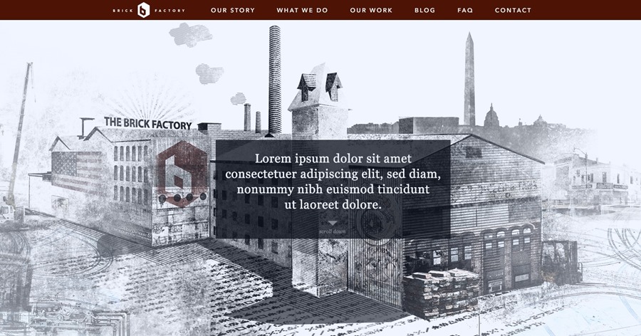
We’re in the process of redesigning our Brick Factory site, so I wanted to use the comps we are currently working on as an example of how things can go sideways. Below is a comp of the top part of a new version of our homepage. The concept is to have a really cool piece of Brick Factory artwork be the initial visual, with a complementary mission statement to orient visitors. In the comp below, the mission statement is in “lorem ipsum”.

I love it. So far so good.
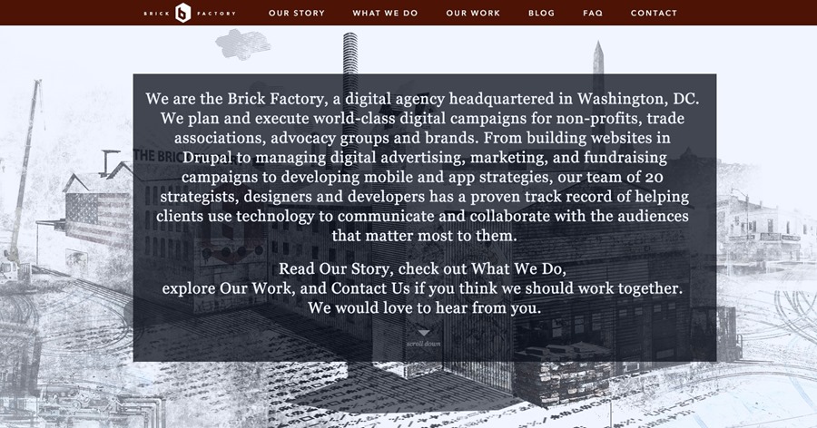
But what happens when the actual text is 3-4 times the length we are planning for? You end up with something like this.

You can’t even see Freddy’s awesome illustration. Kind of a mess.
If I had already built this website by the time I got the copy, I would be kind of screwed here assuming the text is sacrosanct. I would either have to spend a bunch of time reworking the design to fit the actual text or just end up with a site that never looks quite right.
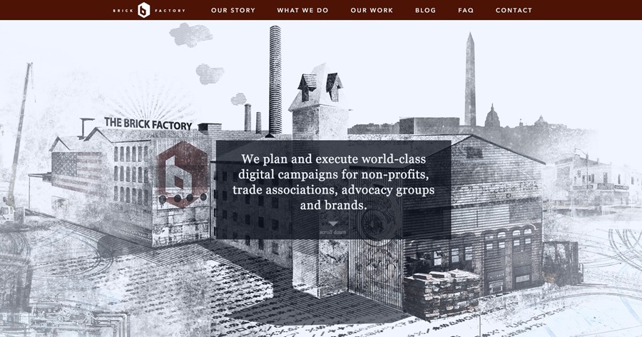
There is a really simple way to prevent this problem from happening. Write your critical content before starting your design process. Always have your design team work from real content. If you aren’t at a point where you can provide copy you probably aren’t at a point where you should be working on your site design.
If you follow this content first process, you’ll end up with a much better end product.
That’s what we did on our new Brick Factory site, which is shaping up really nicely I think.

Sign up today to have our latest posts delivered straight to your inbox.