It’s no secret that sports are all about competition. Teams train day and night just to gain a competitive edge. In recent decades, the competitive nature of sports has transitioned to the Internet, giving more access to the most important team player, the fan.
Now with the Internet, teams are able to keep fanatics updated with the latest news and developments, interact through social media, and gain revenue through ticket and merchandise sales. All of which can increase resources and support that can translate into more wins.
When it comes to having the best website, one has to create a unique, easy to navigate, and modern platform that seamlessly integrates with the life of a fanatic. Below I’ve come up with the 10 best sports team websites in North America. So now, let’s take a close look at this collection and see who made the A-team.
The Only team from CFL team to make the list, The Hamilton Tiger Cats has a captivating splash page and makes good use of social integration on their home page. With features like the Twitter feed, Facebook “Like” box and Fan Poll, the Tiger Cats can easily interact with fans to gain feedback, send notifications and grow user support. (@Ticats)
The reigning NBA champions come in at number 9 on the list for their website. The Heat does an excellent job of implementing several distinctive features to expand their fan base. Miami was one of the few websites that translates its content to Spanish and Chinese and includes a forum where fans can chat about all things Heat. (@MiamiHEAT)
The Houston Rockets grab the number 8 spot on the list with their design. Houston’s dynamic background and wood parquet containers give you the feeling that you are actually in the arena. The Rockets have some fascinating features also, from the ability to chat live with a ticket sales representative to a 3D tour of the Toyota Center. (@HoustonRockets)
The Canuck’s come in at number 7 for their stunning website. The Canucks utilize a flat user interface which makes for a smooth layout, one of the hottest trends in modern web design. The site’s Foursquare feature allows fans to check into Rogers Arena and share their experience. Social media integration goes further with a YouTube subscription service where fans can subscribe and watch News, Highlights and #GoPro Exclusives on the Canucks. (@VanCanucks)
The Golden State Warriors have a very simplistic, easy to navigate layout with some very exciting features. For starters, Golden State has a custom social sharing box that allows you to select between Facebook, Twitter, Instagram and Warrior’s e-mail & mobile alerts so you can stay connected to Golden state no matter what social platform. And another distinctive feature that Golden State had was integrating Soundcloud clips onto its web site. Though Soundcloud, Golden State is able to share pre and post game interviews with fans from just about any device. (@warriors)
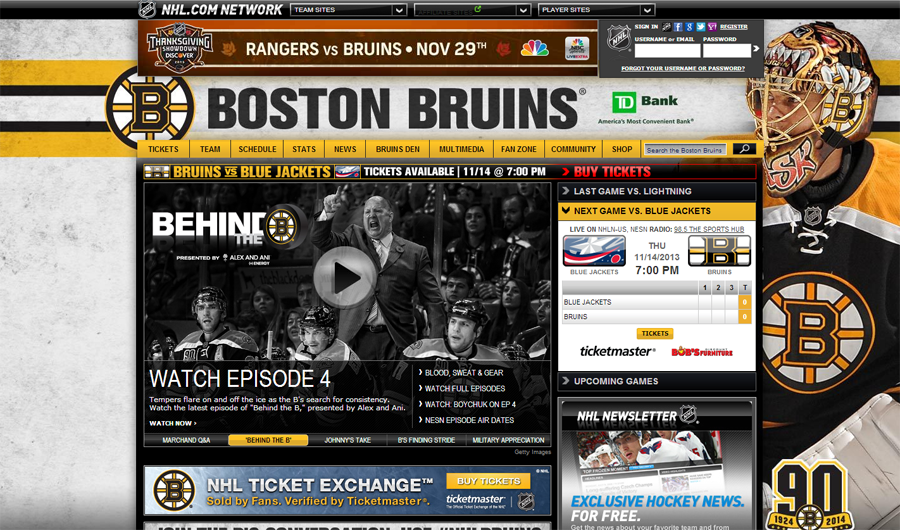
At number 5 we have the Boston Bruins. The Bruins do an awesome job at constantly changing their backgrounds to give the site a different feel and their visual hierarchy makes it easy to find important information. Some interesting features on the site were the Bruin’s Den custom social media box and the Breitling sponsored countdown clock that displays, hours, minutes and seconds till the next Bruins game. (@NHLBruins)

The Brooklyn Nets come in at number 4 with their website. The Nets do a great job at staying current with their flat UI/UX layout and crisp white background. A special feature of Brooklyn’s site is the floating social media bar on the left, allowing you to share from just about any social media platform. (@BrooklynNets)
The Denver Broncos take the third spot with their beautiful website. Denver does an amazing job at capturing the feeling of the mile high town with its background integrating the Rocky Mountains with few Broncos’ players. I also liked the fact that the background transitioned into a solid white background as you scrolled down the page. Some cool features of the Broncos site were its custom Instagram and Twitter feeds that really complemented the flow of the site. (@DenverBroncos)
The Miami Dolphins pop up at number two with their website. The Dolphins do a wonderful job combining the team’s vibrant colors with a flat design, giving the site a sharp, yet smooth appearance. Some stand-out features on the Dolphin’s site would be the #Finstagram widget that allows you to scroll though an Instagram feed of everything Miami Dolphins, a custom Facebook “Like” box slider and a video streaming feature that allows you to watch Dolphins’ games live when they air. (@MiamiDolphins)
The Dallas Mavericks take the number one spot by a long shot. The Mavericks utilize just about everything there is when it comes to modern web design. Surprisingly, Dallas is the only professional sports team in North America with a responsive website. The Mavericks also apply a flat design layout with an off-canvas navigation bar, making directing through the site seamlessly easy. A few unique features I enjoyed on the site were the loading transitions and the social media feed that displayed Facebook, Twitter, YouTube, Pinterest, Tumblr, and Instagram sharing about the Dallas Mavericks all in one feed with the option to filter by platform. (@dallasmavs)
So, what are your favorite sports teams websites?
Sign up today to have our latest posts delivered straight to your inbox.