Having worked in digital politics in a previous life, I observe elections these days with mixed feelings from a safe distance.
Working for political campaigns is hard, stressful and often demoralizing. The long hours rewarded with below market pay. But the highs are pretty high. When you are working on a political campaign it is your whole life for a time. The small victories, like watching the money come in after sending a good fundraising email, are often nearly as sweet as winning the election. It is both completely awful and exhilarating at the same time.
Knowing how hard campaign staffers and consultants worked during the 2014 election cycle, I wanted to acknowledge some of the great work digital teams did this cycle. So, without further throat clearing, here are the five best campaign websites I came across this cycle.
Mark Warner edged out Ed Gillespie in the Virginia Senate race, but I think Gillespie had a slightly better website. I like the use of photography and the site’s responsiveness is a step above the default behavior you’ll get from most HTML frameworks.
My only compliant about the homepage is the video, which feels like something that wasn’t planned for in the original design and got thrown in at some point.
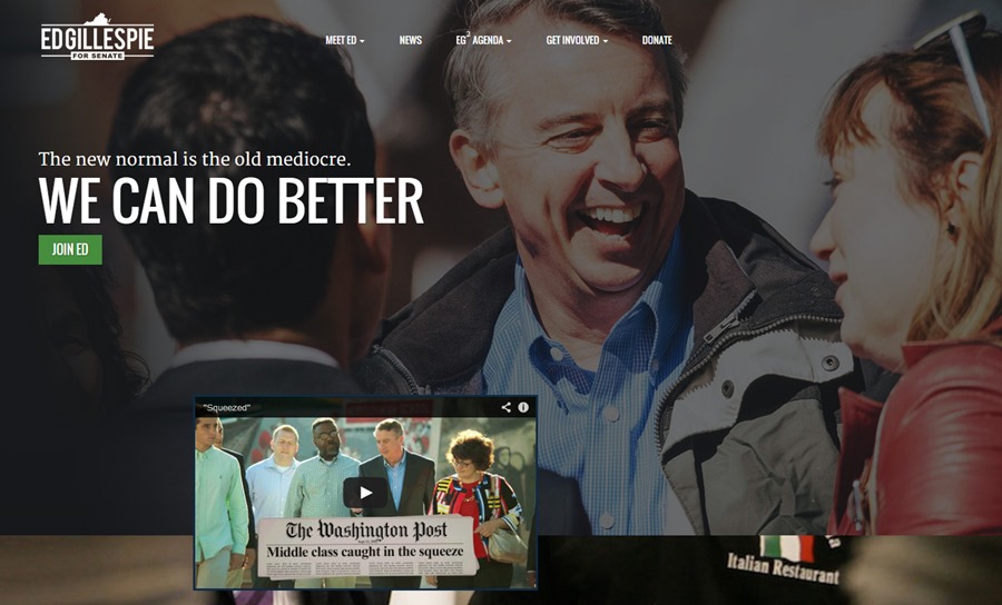
The entire navigation system is nicely implemented. I particularly like the Take Action bar on the left that encourages users to volunteer, donate, share or sign up for the email list. It is unique and nicely implemented.
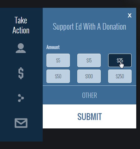
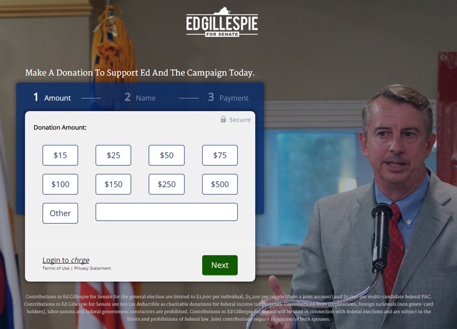
Like just about every campaign this cycle, the Gillespie team had a look at the Obama donate page. The layout and functional of the Gillespie donate page is pretty much identical to the Obama version.
The Mitch McConell site features a giant background video at the top of every page that references Lincoln, coal miners, Kentucky, soldiers, McConnell and AMERICA. I’ve made an animated gif of part of the background video below, but you should visit the site to see the full piece.
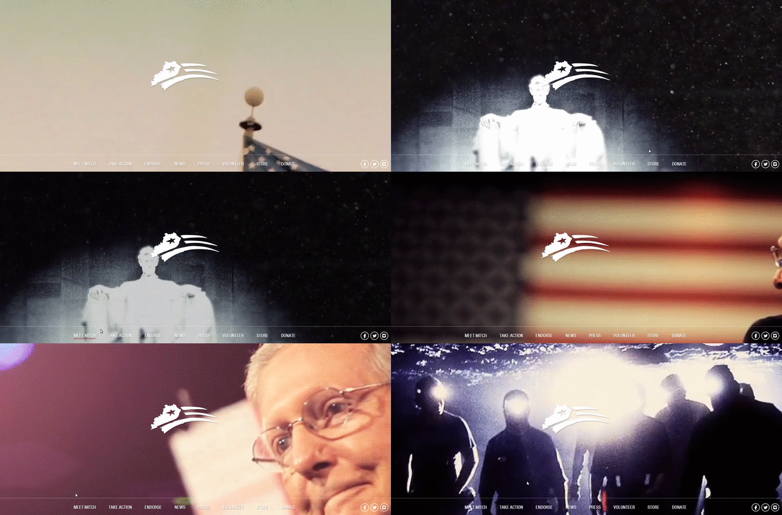
While I’m not sure it belongs on every page, I appreciate the boldness of the approach.
While it lacks the trippy background video, the site of McConnell’s opponent Alison Lundergan Grimes is probably better overall. Great use of photography and the whole site is just solid.
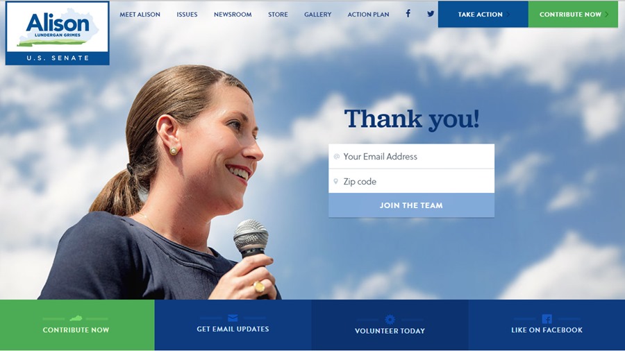
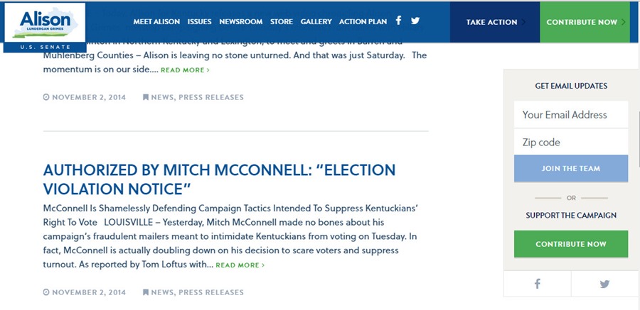
I particularly like the collapsed state of the navigation bar and the way the Get Email Updates and Support the Campaign call to actions stay fixed on the screen as you scroll down the page.
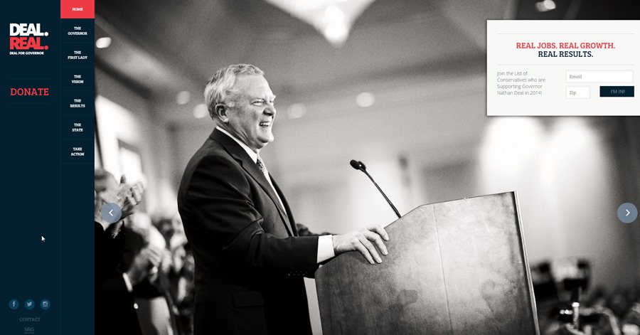
The Deal campaign basically ran back their site design from 2010, going with bold photography and minimal text. It still works.
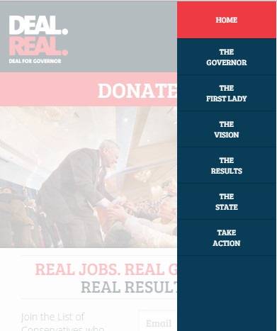
The site works just as well on mobile as it does on desktop. I particularly like the the mobile version of their menu.
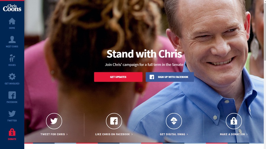
The Coons campaign site features bold photography and a unique icon-based navigation system.
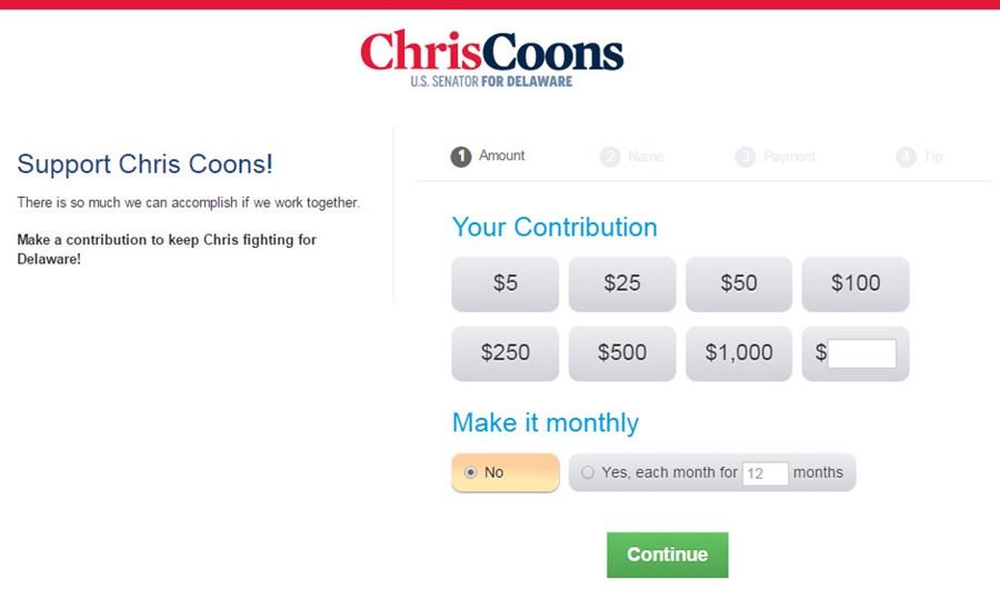
As with the Gillespie campaign, Coons donation provider Act Blue had a look at the Obama donation page.
What were your favorite sites from the 2014 cycle?
Sign up today to have our latest posts delivered straight to your inbox.