The biggest misconception about nonprofit marketing is that you need money to make an impact. False. In fact, studies show that today’s Americans are more inclined than ever to look for ways to give. In 2014, the number of online donors increased by 15 percent.
Although Americans like to engage with social-conscious brands and seem to be giving more than ever, many nonprofits struggle with converting support into donations. Seventy-nine percent of consumers say they would donate if given the opportunity, but only 65 percent have actually done so this past year.
Here are seven ways to make sure your organization meets its donation goals this year:
Understanding what motivates potential supporters is crucial to making emotional connections with them, thereby increasing donations.
A recent study by Charity Dynamics and NTEN found that the more individuals feel connected to organizations, the more likely they are to show support in the form of donations, volunteering, event participation and issue advocacy.
Put simply, once you know your audience, you’ll be able to craft donation asks that resonate with them, thus leading to increased financial support. Asking questions similar to the following can help you understand target publics:
Hooking your audience with a compelling message is only the first step toward creating a loyal following. Unfortunately, however, most marketers stop here.
As many as 40 percent of marketers don’t back their messages with a defined content strategy—a plan for improvement based on audience reactions to stories, keywords, headlines, images, videos, infographics and general message organization. Maybe this is why 71 percent of Americans report being confused by the message companies use to talk about their efforts and impacts.
Now more than ever, it is important for websites to be optimized with messages that direct visitors to content that motivates donation, or conversion. Taking a pledge, signing a petition, making a donation, or subscribing to a listserv are all examples of conversions, and all are direct results of a successful content strategy.
The best way to create a successful content strategy is to experiment with the above content types and adjust your content over time.
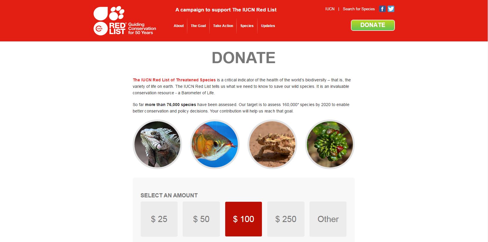
Design matters. If your visitors have to click more than once to make a donation, you’re making them work too hard. Remember: visitors do not equal dollars. Attracting visitors to your website is only half the battle, the other half is directing their attention to the donation page. Ask yourself: Is it easy to find? Is it compelling? Does it make an emotional connection?
IUCN Red List does a great job of creating a user-friendly donation page with a compelling explanation to supplement the ask. Once a visitor makes the decision to donate, they are taken to a page that is aesthetically pleasing and free from clutter. The bright green “Donate” button contrasts well with the red navigation bar, and the site is optimized for mobile. This website gets an A+ for messaging, aesthetics and and user friendliness. Where’s my wallet?
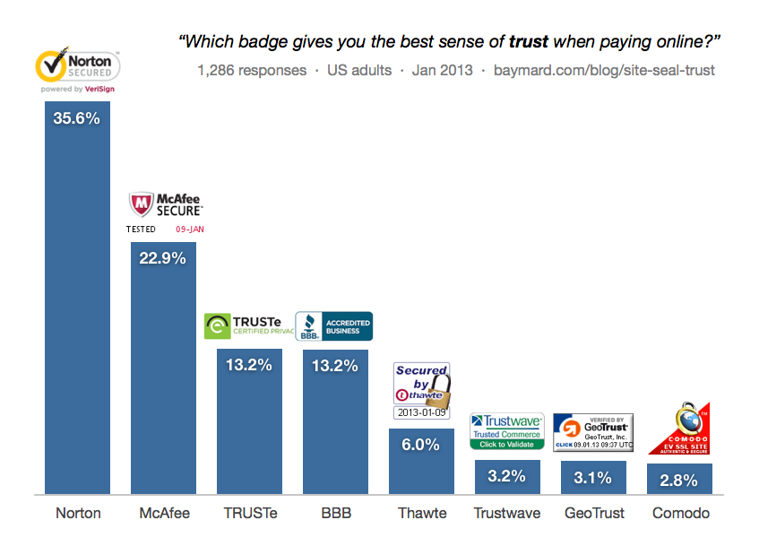
Although people are becoming more comfortable completing transactions on the internet and via smartphone, donors like to know that you’re taking their money seriously. Requesting a Trust or SSL seal for the bottom of a donation form can do wonders for improving the perceived security of your website.
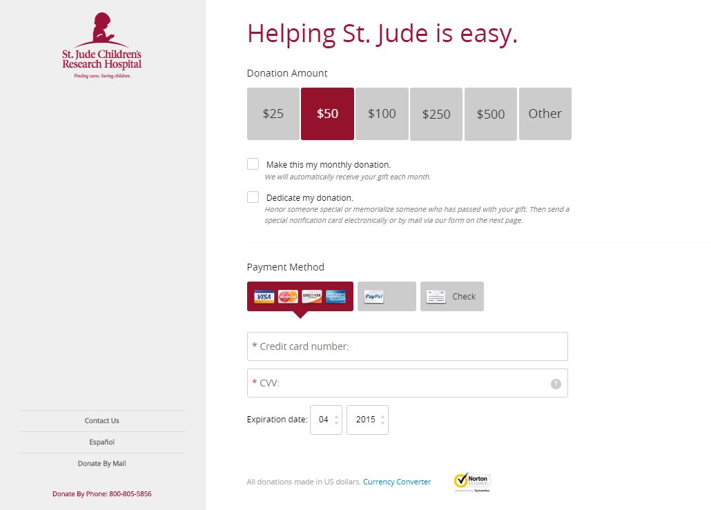
Creating donation levels can be crucial to the success of your campaign strategy, but is a decision that should not be taken lightly. Ask too little and you risk receiving less money than a donor originally anticipated giving; ask too much and you may scare people away.
A good strategy for determining your donation levels is to take a look at your recent donation history. What was your lowest gift last year? What was your highest gift last year?
Consider making the lowest donation level $5-$10 higher than your lowest gift to encourage larger giving. When determining your highest increment, use similar logic. If you rarely see gifts larger than $500 then don’t list $5,000 as your highest level. No matter what you choose, run giving levels for a test period, then stop, evaluate, and adjust accordingly.
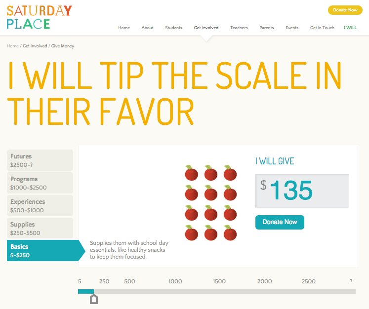
SaturdayPlace.org does an excellent job at using donation levels to explain exactly where their donations go. Not only does the website allow you to choose the increment at which to donate, but the donation page also uses infographics and a scroll bar to explain exactly what each contribution will provide for the organization’s end users. Explanations help users visualize their gift coming to life, which makes them feel more connected to the cause, and ultimately, more likely to donate.
People like gifts. Plain and simple. Gifts remind donors of the causes they care about and reinforce the notion that their contributions are appreciated. But appreciation can come in many shapes and sizes.
Too often we see nonprofits spend frivolously on swag thinking it’s the golden ticket to donors’ wallets when they can be saving hundreds of dollars rewarding supporters with free giveaways like e-books, exclusive web content, or even digital thank you letters.
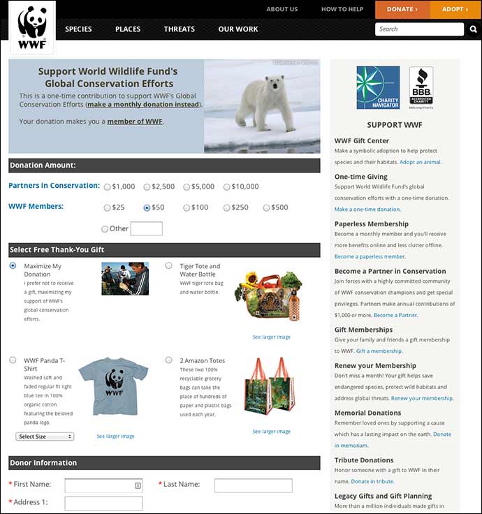
Although traditional, WWF does a great job at rewarding donors. I mean, who doesn’t like free T-shirts and tiger totes?
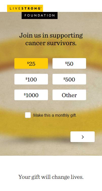
If you glean anything from this blog post, I hope it’s this: Go mobile! Studies show that responsive design doubles giving on mobile devices.
In addition, each usable email sent during an average nonprofit fundraising campaign nets $12.46 in revenue. This statistic holds a lot of weight when you consider how much mobile email is on the rise. By the end of 2018, worldwide mobile email users are expected to total over 2.2 billion—that’s 80 percent of all email users and more than 30 percent of the world. Woah.
Recent news about Google’s algorithm further backs the decision to go mobile. This week, Google announced its plans to make serious changes to the way it ranks websites. Starting April 21, Google’s algorithm began favoring responsive websites (sites that change format when resized on tablets and smartphones). Put simply, if your site isn’t optimized for mobile devices, you will likely see a hit to your ranking on mobile searches. Time for a redesign? We can help.
Does your site pass the “mobile friendly” test? Use this tool to find out.
Sign up today to have our latest posts delivered straight to your inbox.