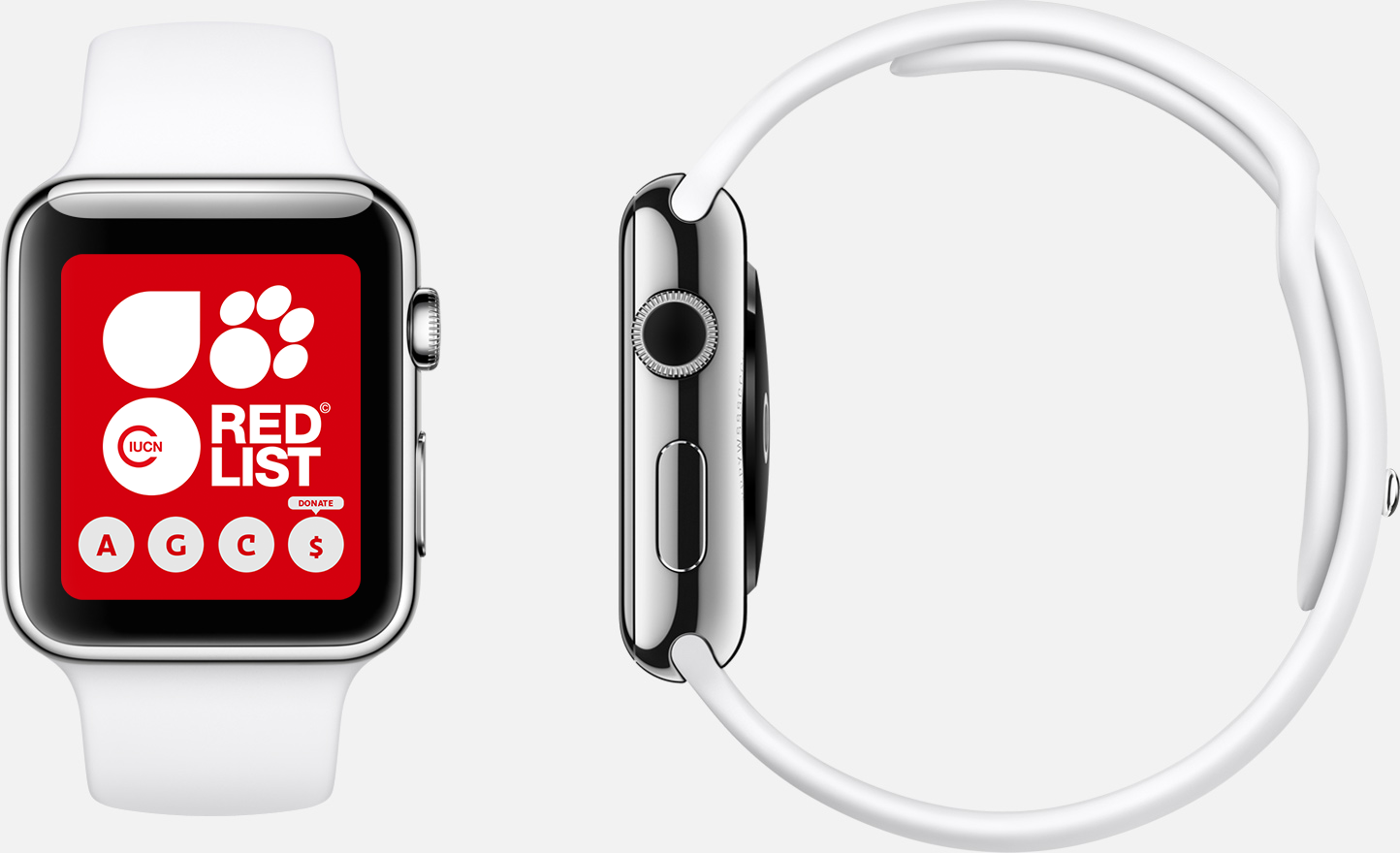
If you’ve visited a tech blog or even skimmed through your Twitter timeline recently, you probably know that wearable technology, like the Apple Watch or Google Glass, is making a huge splash in the tech industry.
You may be wondering how you could ever use a website the size of a postage stamp on a wearable. Well, research from Cisco says it’s possible. According to their discoveries, 9.1 percent of web traffic will derive from wearables by 2019.
Which raises the question: now that we’ve gotten the hang of designing responsive sites for tablets and mobile phones, how do we begin to implement responsive design for wearables? As a comparison, below are some examples of some of our clients’ our responsive sites, compared with the screen size for one of the Apple Watch models.


While you may be unsure of the specifics (or even what exactly it is), you’ve likely experienced a tangible difference when navigating a responsive site.
Responsive design ensures that a website displays and performs well, whether on a phone, a desktop computer, or a tablet. A website with responsive design gives users access to web content on their phones or tablets without the clutter and excessive load times of a website only designed for desktop computers.
Because of their app-like features, responsive sites are faster and more user-friendly, making it easier for visitors to access information on the go.
This positive user experience goes a long way: users who visit responsive sites are more likely to develop long-lasting relationships with companies because of their attention to detail and consumer needs. This often translates into support and donations, as we’ve seen with many of our clients. It’s safe to say that responsive web design has become a new standard for web development.
Because of the limited screen size, wearable technology takes responsive design to an entirely new frontier. But, at least for now, many wearable retailers like Apple are avoiding the issue of responsiveness by restricting web browser use.
Expect this to change. If wearables hope to become the new standard, retailers won’t be able to limit browser use for long. Access to information on the web is too important to consumers to ignore.
Without even marginal access to the web and online content, wearables stand no chance of changing the ways in which we value and prioritize technologies: the Apple Watch will be the next Google Glass, with the potential to change the industry, but none of the practicality to actually live up to it. This likely means that, in the coming years, websites will need to be optimized for computers, tablets, phones, and wearables.
The size of wearables presents as many new challenges for consumers as it does developers. For developers, the challenge will lie in prioritizing the content featured on wearables and coming up with user-friendly interfaces. For consumers, the challenge lies in productivity. My advice for consumers: wait out the gold rush until design trends establish a status quo. As for developers, now is the time to take advantage of this new creative challenge to design for the future and implement your wearable web design.
Designing for new devices can be a challenging proposition; here are some things for developers to keep in mind when beginning the journey.

Sign up today to have our latest posts delivered straight to your inbox.