
Your website is your digital doppelganger. Making a good first impression can determine success or failure.
When it comes to running for president in the digital era, a well designed website may be the most important tool in the proverbial toolbox. With the Iowa Caucus and New Hampshire primaries coming up next Monday, we decided to review the effectiveness of the websites of the Presidential candidates.
We’ve ranked the websites based on six criteria:
1) First Impression: Does the front page create an irresistible urge to go out and canvass?
2) Navigation: How quick and easy is it for you to find the page that you want?
3) Content: Is the information provided relevant and effective?
4) Design: How visually pleasing is the site to the eye?
5) Call to Action: Is the site compelling enough for you to consider donating and/or volunteering?
6) Mobile View: Does the site function the same on mobile devices as it does on desktop?
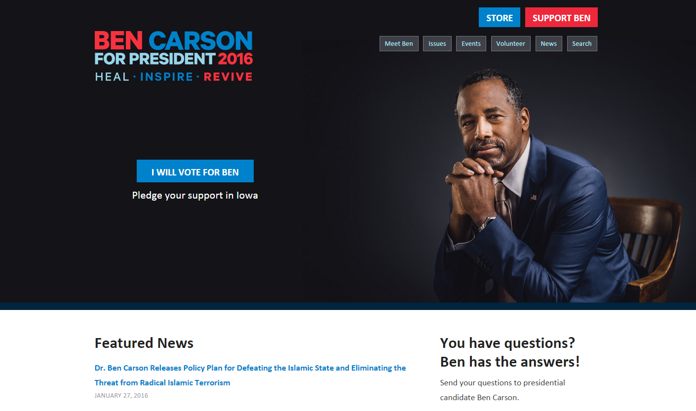
Alas, Ben Carson suffers from having the least effective website out of all the candidates. The main problem is the somewhat unresponsive navigation bar, which is shoved to the top left corner of the page. In addition, a scarcity of multimedia content and a lack of effort when it comes to the overall design of the site landed him in last place.
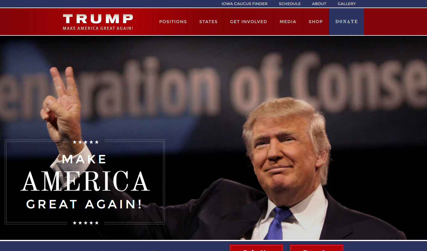
The strange paper texture used in the background of Trump’s website is the main detractor. It clashes badly with the content and is unnecessary when a plain white background functions as a better alternative.
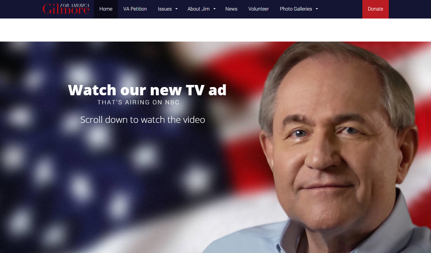
Rather than taking a riskier route in an effort to stand out from the pack, Gilmore opted for the “better safe than sorry” alternative. The entire site feels pre-packaged, as if his digital team took a Microsoft template and cut and paste content.
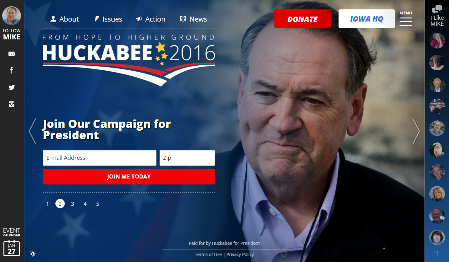
The two sidebars feel like clunky add-ons. Although being able to access the contact bar and read personal testimonies from any page is neat feature, it clutters the page. Beware of browsing this site on a small screen.
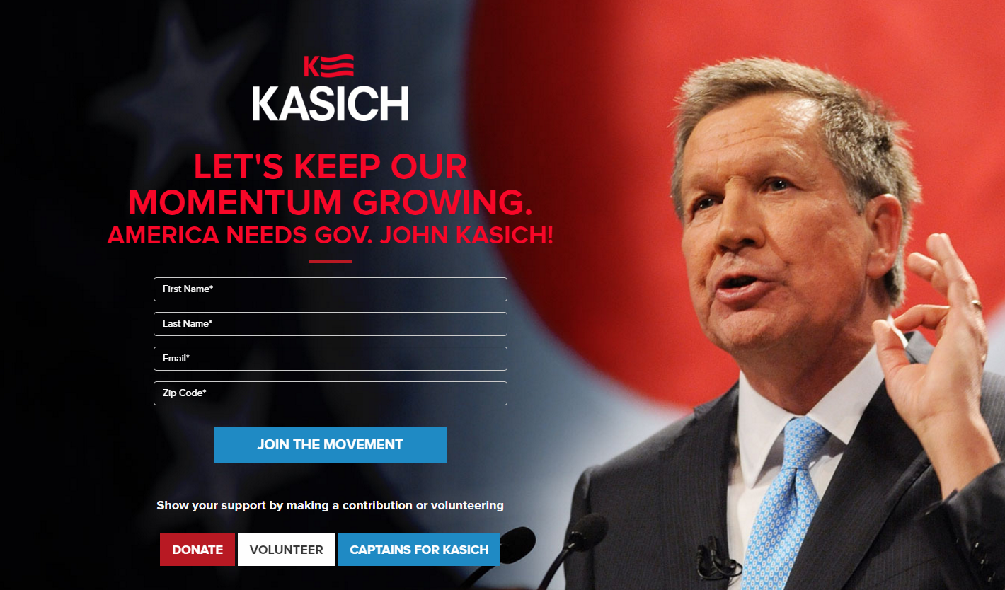
Kaisch’s front page starts off with the run-of-the mill call to action and volunteer form. However, it is disappointingly bare, missing the variety of media and information present on other candidates’ websites, which does little to compel a new visitor to explore the site further.
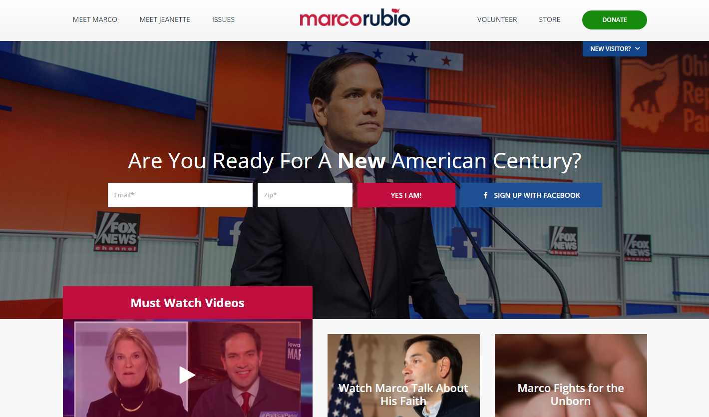
Rubio’s front page lacks organization. The search bar is located a fourth of the way down the page and, rather than group everything neatly into subgroups, all the content is dumped onto the page without any rhyme or reason.
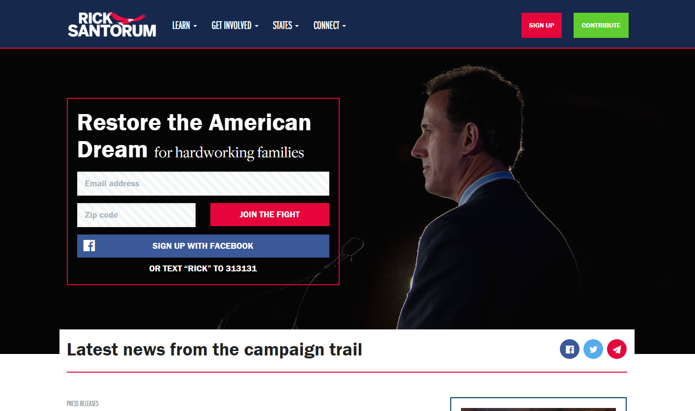
Overall, the Santorum website features a strong design. Although the general layout was well thought out, the color choices leaves something to be desired. The red that is used to highlight key calls to action is also used in graphic elements throughout the site, which is distracting when you’re trying to read the main content.
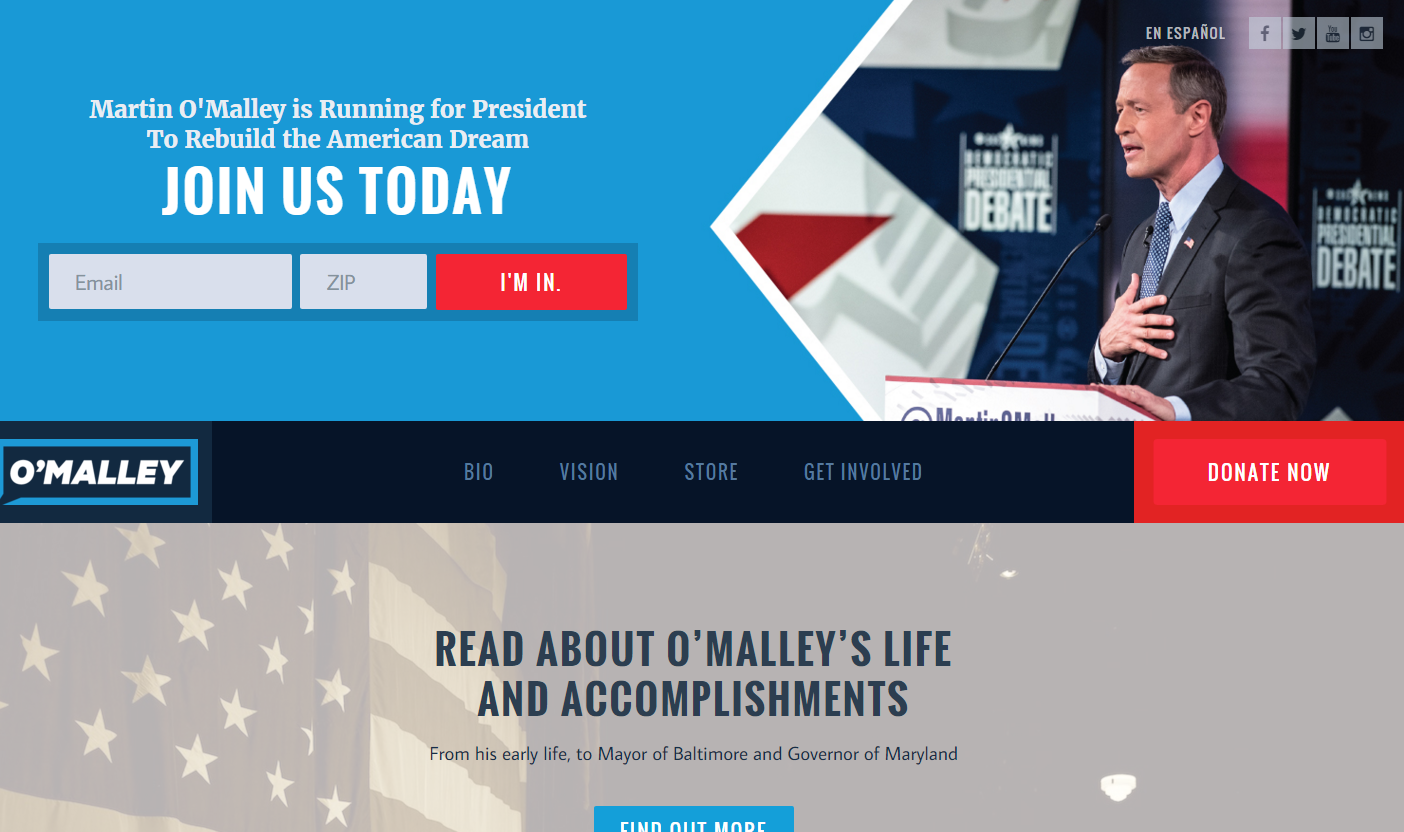
The website opens with a great pitch that calls for the viewer to join his email list. It’s easy to navigate and well organized. The biography page is the highlight. It showcases all the strengths of overall site with responsive elements, such as auto scroll buttons and hoverable images, and graphic icons that help readers quickly locate any information they’re trying to find.
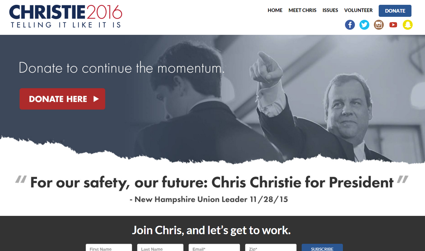
Christie’s site opens on a strong note with direct wording and quotes. The site is well organized in a minimal way. Rather than overwhelming you with dozens of pages to read through, Christie’s website summarizes all his key points into one or two pages.
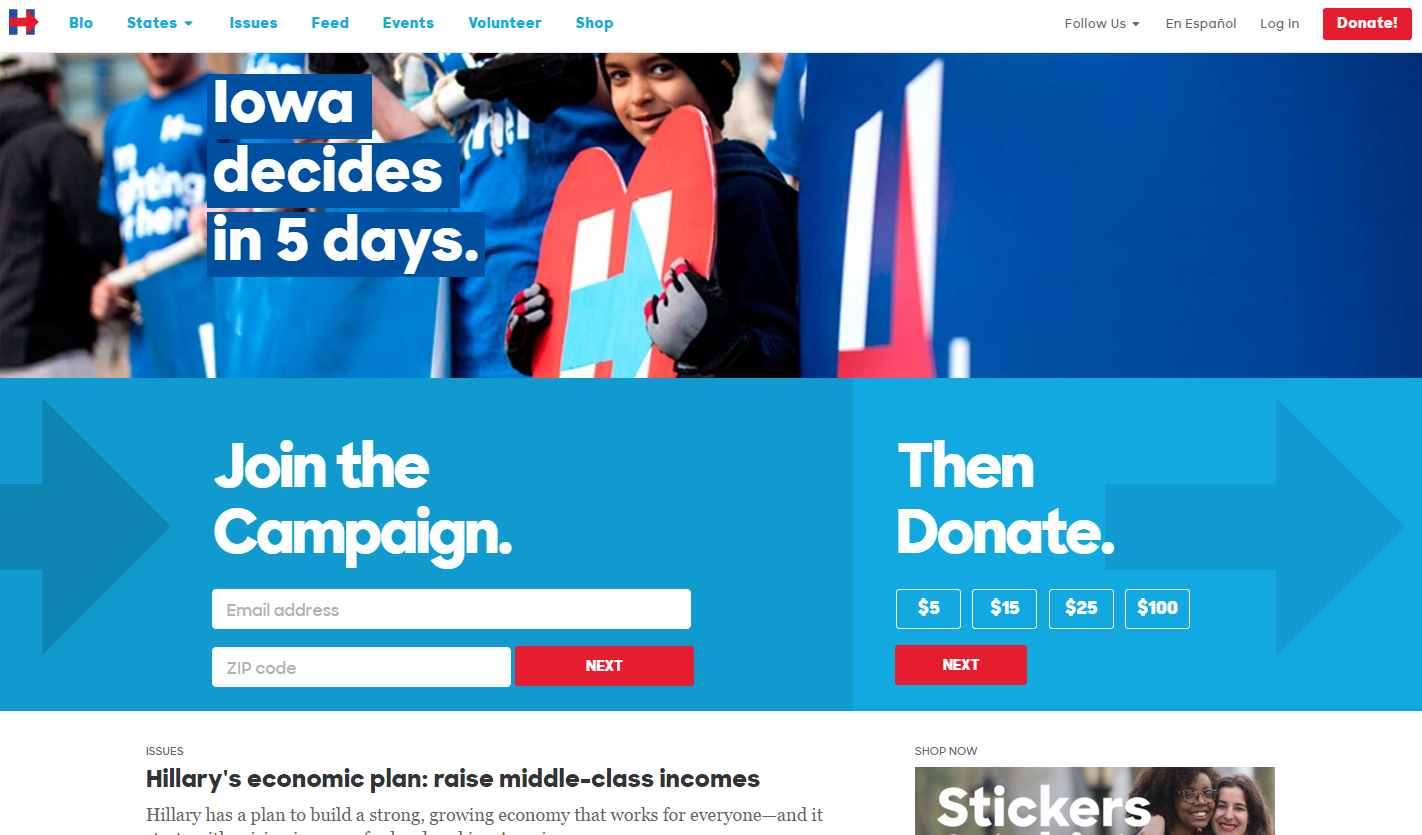
Although the content and design was appealing at first glance, Clinton’s website fails to employ some of the tactics used by the higher ranking websites, such as adding a more personal appeal to the volunteer and donation pages. Nonetheless, the layout and font choices pair up to make for a very easy-to-read website.
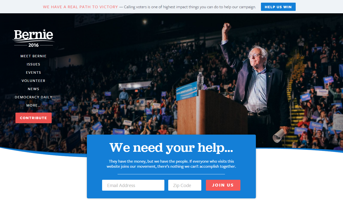
The first thing you encounter is a splash page asking for donations, stating that “Nobody who works 40 hours a week should be living in poverty”. This kind of tactic can easily scare away unsure visitors. Despite the splash page, Sanders’s website is well laid out and exhibits some of the best copy writing of the group, although its menu could use some reorganizing as a lot of information is hidden behind the “More…” and is easily missed. Most crucially, the Spanish language option is buried behind the “More” category, which could make it difficult for Spanish speakers to navigate the site.
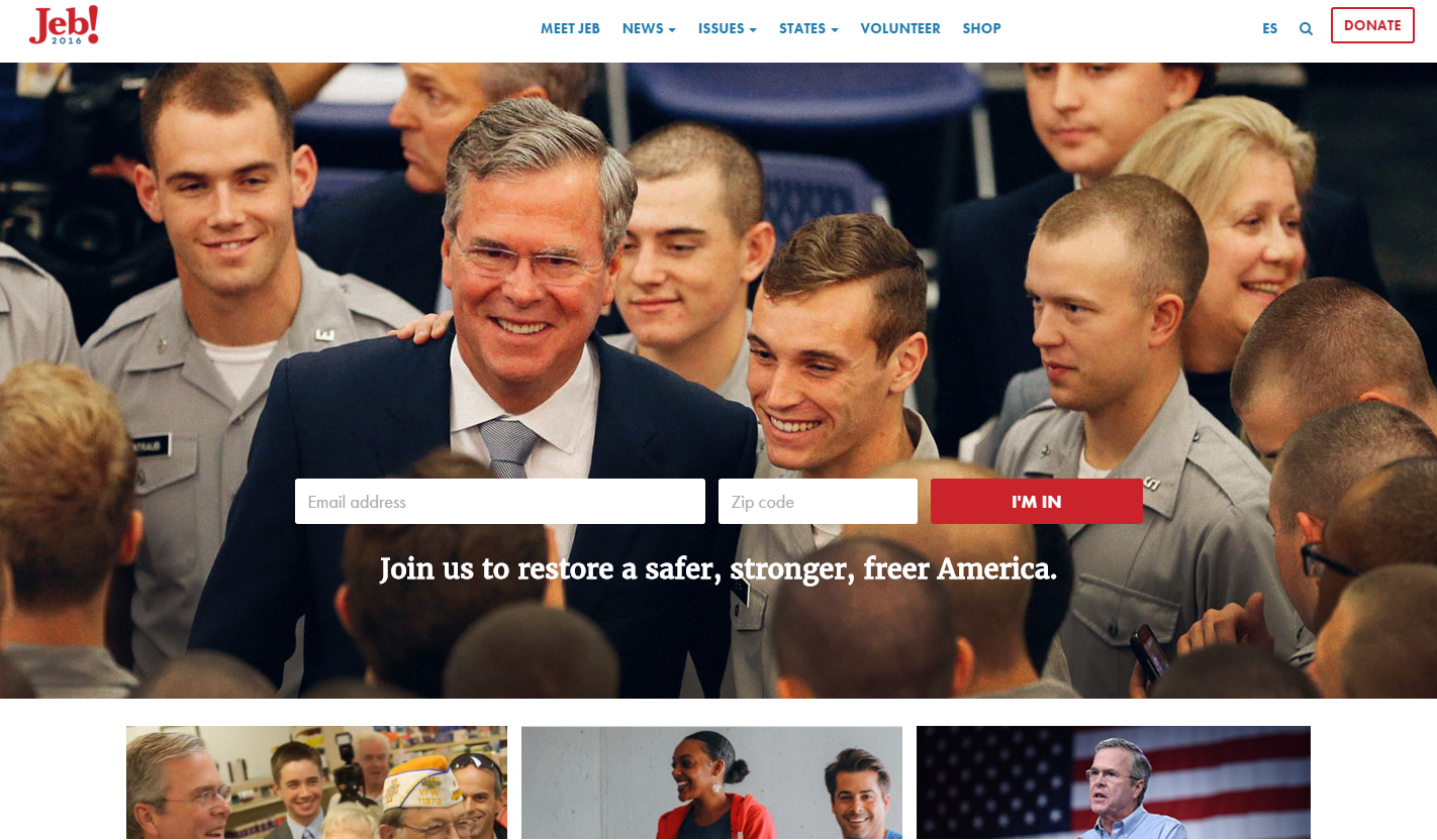
Bush’s website takes a down-to-earth approach. The majority of the images on his site features him interacting with people in a neighborly manner. Each state’s page is tailored with pictures and videos of Jeb spending time with the locals, which markets him as an approachable and easy-to-talk-to individual.
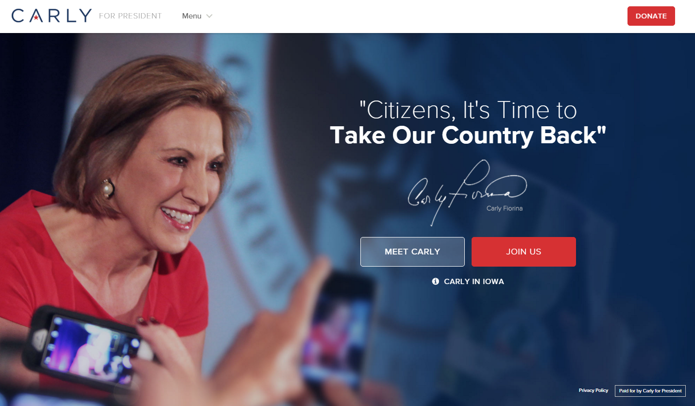
Extremely well thought out in terms of layout and design. Rather than subsections and a long drop down menu, everything is sorted into an overarching category. What fell short was the choice of text on the “Answers” page, which clashes badly with the existing font choice and was somewhat hard to read.
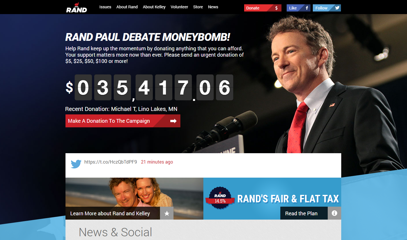
The use of the “money bomb”, the live fundraiser ticker pioneered by Paul’s father Ron in the 2008 presidential cycle, is unique and provides a strong opening point for the website, provided the numbers are relatively high. In addition, a built-in feature displays recent donators’ names, which could provide incentives to contribute. Who doesn’t want their name featured as a contributor on the front page of a presidential candidate’s website?
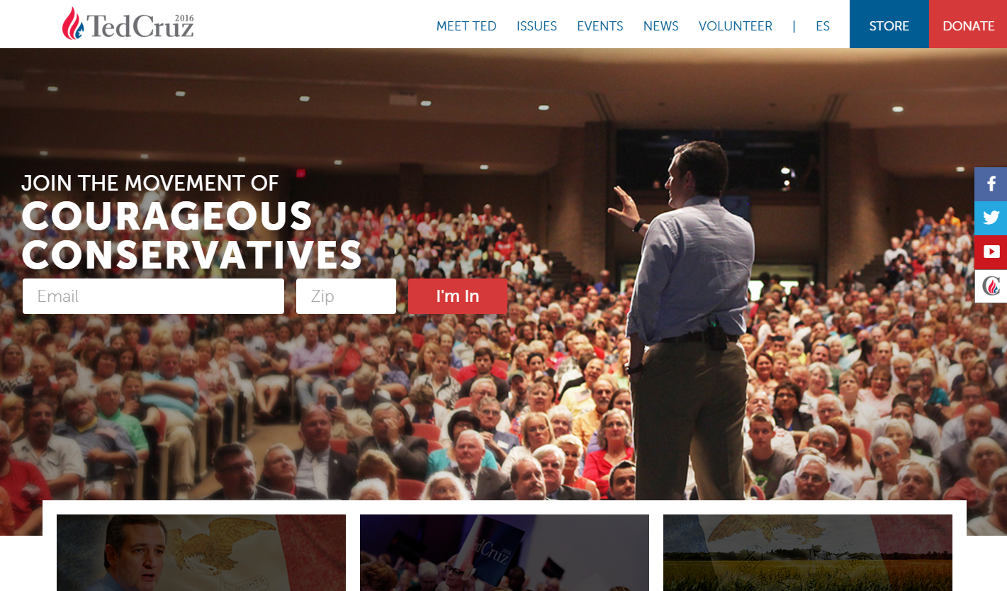
From great graphic design to easy-to-read content, Ted Cruz’s website is like that one teacher who always made you feel special and important by scrawling personal comments on your papers. Including phrases like “You matter” and “I’m in” makes the viewer feel like they matter on an individual basis, rather than just being another faceless supporter.The highlight is the front page that acts as a one stop shop for media, volunteer information, and more.
Despite these rankings, what really matters in the end is whether or not you believe in what the candidate stands for. Though, it doesn’t hurt for them present those ideals in a well designed website.
Sign up today to have our latest posts delivered straight to your inbox.