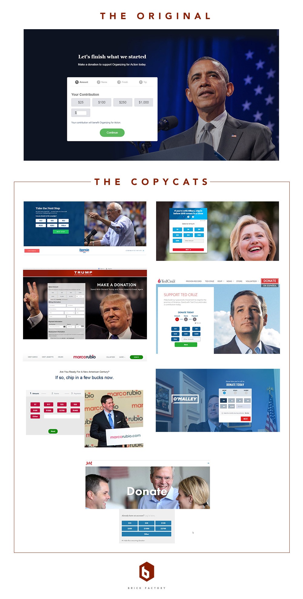
If imitation is the sincerest form of flattery, then the digital team that worked on the 2012 Obama campaign must be feeling downright exalted.
After a bunch of experimentation and testing, the 2012 Obama campaign ended up with a donation page layout that included a large, inspiring quote of the candidate and a stepped donation process that made it dead simple to give (you can see an updated version here). Clearly the design worked, as the campaign raised more money than any other campaign in history.
I think it is safe to say that most of the 2016 candidates had a look at the Obama campaign’s donate page and decided to follow a similar template. Check out the graphic below.

Sign up today to have our latest posts delivered straight to your inbox.