I was doing some work on Google and did a quick search for Barack Obama. I wanted to go to his main campaign site, so I clicked on the ad that shows up as the first result. I often find just typing search phrases in Google quicker than trying to type in a URL or sort through where I have the site bookmarked.
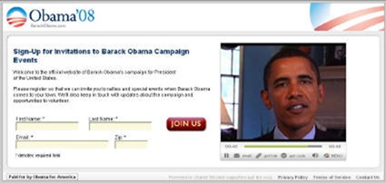
Not surprisingly, I got taken to a page designed specifically for Google Adwords that encourages me to join the Obama mail list. Below is a screenshot of the landing page.

This is pretty typical. The only thing interesting here is that the page doesn’t include any obvious way to opt out of the sign up process. Most of the time when you do these sorts of pages you get the little “Skip to go to Website” option. Want to to go to the website? Can’t get there from here. It seems to be designed in a way that conveys that the only option is to sign up.
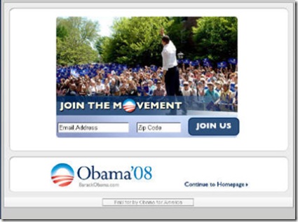
Already being on the list and just wanting to go the website, I figured out pretty quickly that the Obama 08 logo up top is the the way to go if you just want to move along. But clicking on that brought me to another splash page – this one the normal splash page for the overall site. Screenshot below. This one provides you with the ability to opt out and go straight to the website if you choose.

So there you have it. A double splash page. This really underscores the Obama campaign’s emphasis on the fundamentals: good old fashioned list building.
Sign up today to have our latest posts delivered straight to your inbox.