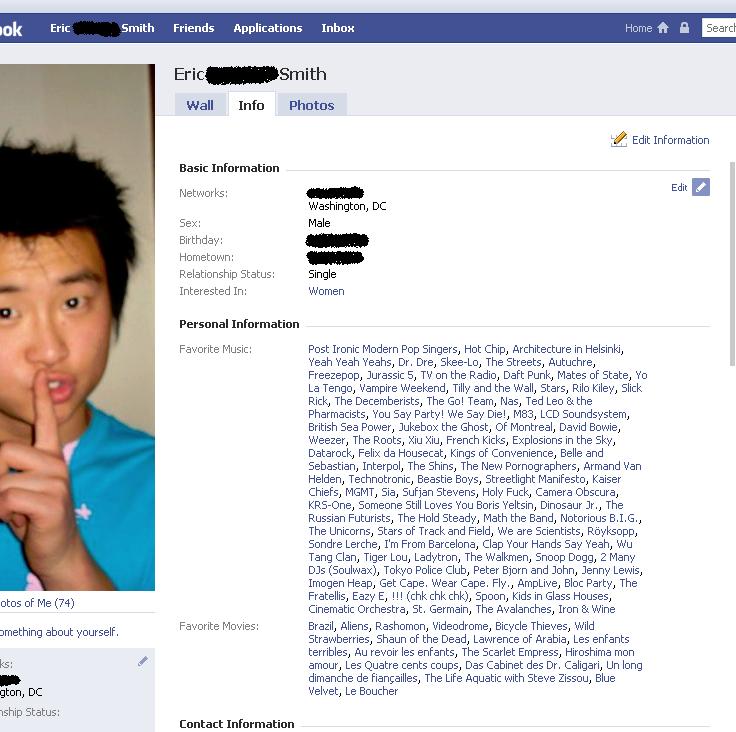
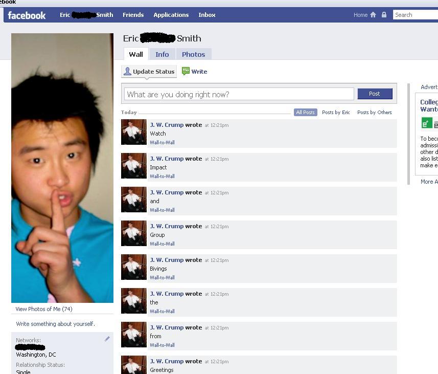
Announced yesterday on the Facebook blog, the redesign of Facebook has finally arrived. After several delays to the new aesthetic, the developers have finally released the new platform to the masses. More AJAX, tab-centric, and a more versatile API… Here's a quick listing of some personal pros and cons with the new design.
Pros
- Tabs! I am a sucker for tabs. They are easy to organize and keep content from becoming cluttered. My biggest complaint when the Facebook team released the API was that too many people's profiles were becoming littered with third-party applications. These apps were visually detracting, and had nothing to do with what I found Facebook to be most useful for (keeping in touch with acquaintences). With the new redesign, one can stick all their scrabble-playing-super-wall-poking ugliness on its own tab and I'll never have to go near it.
- More intuitive photo platform. I didn't post a screenshot of my photos tab, but it is a far more intuitive way to access other users' photographs. It borrows heavily from the minimalistic UI of picasa, and now I don't have to go searching through a user's profile for a link to find their albums.
- Better use of horizontal space. Facebook finally spread its wings a bit. The redesign makes a much better use of horizontal space, and avoids feeling clausterphobic by combining this new feature with the tabs, mentioned above. The wider limit also allows third-party developers much more freedom when it comes to mapping the UI of their applications, so I expect to see better things than graffiti and super wall.
- Improved 'friends' module. With the redesign, the friends module was improved. Now you have a choice as to how many thumbnail pictures to display, as well as designating which ones (there were some third-party applications to have "favorite friends" displayed on the previous facebook design, does anybody know what they were called?) if you would rather permanently display your best friends.
- Smart use of AJAX. The AJAX on the new design is both aesthetically pleasing and purpose-driven. The way I like it to be.
Cons
- Advertisements in my face. I remember when Facebook had no ads. Then it had text-based ads. Later, they adopted vertical banners. Now, they've put those vertical banners front and center. With the decreased clutter on the pages (which is a good thing!), it leaves the advertisements to stick out like a sore thumb. With the previous design, I found I could largely ignore advertisements if I just pretended they were another annoying application.
- More clicks. My preference for tabs aside, the prosecution points out that there is something to be said about having all "crucial" profile information contained on one page. When I need to know if the young lady in my rhetoric and composition class has awful taste in music or not, I have an additional click to consider. Multiply this by lots of young ladies and you're talking about a serious time investment.
Overall, I'm pleased with the new Facebook design. I think it's a step in the right direction, which is a personal first. This new implementation puts the criticisms of previous redesigns into perspective. I'm sure the previous flaws helped shape the success of this release. Anything to add?
Catch some pictures of the redesign after the break.
Here's what my profile looks like:
Wall Tab (thanks to J.W. for the censor-rific wall posts)
Info Tab

P.S. If you haven't gotten the notice to switch to the new Facebook redesign, you can access it at http://www.new.facebook.com/ (don't forget the "www").
