 Ok, maybe I'm a bad person who relies upon stereotypes too much, but one would think a site for geeks would actually have great features since geeks are so tech savvy. Wrong.
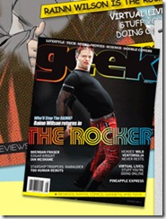
While browsing through the magazine rack at Borders Books earlier this summer, I came across Geek Monthly with its cover girl, Tina Fey. Either way, I read the article about her since I like her show 30 Rock and went home to check out the magazine's site. I was expecting a great site that was graphically designed well with bells and whistles like easy to search sections, forums, great blogs, social media features, and great content. I expected something like the beautiful site for Backpacker Magazine (since when did backpackers know so much about designing great websites?). However, as you can see in this image, like how the current cover boy (Rainn Wilson from NBC's The Office) is dressed, the site does not look pretty.
Either way, the Geek site has a rather distracting design, no clear navigation, seemingly no access to articles from past issues or from the current issue, no community features, etc. It does have a blog, but not a great one. You can also see an article from the current issue, but it pops up as a jpg… What?
So, I'm disappointed. Were my expectations wrong in the first place?
Sign up today to have our latest posts delivered straight to your inbox.