Our recent discussions about the national and international newspaper industry got me thinking: I wonder how network news sites measure up? Are the sites of some of the United States’ most popular news networks better or worse than those of their print competitors?
Functionality
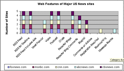
To answer this question, I took a quick look at the sites of 5 news channels: cbsnews.com, abcnews.com, cnn.com, msnbc.com, and foxnews.com and evaluated them on the same basic criteria as the newspaper sites. Here is a chart that summarizes the results:

Basically, what I found is that these 5 news sites are about on par with the top 5 newspaper sites in terms of functionality. One major difference, however, came in the registration category. Where 4 of 5 top newspapers required user registration, only one network site (CNN) required registration. In addition, CNN’s Pipeline (the portion of the site that requires registration), which costs $2.95 per month, only includes the latest articles and video pieces, which are usually transferred to normal cnn.com coverage later in the day. Therefore, readers can definitely use CNN regularly without registering. In essence, all of the network news sites are open and free, where the top newspaper sites require readers to sign up, and in the case of the New York Times, pay a fee to access certain news coverage.
Newspapers had the network news sites beat in terms of bookmarking, with three newspapers in the top 5 offering this technology and none of the network news sites offering it. In all other categories, however, the results were close to identical.
Site Design
In terms of site layout and appeal, it was difficult to pick a clear winner. It was easy to see, however, that Foxnews.com has the worst site of the five I looked at. The navigation is terrible, and the homepage is a mish mosh of far too many elements. I found the site a bit overwhelming and thought it was next to impossible to figure out what the truly important news was. Surprisingly, ABC’s navigation was almost as bad. The redeeming factor about this site is that there are separate sections for blogs, podcasts, and video content on the homepage, which made it relatively easy to find the Web-unique content.
In terms of news reading, CNN provided the best article organization and breadth of coverage. The problem with this site is that Web-unique content, such as blogs and podcasts, are not brought to the forefront. To find the reporter blogs, I had to do a site search. There is no link to them from the homepage. The only link to the podcasts is at the bottom of the homepage, where the RSS feeds for podcasts are listed. This site does have one particularly interesting feature, Exchange. This part of the site lets users send in their own pictures and videos and lets others comment on them. I wish more news sites would adopt this kind of system.
CBS and MSNBC finish at the top of the heap. Their navigation systems were easy to work through, and it was not difficult to find the content I was looking for. I particularly liked MSNBC’s simple homepage design.
All of the sites featured a nav bar that lists each one of the network’s news shows. That way, it is easy to find content that you may have seen on TV. I thought this was a useful feature.
Conclusions
Overall, I was sort of disappointed with the network news sites. Given that network news has a plethora of video and audio content, as well as highly recognizable media figures, I expected that the sites would be more sophisticated in terms of functionality than the newspaper sites. In addition, because none of the sites allowed users to comment on articles, user-generated discussion and interaction was limited. It looks like the online news industry has some work to do.
Sign up today to have our latest posts delivered straight to your inbox.