As a follow-up to our research on newspaper websites that we published recently, we decided to break out a list of the best examples of “good” newspaper websites. Steve, Todd and I collaborated on the following list, judging sites not only on their web features but also on the design, aesthetics and general usability of the site [Note: this list only covers the top 100 US newspapers in terms of circulation, which is what our study looked at. We’re sure that we missed some great smaller papers.].
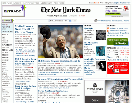
(1) New York Times: We love the general feeling of the NYT site, which is pleasing to the eye and easy to navigate. The site is loaded with great features, and the website is rumored to be dropping its annoying pay wall, TimesSelect, in the coming months.
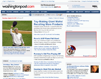
(2) Washington Post: Not only do we like the design and the navigability of the Post’s website, but we really love its database applications, which provide interesting tidbits of information difficult to find elsewhere. The Post’s website has been a huge success, and is one of the best examples of newspapers creating an online product that is significantly different from its print product.
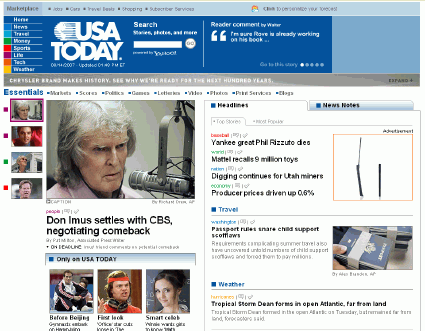
(3) USA Today: Social networking. Social networking. Social networking. Did I mention that this site has the most robust social networking features out of any of the newspaper websites we researched? Oh yeah. And this site has social networking.
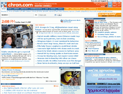
(4) Houston Chronicle: We like the non-newspaperish feeling that this homepage exudes. It’s significantly different from any other newspaper site. Chron.com offers its users interactive features such as comments and blogs, has a great RSS system made available right on the homepage, and looks good while doing it.
(5) Denver Post: The homepage of this site isn’t much to write home about, but registering with the site automatically gives you your own blog and your own photo gallery for uploading and sharing photos. When you add in some interesting political features, including a voter’s guide and a poll for picking candidates and combine that with alternative content views, internal and external bookmarking features, as well as links from stories to relevant materials, you’ve got all the ingredients necessary to build a great website.

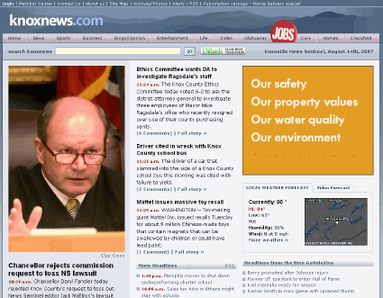
(6) Knoxville News Sentinel: I’m not sure a newspaper website could look any better than this one. When we talk about de-cluttering sites and making them look “clean”, this is what we mean.
(7) Fresno Bee: Great homepage, interesting CrimeMap feature, and overall just a solid site with lots of technology and an easy-to-use format.

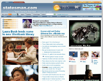
(8) Austin American Statesman: We really like the unique layout and coloring of this site’s homepage. We’re also giving this site points for allowing anyone to blog and for linking to many of the site’s blogs directly from the homepage.
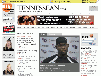
(9) Tennessean: The blog-like feel of this site’s homepage helped it make our list. We also like the strong presence of multimedia on the homepage.
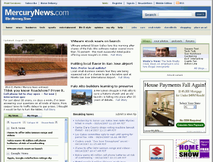
(10) San Jose Mercury News: On this homepage, we like the simple layout of the article headlines and descriptions. I also like the inclusion of the box with blog headlines, user photos, forum titles, and podcasts toward the top of the homepage. The site loads a bit slowly and is a little light on the features, but it does have all the core elements of a good site.
What are your favorite newspaper websites? Share them below in the comments or on the Bivings Report Wiki.
Update: We edited the info about the Times dropping Times Select for clarification. It was reported on August 7th that they would be dropping it. They did not drop Times Select on August 7th.
Sign up today to have our latest posts delivered straight to your inbox.