Was on the site of Edward Tufte, the author of the stunning series of books about data and its visualization — The Visual Display of Quantitative Information is the first in the series — looking up info about his new book, Beautiful Evidence. Was especially intriqued by his notion of Sparklines. An example is below:
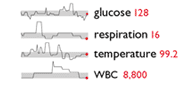
This picture depicts four vital signs over time, with the grey bar representing the normal range and the red dots and numbers the latest readings. It’s an elegant and economical way to provide time-series data, and to easily see and know when data diverges from the normal or target ranges. His new book will have a home on my shelf very soon.
There’s a link on his site to a fascinating applet that turns any web site into a graph. The graph depicts the tags (or links) in the site. See legend here. Here’s a screenshot of what this blog looks like as a graph:
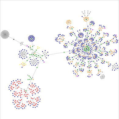
As uncovered by my colleague, Matt Wood, the ball of dots on the right represent the major portion of the blog; the bottom left-hand corner of dots is the Archive side bar; the blue ball with green center to the left is the Tag Cloud.
The site provides graphs for a number of popular sites (scroll down.) You can add any URL to the applet and watch the graph reveal itself. There is also a collection of such graphs on Flickr here.
At The Bivings Group, we care a lot about site design, user navigation and site effectiveness. Such graphing tools help push the frontiers of our knowledge.
Sign up today to have our latest posts delivered straight to your inbox.