I received an email the other day from Brian Kroski, VP/GM Online at the New York Observer, a well-renowned weekly paper in New York City. The Observer recently redesigned it's website, and I was quite impressed with the results.
The redesign of the Observer has integrated many Web 2.0 features that we have discussed here at TBR. Here is some of the functionality I noticed on the site:
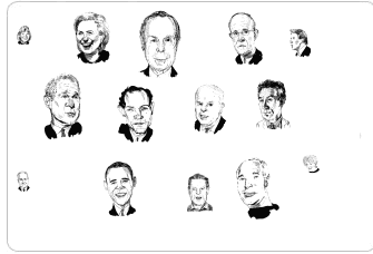 Tag clouds. The Observer online has many different tag clouds. I think this is a great feature and I really wish more newspaper sites used tags. Tags not only make it easy for people to find information they are looking for, but they also give the newspaper itself a great method for organizing its content. The Observer has tag clouds on the homepage and every individual section of the site, giving readers lots of different tools for searching for content. A fun feature that the site provides is their "head cloud", which shows the people that are most discussed about each day in the paper.
In addition to these features, The Observer allows comments on all of its articles and blog posts. Unfortunately, not much discussion has occurred on the site so far, but I imagine this will change as the redesign gets more publicity. I tested the commenting feature by responding to an article, and my comment appeared immediately. So it seems that the Observer has done what many papers are unwilling to do: relinquish some aspects of control in order to really open a site up for discussion.
On the downside, the site does not provide any video or user submission features. I don't see this as a big problem, as newspapers are, after all, sources of printed content. Just as it's better for political candidates to refrain from blogging than to have a "bad" blog, I think it's better for newspapers to stick to what they know –print content–rather than attempt a multimedia program and do it poorly. It's important for newspapers to know their limits and do the best they can with the resources they have. So cheers to the Observer for maintaining its integrity and not trying to expand too far beyond its reach.
Also, the site seemed a little slow to me, with the time between viewing different pages longer than it should be. This got a little annoying, but wasn't a big problem.
Overall, I think the NY Observer has come up with a great online program. Many other news publications can learn from this weekly's redesign.
You can read more about the paper's redesign here.
What do you think? Use our commenting feature to write your own mini-review of the New York Observer website.
Sign up today to have our latest posts delivered straight to your inbox.