Last week on Thursday, February 21, a 6.0 earthquake rocked northern Nevada and was felt in Idaho and Utah as well. In response, the Salt Lake Tribune wrote a traditional article about the event. However, its coverage didn't stop there.
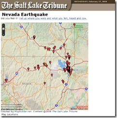 The paper decided to ask readers who felt the quake to describe what they noticed and where they were at the time. These responses were mapped on a MapBuilder map to give a graphic representation of where people felt the earth shake.
In Monday's E-Media Tidbits column, Amy Gahran of The Poynter Institute highlighted this nifty map. Kim McDaniel of the Tribune explained to her that this map wasn't originally designed to examine the quake; it was originally used in November to show where holiday lights were located in the Salt Lake area. After the quake hit, she and her team had a great idea and implemented it.
It is very important to note that newspapers of all sizes can launch great interactive tools. This ability is not reserved for large papers like the New York Times that can create sexy flash presentations like the one about box office data that Todd mentioned yesterday.
Granted, it is easier said than done, but creativity and fast thinking — sometimes coupled with services like MapBuilder — can go a long way for any newspaper trying to report better and connect with its audience in meaningful ways.
Sign up today to have our latest posts delivered straight to your inbox.