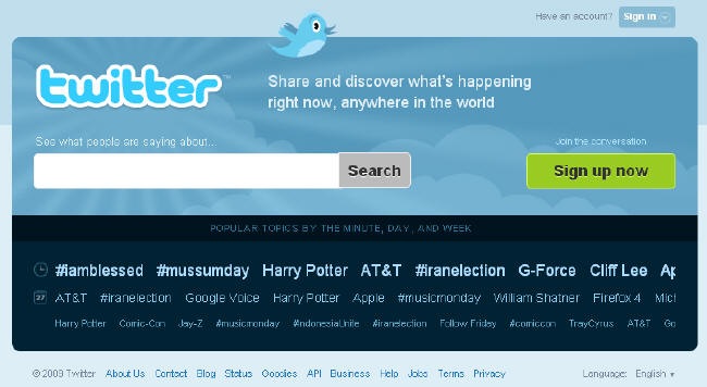
I’m definitely late to this party, but yesterday Twitter launched a new design for its homepage. This is the version of the homepage users who are not logged in and who are visiting the site for the first time will see.

Lots of smart people have already surrounded this topic, so I won’t write a long drawn out post about it, but I did want to share a few quick thoughts.
To state the obvious, the new site emphasizes search and trend tracking, and de-emphasizes orienting users new to the service and Twitter’s social components. It looks like the homepage for a search engine. This strikes me as a mistake. While I certainly use Twitter trends and search, the main reason I use Twitter is for the community of people I follow and who follow me. This aspect of the service gets lost with this homepage. Perhaps more importantly, the new page doesn’t do a good job of explaining what Twitter is – it assumes you already know.
In addition, the heavy highlighting of trends on the homepage will further encourage people to spam Twitter, or, more legitimately, to manufacture memes so that they appear on this main page. The obsession people have with becoming a trending topic will increase dramatically I would think. I’m not sure this is a positive development for Twitter.
What do you think?
Sign up today to have our latest posts delivered straight to your inbox.