We started working on a new Brick Factory website last Summer and made steady progress throughout the Fall and early 2024. In late January it was clear that we were almost finished, so I joked that we should launch the website on Valentine’s Day as a gift for our Chief Creator Officer, Tom McCormick. Well, we did it and you can check it out here. Happy Valentine’s Day, Tom.
A few weeks ago, I previewed the site and wrote about the strategy behind the redesign. To give folks a peek behind the curtain, here is another post detailing the process we used to build this site.
As the owner of the company, on this project, I was basically the client. My job was to explain what I was looking for with my teammates guiding me through the process of building the site.
Before we did any design or development work, I did some thinking about what I wanted the new site to accomplish. In advance of getting started, I gave the team the following information:
After the planning work was done, we had a kickoff meeting with Tom and Morgan Williams, who was our primary project manager on the redesign. I provided the materials mentioned above to them prior to the meeting so they had time to review and do their own research. In the meeting, Tom shared his thoughts and we brainstormed some design initial ideas. And then he got started doing actual design work.
On most of our projects, we start with low-fidelity black-and-white wireframes to get quick feedback on initial concepts. Once we have a solid foundation, we move on to high-fidelity visual design prototypes that more or less look like the end product. For all design deliverables, we produce versions for both mobile and desktop.
On this project, we felt like we had a good enough grasp on the content to skip doing the low-fidelity wireframes. Tom went straight to producing the visual design prototypes.
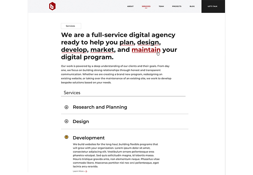
The design process started with the homepage. As is true with most organizations, the homepage is the most visited page on our website. The homepage establishes the initial brand identity for the company, with the interior pages taking visual cues from it. The homepage design process was smooth, and we pretty quickly got to something we all liked.
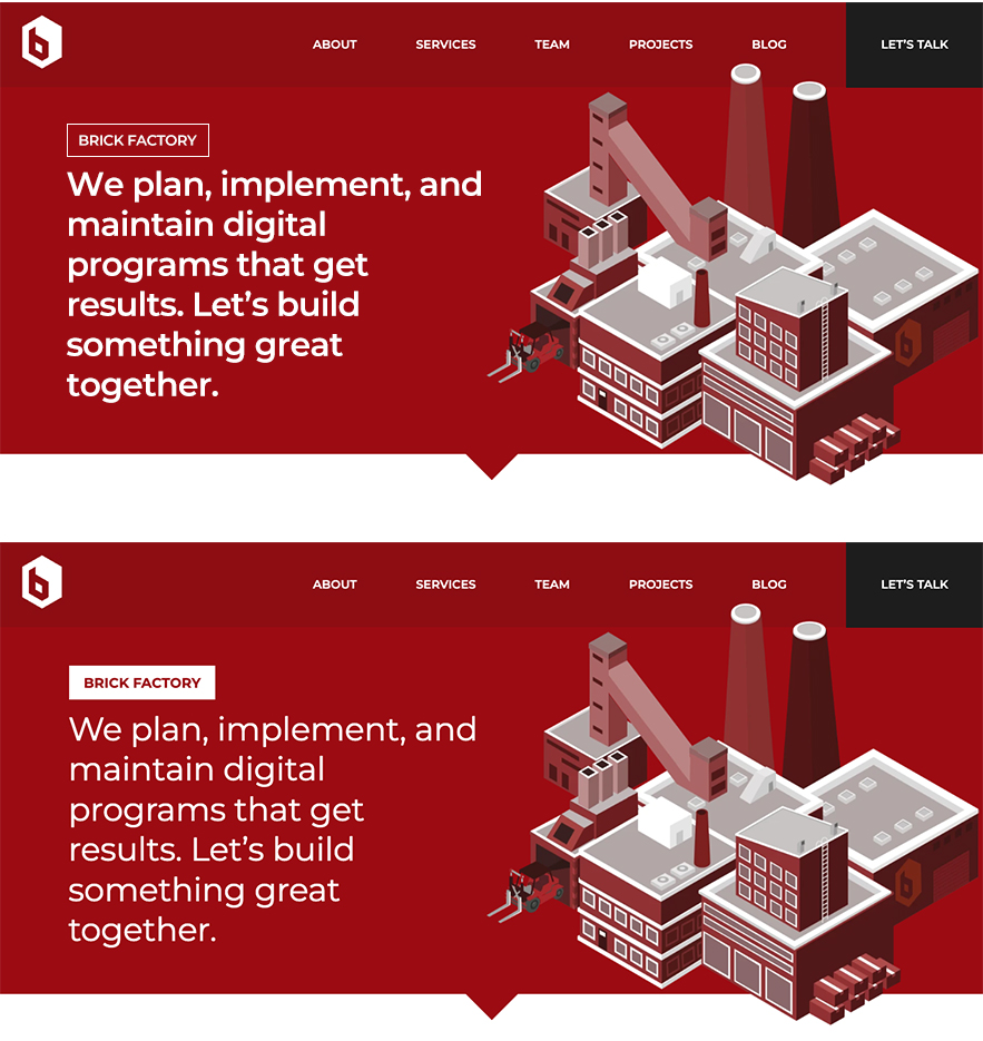
Here are some early versions of the homepage opening, along with the final version we ended up going with.
After getting the homepage to a good spot, we turned our attention to the site’s interior pages. This was a bit of a struggle. The initial versions we came up with were a little too close to what we had on our existing site and frankly felt a bit overdesigned to me. Here are some early iterations of our Services section, as a point of reference:
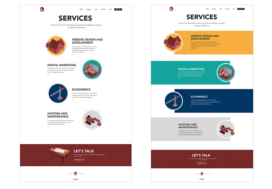
After thinking about it, it became pretty obvious that the problem was with the content I had produced and the direction I had provided. The interior page content was sparse, lacked introductory content, and was not very web-friendly. Since the text itself was lacking, our designers felt the need to embellish it with design elements. I went back and edited the content to break things up into digestible chunks. I basically rewrote it to be more web-friendly.
Tom then turned the content into a design system that would work well with WordPress Guttenburg. By making the text more digestible, we were able to create pages that are attractive and easy for impatient web users to scan. Here is what the Service section ended up looking like.
Once the designs were approved, we began building the website in WordPress. We used a modified agile development process with Morgan serving as project manager, and Chet Gassett, Silvio Loto, and Michael Dippold working on frontend development. Chet, Silvio, and Michael cycled in and out of the project based on availability.
Here is a high-level overview of how the process worked:
Morgan, Chet, Silvio, and Michael did Quality Assurance on the site throughout the development period. Morgan took the lead in testing the site on different devices and screen resolutions, using Browserstack to facilitate the review. Once we had a draft of the site done, Tom reviewed it from a design perspective and provided feedback.
I was briefed on progress and provided feedback when asked, but mostly stayed out of the initial QA process. I only reviewed the site when it was close to completion, and also shared it with a few other folks in the company for their feedback. This review resulted in some adjustments to the original design that I’m certain were frustrating to our front-end team.
As an example, on our homepage opening, we ended up unbolding the intro text and adding a white background to the Brick Factory tag.
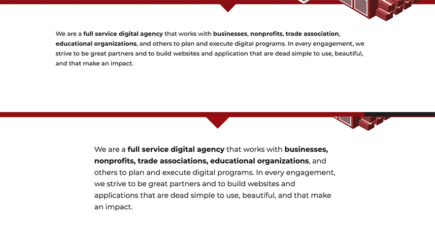
In another example, we tightened up the width of our content areas to improve readability.
These types of adjustments may need small, but coupled together they ended up making the site much more refined.
Tom, Chet, Morgan, Michael, and Silvio did an amazing job and I’m really proud of our new website. In terms of lessons learned, I would flag the following, most of which are on me:
Sign up today to have our latest posts delivered straight to your inbox.