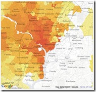
Through a very elegant blend of rental data from Netflix and Google Maps, the New York Times continues to improve on the infographic with a very interesting interactive feature called "A Peek Into Netflix Queues", which it published on January 10.
 The Netflix maps drew me in for about 30 minutes, as I clicked from film to film, watching as the density of rentals for each was represented in shades of red within each zipcode in the Metro DC region. For rental distributions that may confirm some common assumptions, look no further than "Frost/Nixon" and "Paul Blart: Mall Cop".
One commenter on Metafilter went so far as to say that the feature could be used by people (snobs?) as a tool for selecting neighborhoods in which to consider living. ("Hm, the schools are good and the neighborhood is safe. But do we really want to stand in line at the grocery store with a bunch of people who sat through ‘Bride Wars’?")
The Times has mapped 12 major metro regions. Take a look at it here.
Sign up today to have our latest posts delivered straight to your inbox.