There is little doubt that the 2008 Obama campaign was the most sophisticated digital operation in the history of politics. It is not really close.
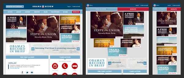
Given how high the bar has been set, there was a lot of hype surrounding the November release of the 2012 version www.barackobama.com, which features a responsive design. Responsive designs are all the rage these days, as they allow a site to automatically resize based on the resolution of the device the visitor accesses from. This approach prevents web developers from having to create specific versions of your site for desktops, smartphones and devices like the iPad.
When well executed, a responsive design can be a thing of beauty. Here are some great examples, with the Andersson-Wise and Boston Globe sites being particularly impressive, albeit in vastly different ways.
When done right, a responsive design creates compelling user experience on all devices. Unfortunately, I don’t think the Obama site achieves that goal.
Desktop
In a podcast about the new site launch, members of the Obama site team emphasized that they designed for mobile first. I think this is a nice sound bite, but in practice it just isn’t true. While mobile is growing rapidly, I would guess that 80% of the traffic on the Obama site still comes from traditional desktop user. Frankly, it wouldn’t be smart to design for mobile first. And the Obama campaign didn’t.
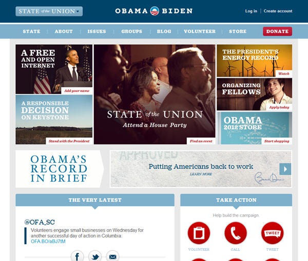
As you can see, the site looks great on a desktop (screenshot below). It loads well in all browsers and looks great at all resolutions. I particularly like the use of a fixed navigation bar and the presentation of top stories as boxes of varying sizes.

iPad
The user experience falls apart a bit if you view the site on an iPad in portrait view. The top story boxes that line up so nicely on a desktop stack in a random fashion. The text of the “State of the Union” cuts off a bit. It just looks kind of sloppy (screenshot below).

However, if you view the site in landscape view on an iPad it looks just as fantastic as it does on a desktop. And if you click through the site on an iPad in both portrait and landscape views, things display nicely and work well.
iPhone
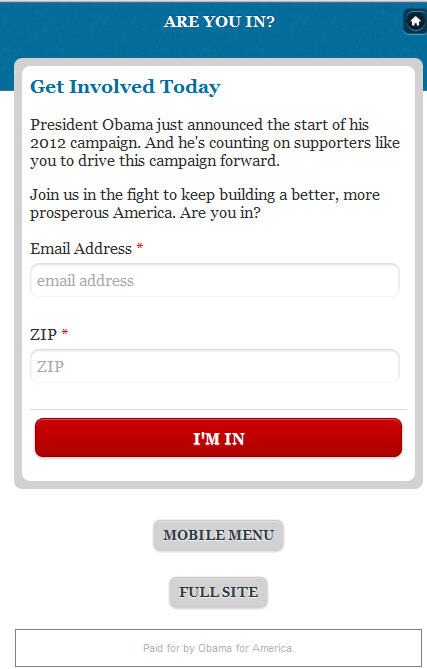
It is on the iPhone where the trouble actually starts. When I first visit the site on an iPhone I’m taken to a mobile splash page asking for my email address. The splash page design looks to not have been updated from the campaign’s previous mobile site, with the shades of blue and iconography not matching the redesigned site.

Perhaps more importantly, when you click on the “Full Site” link to skip past the sign up page I’m taken to a Page Not Found error. That is a pretty big mistake to make on an initial splash page.
Once I get past the splash page and get to the homepage on the iPhone, this is what I see.

Everything renders brilliantly, but you see very little content initially and you have to scroll forever to access all the content. Instead of being optimized for mobile, it feels like a versions of the main site shoehorned to fit in a mobile browser.
Further, if you explore the site a bit a bit on mobile you will find a variety of small little errors beyond the one on the splash page. As an example, if you click on the Create Account link that is featured prominently you will be taken to this page.

The page encourages users to login, and then includes a box asking you to register if you don’t have an account. The register link is cut off, and you can’t actually scroll to the right to access it. So users are essentially boxed out from registering on a mobile device.
If you search for “barack obama” in a mobile browser, you get this ad from the campaign that encourages people to register for mobile updates. This strikes me as really smart.

But when you click on the link to register for mobile news, you are taken to the main mobile site homepage which doesn’t include an obvious email or text message sign up. So the great idea of using the ads to encourage mobile sign ups is ruined by poor execution.
Conclusion
The Obama campaign deservers a ton of credit for building a site with a responsive site. I applaud the ambition, and think the site works great on desktops and generally performs well on the iPad.
However, I don’t think the responsive design developed by the campaign creates a compelling user experience for mobile users. In addition to being buggy, I’m not sure that the approach is right.
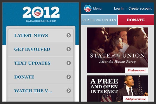
The previous iteration of the Obama site featured an optimized mobile site that looked like an iPhone application. The screenshot below shows the old and new mobile sites side by side.

While simplistic, the previous mobile site presented users with clear choices. You could quickly find what you were looking for. The new site assumes mobile users will take the time to scroll to find the content they are looking for. This is a pretty big leap of faith.
Given the resources that are available, I would have rather seen the Obama campaign build a fantastic site optimized specifically for mobile instead of limiting itself to a responsive design.
Sign up today to have our latest posts delivered straight to your inbox.