Last week stocklogos.com posted a listing of popular logos and revealed the cost of each. As I’m sure was the plan, the post successfully elicited the expected sentiments of disbelief. Or mine…
That 2012 Olympics thing ran someone 625 grand. That seems perhaps excessive. New Zealand Banking Group at 15 mil? Pinch me I guess.
I have to admit the numbers really mean very little to me. Companies spend what they can. No one was hoodwinked here. Part of what designing a logo entails is justifying the cost. Several of these designers are the best in the business at this lost art form. The document that accompanied Pepsi’s latest logo ($1,000,000) was a laborious, bewildering masterpiece. Ten percent of the justification made sense (it’s a smiling face, basically), the remainder can be described as brilliantly rendered hogwash. I would have bought off on it as well. It’s a very smart logo. Another wildly successful logo is Nike’s mark. The company was brand new, so the logo was designed for 35 bucks in 1975. As a side note, my parents bought my first suit in 1975. It also cost $35 (and weighed 35 pounds).
Even though the costs here are relative, mostly (BP, what the hell?), I thought we could go through the designs and score them for success versus price tag.
PEPSI
Cost: $1,000,000
This is a big winner for me. I love the design, appreciate the insanity, yet curiously have Coke in my refrigerator. I’m sort of old though and fear change. And loud noises.
NEW ZEALAND BANKING
Cost: $15,000,000
15 million for a bank? If New Zealand’s banks are as angelic as ours, then I assume there were sufficient funds for this weird, healthcare-looking symbol. I’m not a fan of this effort. Congrats to the designers though on getting what I assume was a giant, novelty-sized cardboard check accompanied by balloons and New Zealand’s version of Ed McMahon.
ACCENTURE
Cost: $100,000,000
I like this logo and would have paid dearly for it. Dearly for me would have been 2 grand though. Landor Associates did the work in 2000, I just now read, and they seem like a pretty substantial group. The price is pretty outrageous though and sometimes the logo looks like a programmer left some html markup in the text.
BBC
Cost: $1,800,000
I’m guilty pretty sure I’ve borrowed this idea on more than one occasion, so it would be unfair to bad mouth this logo. It’s one of the most recognizable logos in the world, but to be honest, it’s just a redesign of the old italics logo. Still, well worth the money.
BP
Cost: $211,000,000
This is a very complex and probably brilliant idea, perfectly rendered. It was purchased by a company that does not have a budget. Still, it just makes you shake your head and want to ride a bike to work. Except me, because I live far from work and am older, as I mentioned in the earlier Pepsi briefing up there.
ENRON
Cost: $33,000
Paul Rand was a graphic design genius and is partly responsible for a lot of what you watched while your parents went out and left you with the “remote control baby-sitter”. Most of his work is absolutely inspired and this Enron logo is in that category. For 33 grand, this was a steal.
GLASGOW 2014 GAMES
Cost: $95,000
Yeah, me neither. I had to look up what these games are. Then I got bored too, but I did see the branding statement and it’s a doozey. Sample:
The next ring of the brand identity, in an orange-gold – ‘Triumph Yellow’ from the CGF palette – that echoes the ore of the medals, represents the number of sports. It’s just over three quarters of the full circle.
Do yourself a favor and read the full screed. It’s adorable.
GOOGLE
Cost: $0
I’m sure there’s an interesting as hell back story here…hold on…no. No there isn’t according to my second monitor. One of the founders threw it together. So, considering Google is profitable, as far as I know, this was a great buy.
COCA COLA
Cost: $0
Another freebie. Frank Mason Robinson, a bookkeeper designed it and named it in the olden days, before branding statements were a thing.
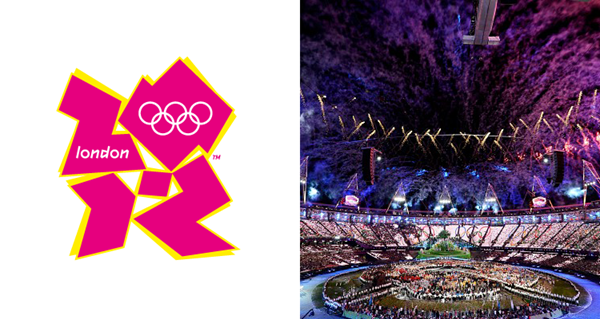
LONDON 2012 OLYMPICS
Cost: $625,000
Bad logo. I don’t take joy in disparaging design work, but this one is a straight-up punch in the face. Ordinarily I would admit that I’ve designed worse at this point in the sentence, but no. That’s not happening today. Nothing about this garish pink fiasco makes sense.
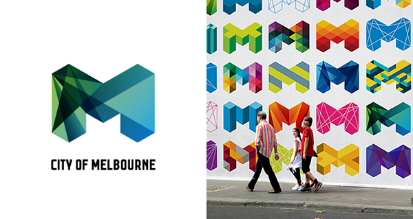
CITY OF MELBOURNE
Cost: $625,000
Landor Associates again, but this one works so well. I love this logo and in this version, the palette in particular. How Melbourne got this price tag through their Town Hall Meeting or whatever they do down there is a wonder though.
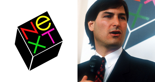
NeXT
Cost: $100,000
There’s an interesting story behind the negotiations for this Paul Rand logo, but let’s instead focus on how it really sucks. You can’t hit every one out of the park, but deep down I believe Paul Rand might have been having some fun getting away with murder in this case. Evidence of his skills here.
NIKE
Cost: $35
Another case of the new company getting their first logo for near nothing and never really needing a redesign. Maybe the most recognizable logo out there, it may will never need an update.
Nike Fun Fact: I owned the very first pair of Nikes and carried them around in the box, putting them on for sports, then re-boxing them. I had few friends.
TWITTER
Cost: $ 15
Artist Simon Oxley is an exceptionally gifted illustrator who drew and uploaded this bird to istockphoto. The Twitter nerds grabbed it up for 15 bucks and it became the logo (for a time). As someone who does this for a living, that’s the kind of heart-warming story that drives me to consider shoe sales.
Sign up today to have our latest posts delivered straight to your inbox.