We assume that by now designers would have learned that excess code, images and transitions don’t have a place in modern web design. A look around the internet proves that assumption to be false in many cases and so I’ve been tasked with writing a blog post to help clarify the issue.
We can run through the usual pros and cons list, but I think most designers and clients realize that while animations are fun and can aid in usability, too much of a good thing becomes a problem as a consequence of complexity and load time, not to mention the mobile experience concerns. There’s also the process of creating and implementing the animation to consider. Outsourcing that particular skill if you don’t have the talent in house can be prohibitive as well.
The question that remains then is when is animation appropriate for a site?
The 2 types of animation we’ll look at are micro (functional) animations that include forms and menus and what I’m calling attention animations (there has to be a better name, but I don’t know it) including single animations, mouse over events and scrolling transitions.
[I don’t have interest in discussing loading animations because this isn’t 2002 and you need to finish reading this post during your lunch hour.]
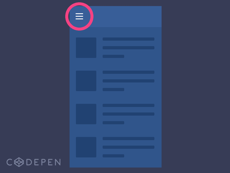
Micro animations are a UX dream come true when done sparingly. They are usually mobile-friendly as well. Micro animations aid the user in providing instant visual feedback. The clearest example of this is the hamburger menu (usually seen on a mobile site). A mouse over or click on the hamburger instantly reveals the purpose of the icon and educates the user on their path forward. The hamburger to X animation cements the process for the user. Trigger, action, reward. It’s perfect.
Another good example is the form submission.
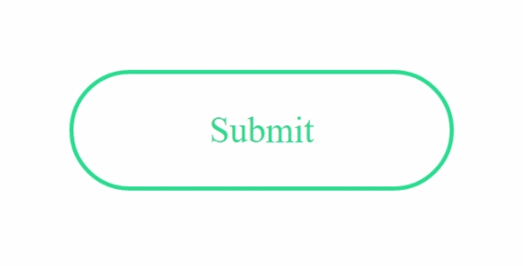
When a form is completed the submit button animates to a check mark. Simple enough but an immediate recognition that the form was submitted successfully.
The Read Along mouse scroll and the Search field below are literal tutorials in a 1 second animations.

The other animation style we’ll look at draws attention to locations on the page. This includes scrolling triggered animations, mouse overs and single animations. Unlike micro animations, the reasons for including attention animations can be varied.
Scrolling animations can be very helpful in creating a more immersive experience but can give way to readability issues if overused (which they often are).
The example below is a pretty measured approach. Each section eases into place with a user’s recognition speed in mind. The actions are consistent in their motion speed, so even the animation is part of the branding. Nothing fancy, but it works and adds to the user experience.


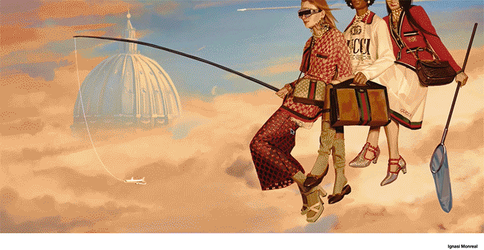
Below is a different scrolling animation. It’s Gucci, so it needs to be weird, however it wouldn’t work for most sites. The load time is tough for plenty of users and the experience is mysterious.
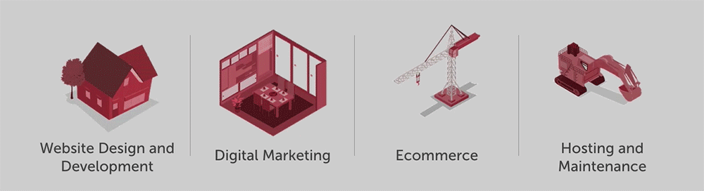
For singular animations we’ll look at our own Brick Factory site.

The factory being built in fast motion could be just a quick flash of animation to keep things lively on page entry, but it’s a little more than that. It hopefully tells a story in those three seconds. First that we actually build things… we do the work. It isn’t farmed out or templated. Second, that we build these things with the client. Lastly, it’s a pretty intricate set of actions that we include here and it almost forces users to watch it a few times. It leads directly to the description of what we do. So, in three seconds we present a statement, back it up, then lead you to our four main service options that we highlight with even quicker animations on mouse over. Even if that’s all we get from a visitor, we’ve given you the basics.
Animation on websites needs a purpose. That’s the takeaway. The user’s best experience is our goal and if your effort strays from that idea, you’re probably doing it wrong. In the examples above the animation’s purpose is pretty clear. They’re either helping move you through an interaction or telling a story within the context of the page. I still don’t know precisely what Gucci is doing, but I’m not really the audience there and I don’t think it’s incorrect, just mysterious. It certainly is telling a story.
Where animations go wrong is in cases of overuse, distraction and a lack of purpose. If a grandiose opening animation begins the visitor’s experience on a site, most of us won’t stick around long enough to see it or wait around to visit the site itself. If that same desktop animation is forced into a mobile experience, the results are haphazard at best. If an animated popup asks the user to consider an additional task (email sign up, questionnaire, poll, etc.) the distraction has to be worth losing the user’s attention in that moment.
Working animations into the initial design of the website rather than adding them as a layer to enhance the experience is the way to avoid unnatural and unintended distractions.
*We means the industry, not me. I did the reading. I’m good.
Sign up today to have our latest posts delivered straight to your inbox.