With the amount of media the average user interacts with on a daily basis, it is understandable why it’s so difficult to capture an audience. In today’s world, having a website is simply not enough. You must have an exemplary product or service, thought provoking content and ideas to lure in a visitor, and visually stimulating images and videos to get them to stay long enough to sign up. However, the experience doesn’t stop at the “contact us” page; it actually can turn the entire experience from a memorable one for all the right reasons, and turn it into a deal breaker. Reducing difficulty for the user is a must, and truthfully not as difficult as it seems. The examples that follow show how a great contact form can make this small yet important part of the client relationship convert as smoothly as possible, and in some senses make it fun!
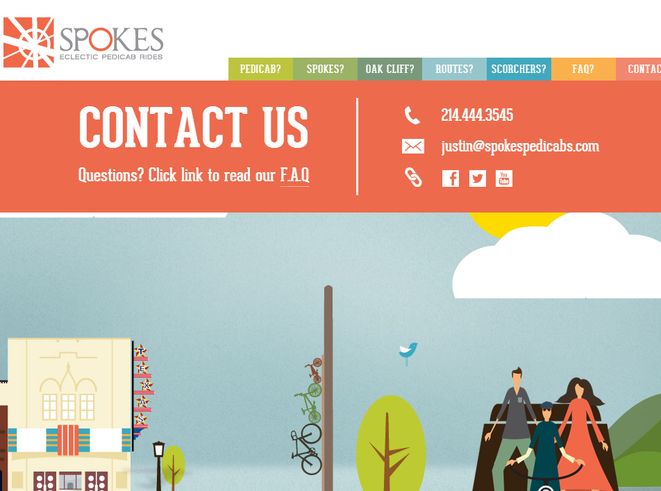
Spokes specializes in transportation via pedicabs specifically in Oak Cliff, Dallas, Texas. As their community grows, the need for more useful and reliable transportation has increased as well, and they make transportation fun. Their site is a single long page with links to jump around, or to simply scroll through. As the user progresses through the site, Spokes uses animated visuals with cleverly thought through dialogue, as well internal links to more information for the user’s convenience. The user can even view this simple contact form while scrolling through the site, fully aware of the personality and vision of this company.
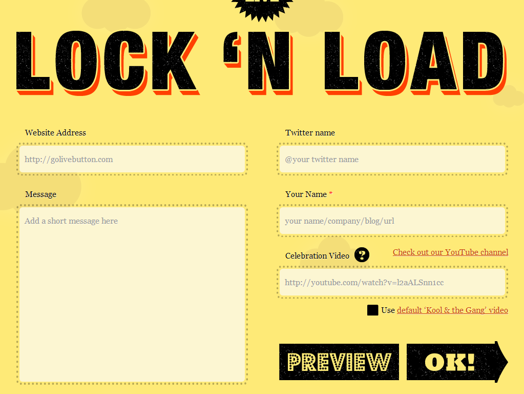
Golivebutton.com provides a unique product for individuals that are trying to increase the amount of traffic they are getting on their webpage. Users receive a “Go Live” button that they share on their social network. From here they can tell their followers and new users about their work and hopefully gain new users. Their contact form is a playful and interactive form that actually provides the user with the product after giving their contact information. Each field clearly suggests what needs to be put in each field and from the homepage the user can easily see where to contact the site from. Small things such as arrows and images go a long way in helping users find the contact form, but ultimately, assisting them get through the form as quickly and easily as possible is the most important aspect of the contact page.
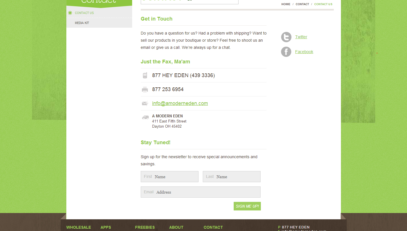
Looking to reach that inner kid inside, or to simply quiet down your own little one? Then you should probably give this company a call. Amoderneden.com has been developing design minded goods and toddler apps for the little one in all of us, and would love to help out with the new edition to the family. One look at their contact page goes to show that they understand how busy parents can be let alone a fellow designer of applications. From their fax number to their mailing list, the user can very easily contact them for inquiries concerning products, carrying their items in-house, or shipping problems care free.
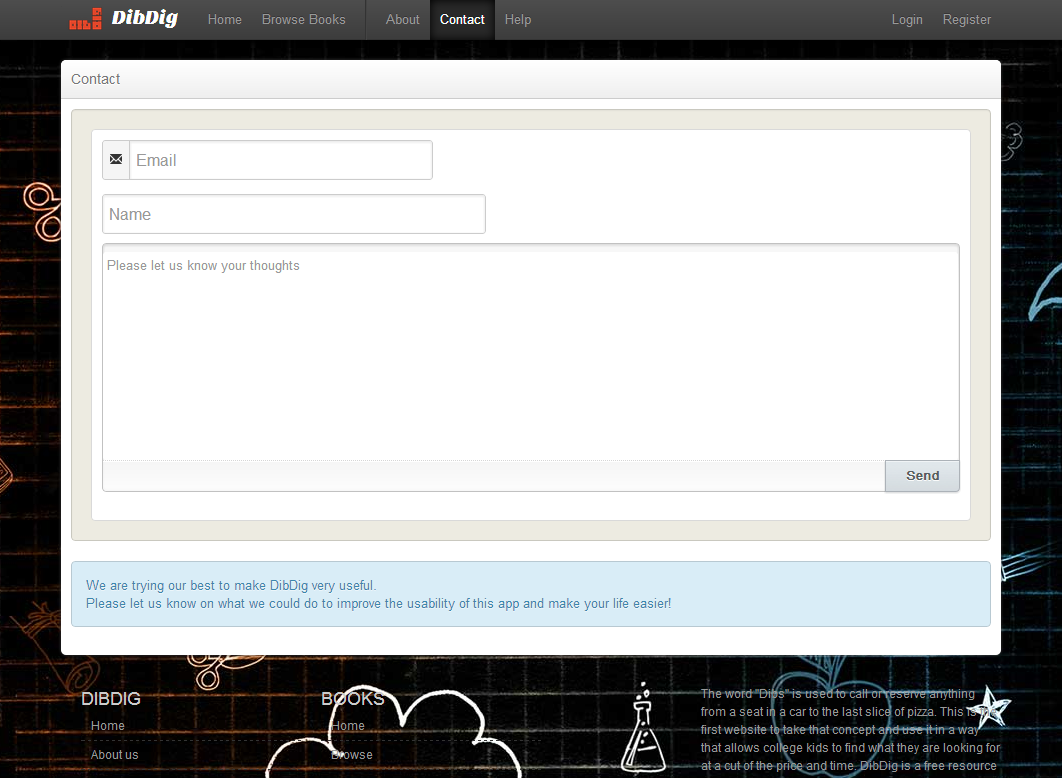
Need a text book, cab, off campus housing, or late night pizza? Dibdig.com offers an application that allows you to do all of these things with relative ease. Their site utilizes the twitter’s bootstrap design language for easy mobile usage and convenient online navigation. Designing for mobile first is important for a number of reasons. First, large load times for mobile users can be an immediate turn off. If users aren’t able to get what they want accomplished immediately then they may not even return to try out your mobile site again let alone contact your site for your product or service at home. If the form is extensive then mobile users that have slow connections will be even more impatient, and most importantly, if they are already on their phone and you are providing a phone number then they can contact you immediately. With all this being said, your “Submit” button should check for errors upon submission, or in real time, to prevent any future problems for mobile users. Dibdig.com’s contact us page is short, to the point, and perfect for mobile usage for anyone; especially college students planning the rest of their day after the class they are sitting in is over.
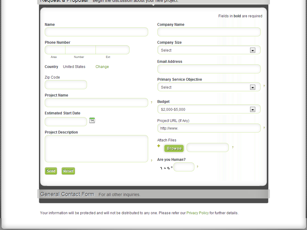
Plaveb is an online business consulting agency that focuses upon manufacturing elegant web solutions for their end users. Since the business relationship and emphasis on growing client interaction are major factors for Plaveb it only makes sense that they have an impressively functional contact page. One aspect of the Plaveb contact page that sets them apart from competitors is their use of the drop down box. Now, according to HubSpot’s research only a single drop down is truly effective on any contact page, but in the case of Plaveb it seems to be a functionality that their users would appreciate. Users can begin the conversation of partnership right off the bat and everyone knows where everyone else stands. The selections in the boxes are well thought out, and directly relate to important information for the relationship. Overall, the use of this technique is very well represented, and other providing a similar service may want to follow suit.
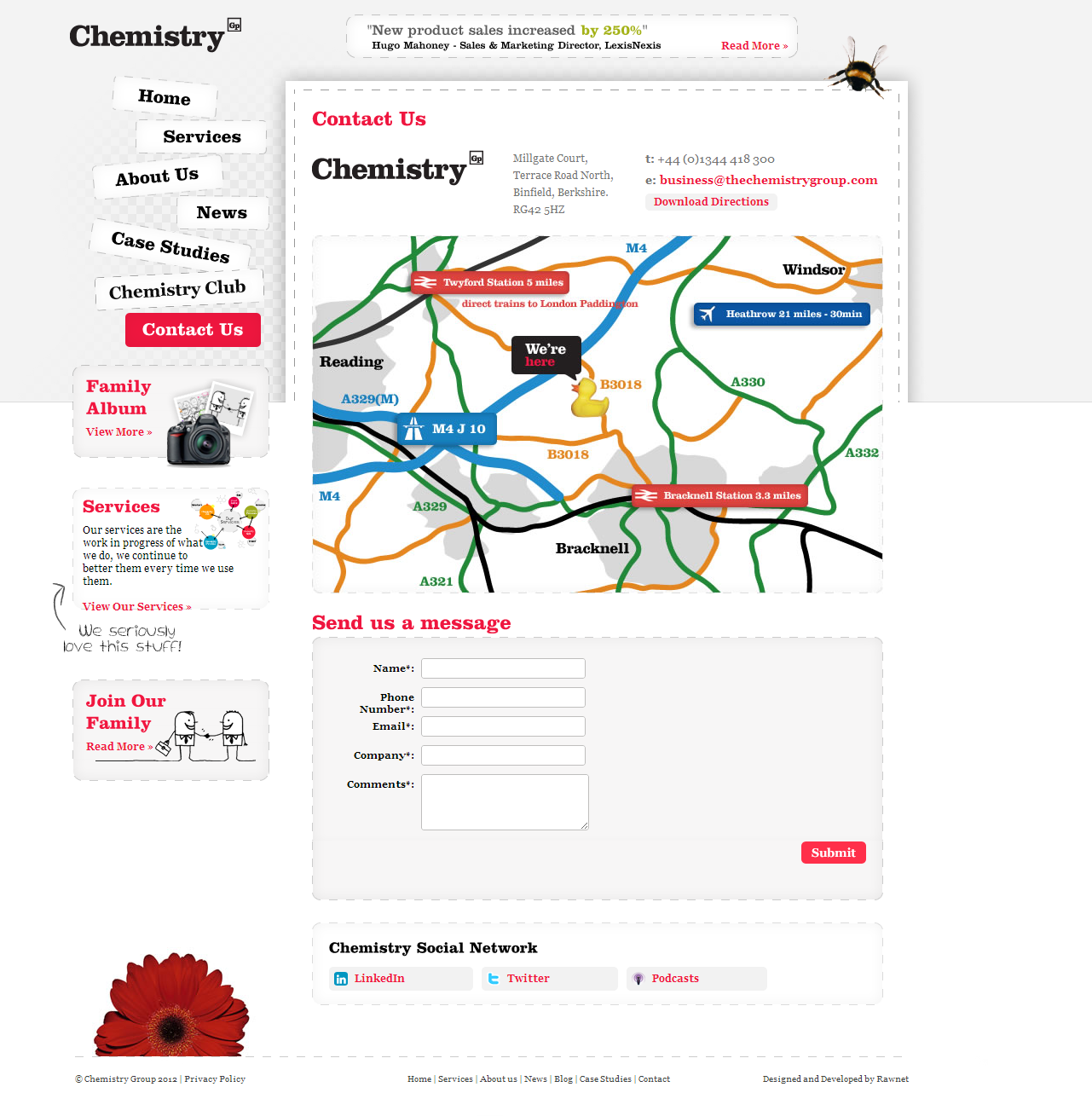
The Chemistry Group is a client specific organization that is known for increasing hiring accuracy, reducing attrition, and overall developing product sales and turnaround times through case studies and well thought through organizational change practices. Their website is informative as it is playful, and definitely leads you to learn more about them as a group. When you arrive at their Contact page though, the importance lies within the single text area provided. More than one text area for the user is overkill, and for anyone visiting this site or any for that matter that want to simply ask questions and potentially utilize their service only really needs that one space. The idea behind sophisticated areas is nice and all, but at the end of the day having the user convert and share their information is the only real goal. Multiple text areas are time consuming, and not necessary especially if they are a required field for security purposes. The busy user wants to ask their question, share their limited information, and hopefully receive a response as quickly as possible and on both ends of the spectrum a single text area allows you to oblige what will hopefully develop into a mutual relationship.
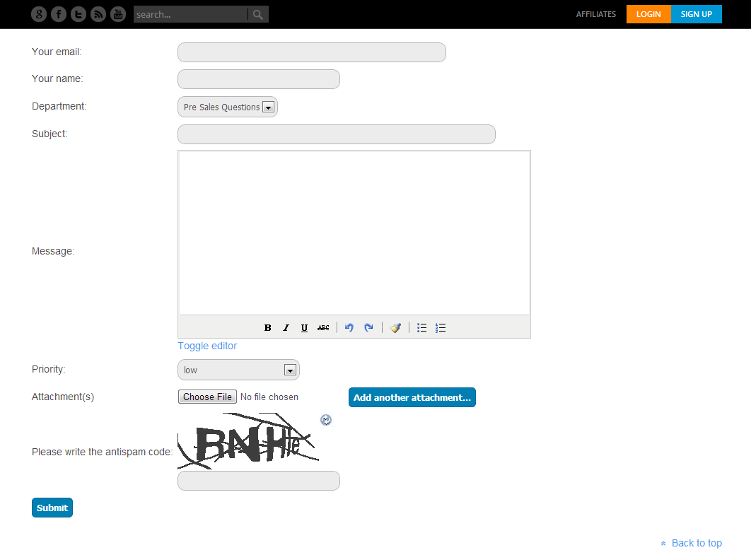
Joomla-Monster is an online store for the bootstrap grid system, templates, and more for the technology savvy consumer. Users can download a number of products to help improve their online presence and increase their knowledge of what makes a company successful on the online platform. Just as Joomla-Monster knows, in addition to all of the bells and whistles that are desirable with a company website, in today’s digital world, security is an increasing concern. Similar to the items that they offer on their site for consumers to purchase to improve security of their systems, Joomla-Monster does a good job of protecting their inquirers of products on their site from spam and lost information through their contact page. Today, individuals are able to intercept e-mail addresses with ease, people can blow up e-mail addresses with spam through contact pages, and overall make the entire collection process of potential new clients and inquires very difficult through contact pages. The anti-spam verification, required e-mail, name, subject, message, and regarding fields ensure that no loose information is forgotten or slipped through to the next page. If you do not fill out any particular field, you are bounced back. As technology continues to become more complex and powerful it is important for anyone asking for user contact information to take all precautions to protect their clients. Not only will it make your clients feel a bit safer when asking questions, but make you look more responsible.
Sign up today to have our latest posts delivered straight to your inbox.