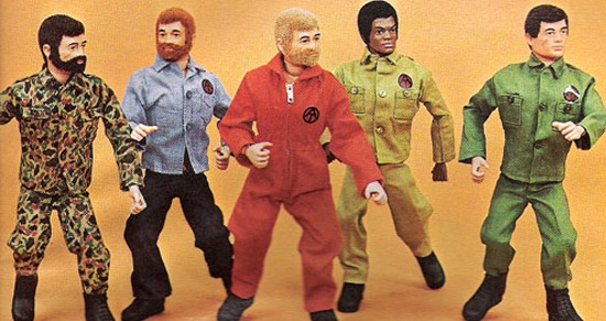
Many, many years ago Christmas morning was a chaotic riot of laughter, terrific screams, minor injuries and general twitchiness. As amazing a sight and experience as the pile of toys was, there was the overriding stoic presence of my father checking his watch, waiting to put the hammer down and march us all off to church. The experience was as unnerving as it was exciting but with some planning (midnight Mass?) could have been so much better for me. It wouldn’t occur to me for years that my parents worked it this way to get a breather from my high-pitched squeals of panicky joy.

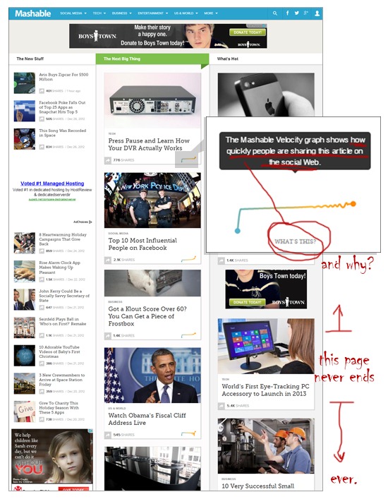
Mashable’s recent redesign presents all the content they offer in a way that gives me that same uneasy feeling. For me, there’s just too much thrown at the user. There is no top story, only The New Stuff, The Next Big Thing and What’s Hot all given equal importance on the page. Putting aside that fact that all three category headings are promoting the same thing basically, my eye bounces right off the page. Users will get used to this and I will as well, but I question a design that forces you to refocus every time you hit this main page. It’s a small, quickly resolved snag but it’s one that diminishes the otherwise pleasing user experience.
The infinite scroll and myriad social networking opportunities throughout are meant to be fun. I know fun. This isn’t fun. Besides those social media options attached to every article, the new Mashable Velocity graph is a clever widget that (once I learned its purpose) I skipped over with a vengeance. It measures the speed of sharing. I can’t believe I typed that. The sub levels are where this redesign works better for me. Big photography, logical layout and plenty of white space makes for an easy quick read. I don’t think many users will take advantage of the infinite scroll that is unfortunately included on the subs, however.
Homepage screenshot

The contact and other admin pages haven’t really been designed at all, but I’m sure they will be at some stage to match the new look. I don’t feel this redesign was rushed at all, and third tier pages get pushed to the bottom of the list frequently on bigger launches.
As far as basic usability goes, the site does a yeoman’s job for me. The navigation is where I need it and the design of the elements is very clean and easy to find. So the fonts are fine, the palette is good and the code is clean, but that infinite scroll and the lack of a visual bulls-eye is going to bug me. I’m wondering for how long the bottomless pit of content will be a web trend.
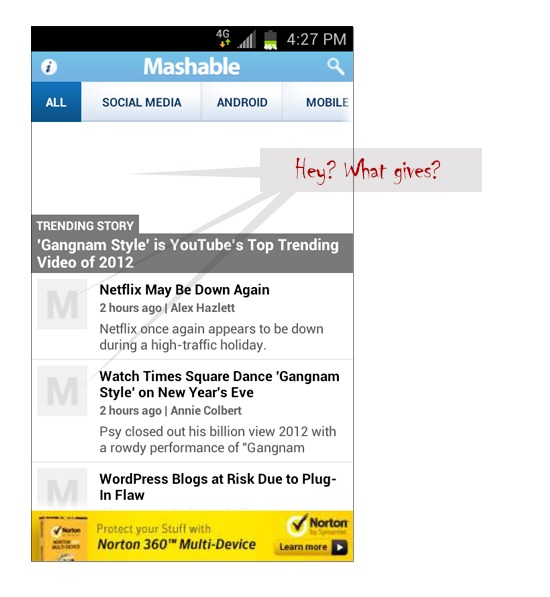
Mashable’s mobile app for the Android hasn’t been redesigned/updated yet and is surprisingly clumsy considering how much care had gone into the web design.

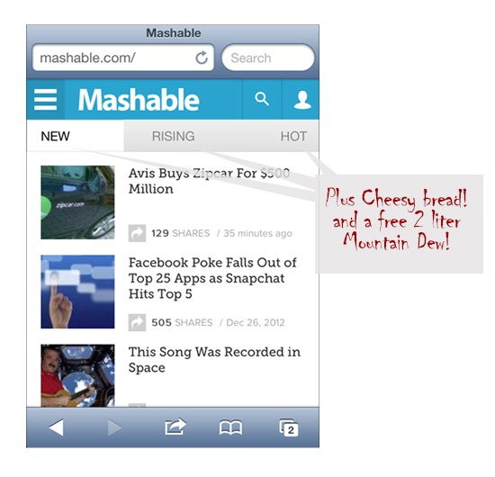
The new Mashable site is fully responsive, creating unique experiences for tablet and smartphone users accessing via the web. The mobile web version of the redesign is tight and pretty easy to get through. The abbreviated navigation is a bit cryptic, and reads like a Pizza Hut promo (NEW, RISING, HOT) for me, but it’s fine and I’m likely being picky here. Also, thanks to coding limitations, I suspect, the infinite scroll is absent.

Overall grade is a B for me. I’m a Mashable fan and will continue to be as I fight the urge to sound like an old bag shaking my fist at design choices that rub me the wrong way. I don’t want to turn into this guy…

Sign up today to have our latest posts delivered straight to your inbox.