It is said that a picture is worth a thousand words, but what is said when the design itself lies within the formatting of the word? Each letter, each stroke has a meaning, has a purpose and makes a statement all its own. So how many words, ideas and expressions are portrayed in a perfectly curated and properly polished typography based website? Two-thousand? Three? Fifty? It is my perspective that this expression of sophisticated design cannot be quantified, rather simply appreciated for what it is.
So much lies in a word. A single word can stir emotions, spark excitement, cause a raucous, and make you stop and ponder, all within the meaning, purpose and in the web world, the design of the word itself. Below is a list of some of my favorite typography based websites. I chose these for the use of tailored fonts specific to their brand, the use of specific color to highlight their chosen text, and the seamless integration of just the right number of fonts used.
Clean. Sophisticated. Modern.
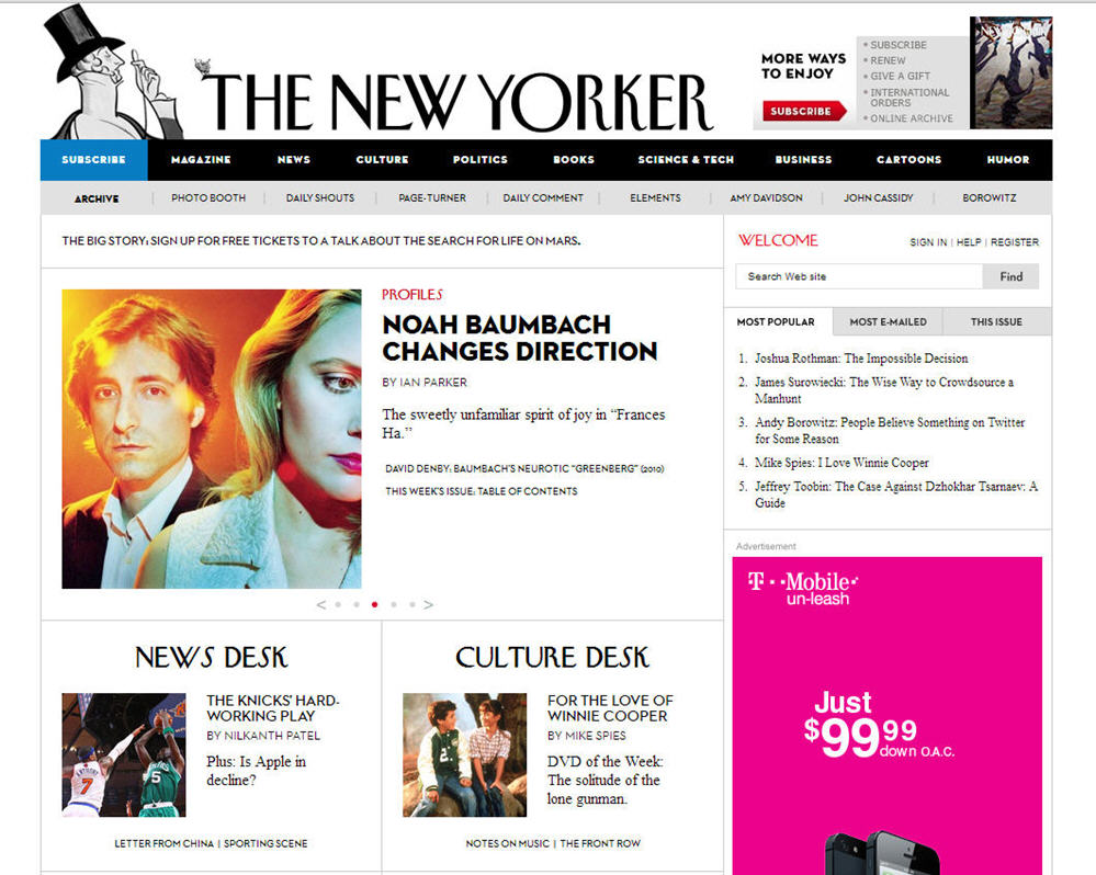
The publishing world understood the importance of perfect typography even before the web world caught on, and The New Yorker shows us just how it is done. I would go ahead and bet you can picture what The New Yorker type looks like. Their logo offers a perfect blend of whimsy, polish and just a hint of pretentiousness, and this trickles down throughout the entirety of the site.
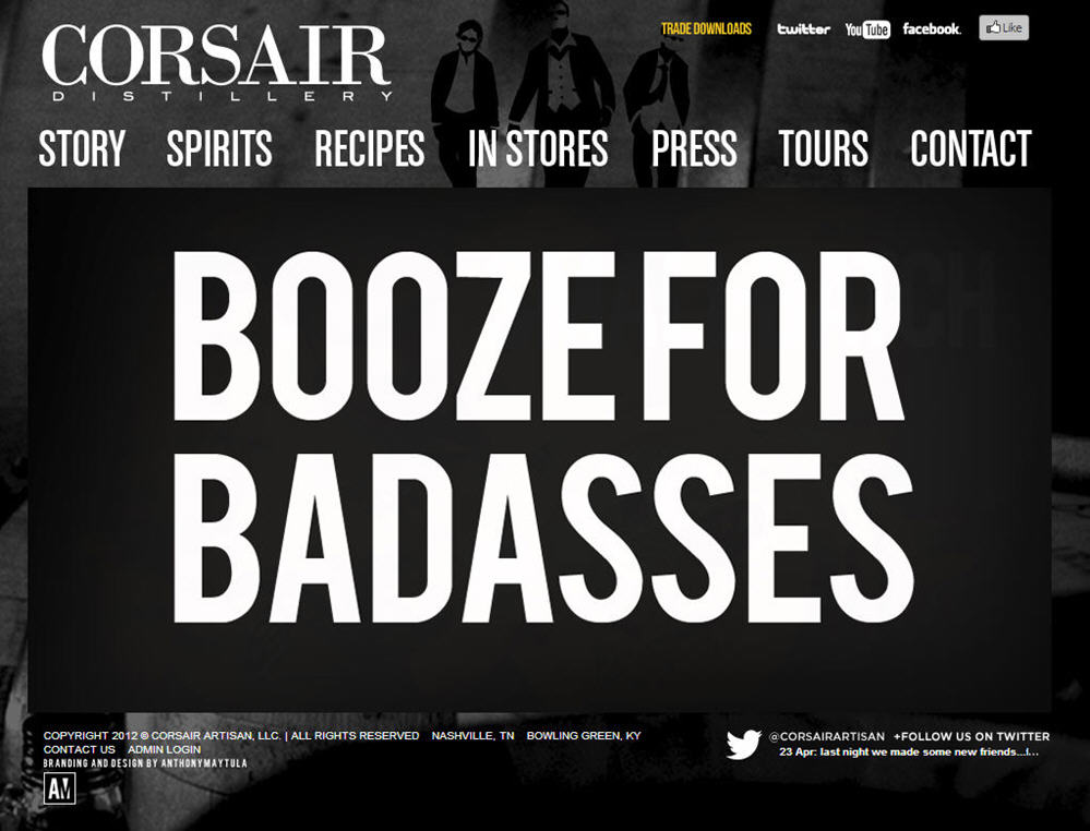
This one may be just a bit of a biased choice on my part, being that I am from Nashville and actually used to work in this same building, but that is beside the point. Not only is this some wonderful whiskey, but the way they explain the boldness of their spirits just in the font and placement of text on their site show some skills in the typography department. The perfect blend of simply black and white with well chosen pops of color leaves us wanting to know more about their product, and by this I do mean a taste test is desired.
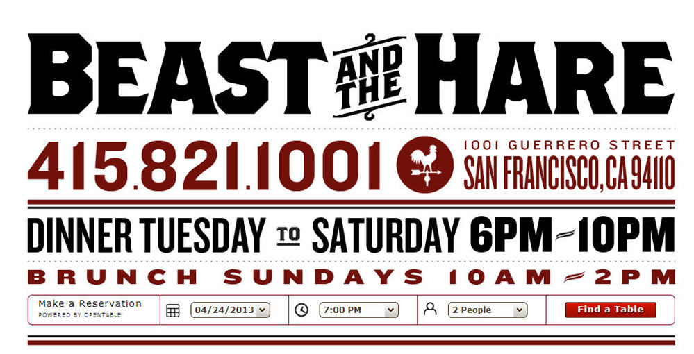
Let’s be honest, when you are hungry and looking for a great restaurant, you want to get straight to the good part – the menu. What do they serve, what cocktails do they have, and are they still open? Beast and the Hare spelled it all out on this one page layout of their perfectly descript site. Clever and cool, this site is easy on the eyes and it lends itself to believe the food would also be easy on the lips.
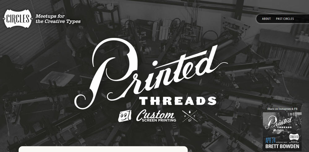
The point of this site is to spark creativity within a group, or circle. Easy. Get people together, get a speaker and get creative. When it comes to their site, they kept it simple. In its simplicity it is actually quite genius. This site provides the information needed in a way that almost resembles a meeting invite you would add to your Google calendar. Nothing too fancy, yet cleverly displayed. While this is personal taste, I actually really like the oversized font throughout the homepage. I don’t feel that they are screaming at me, I feel that I my participation is quite zealously wanted.
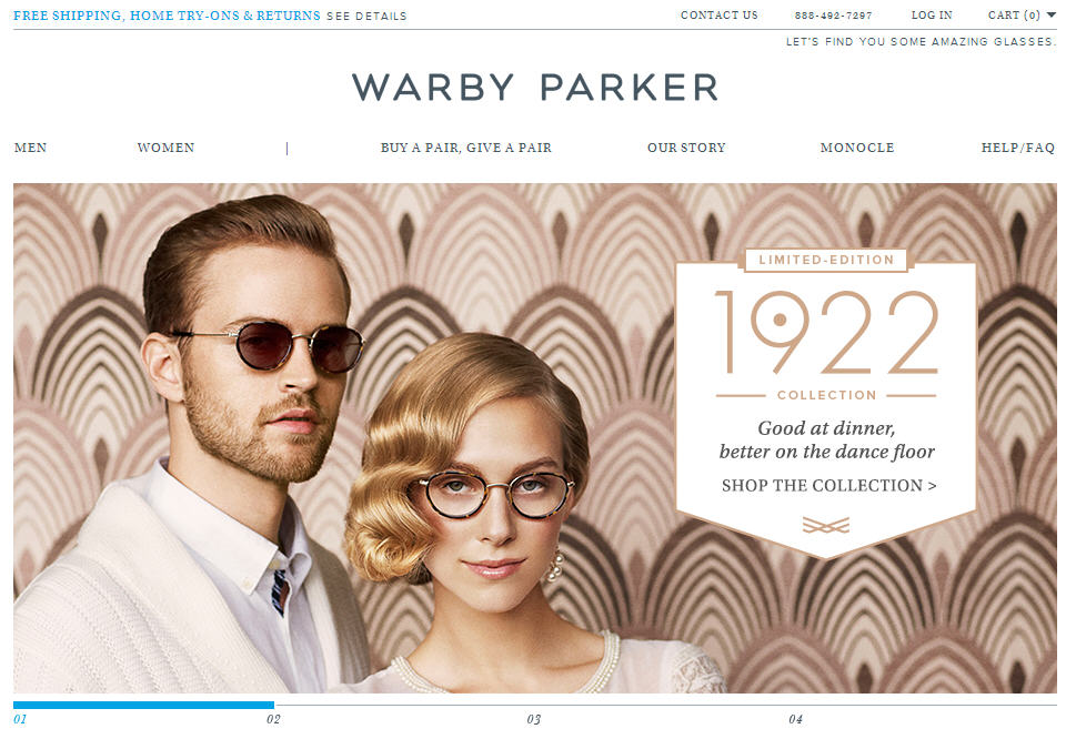
While I am not 100% positive that I reside on the cool team able to wear these frames, I would like to think that I am. I appreciate the model and the site they have built. The pops of color mixed with the smooth type they have chosen showcases an essence of calmness and tranquility. This sense of ease makes my purchasing of a third, or fourth pair of glasses less stressful and more rational – right?
Sign up today to have our latest posts delivered straight to your inbox.