The last few years has seen a dramatic rise in people using tablets and smart phones to browse the Internet. This explosion has made building websites more complicated, as web developers now have to make their sites look good on on tiny phone screens, Al Gore-style widescreen monitors, and everything in between.
A few years ago the most common method for dealing with mobile was to create a specific design theme for users accessing your site from mobile phones. You essentially created a different user experience for mobile users vs. desktop/laptop users. For a variety of reasons – emergence of tablets, increasing diversity in phone screen sizes, growth of super widescreen monitors, etc. – that strategy no longer really works. There are simply too many screen sizes to account for. As a result, the last few years has seen the adoption of responsive design, which causes a site’s design to adjust automatically based on the size of the screen of the visitor.
Earlier this week, we took a look at the websites of the nations 150 best colleges in an effort to identify the schools with the best websites. Optimizing for mobile seems particularly important for colleges given that two of their primary audiences are prospective and current students. So while doing our research on the best sites we decided to take a look at how colleges were dealing with the rise of the mobile web.
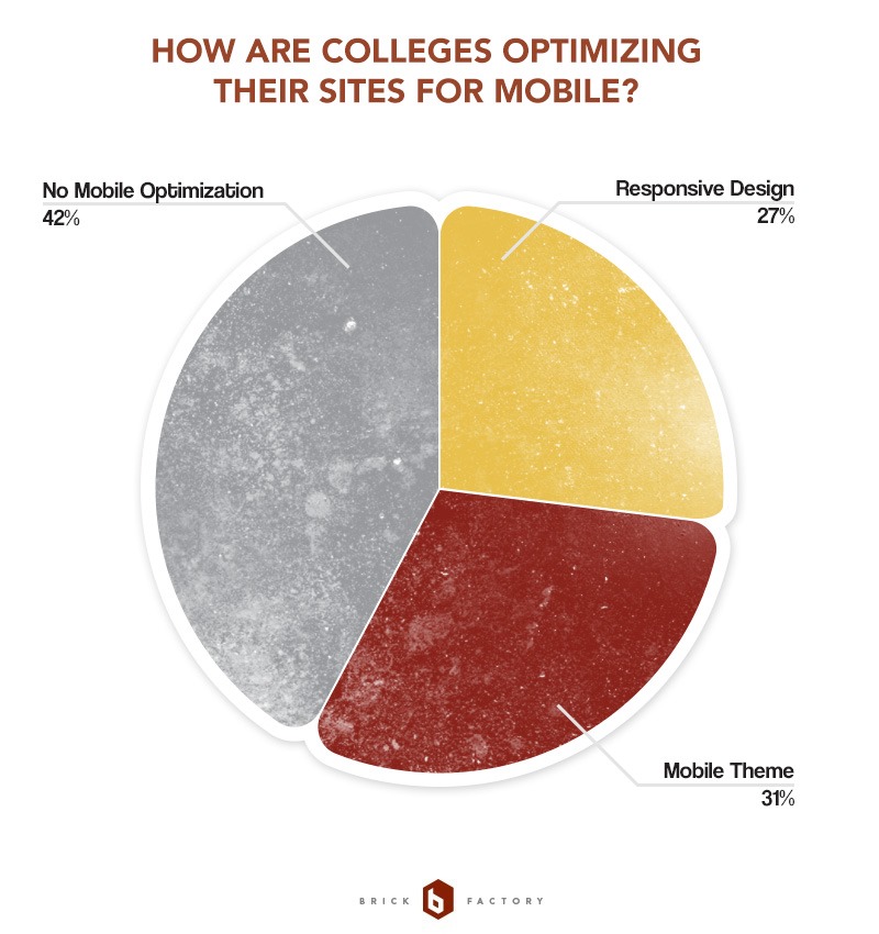
Were colleges ignoring mobile? Were they implementing responsive designs? Were they building themes specifically for mobile? Here is what we found:

I found these results fascinating. The fact that 27% of colleges are utilizing responsive design is impressive when you consider this has really only become a common practice the last 2-3 years. I was also surprised that 42% of the sites we looked at were not optimized for mobile at all. That figured seems really high to me given that the rise of the mobile web isn’t exactly a new trend. Having said that, redesigning a college website can take years. I suspect that as colleges enter redesign cycles over the next few years we’ll see a rise in the number of sites that utilize responsive design grow.
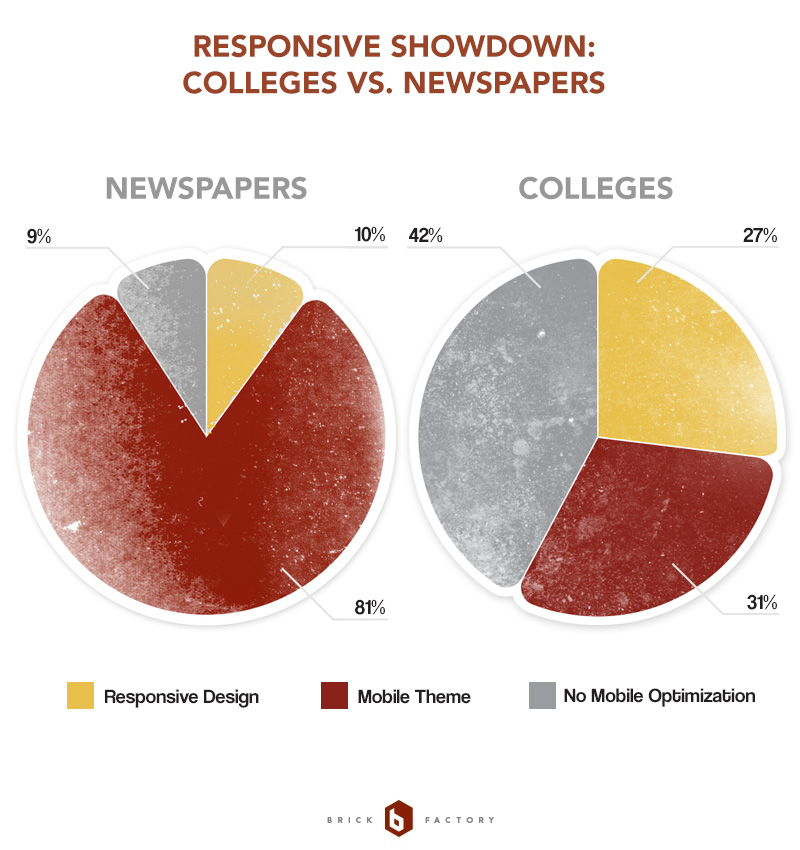
We took a similar look at the mobile strategies of the 100 largest newspapers in the U.S. a few months ago. Since we could, we decided to compare the results for colleges and newspapers.

A few quick observations on this:
I suspect the coming year will see the number of both newspaper and college sites utilizing responsive design to increase dramatically.
Sign up today to have our latest posts delivered straight to your inbox.