I was born and raised in San Antonio, TX so for years I’ve visited the website of the city’s largest newspapers, the Express-News, every few days.
This hasn’t been a particularly pleasant experience, as the Express-News has long pursued an ill-advised portal strategy and made its content available through the hideous www.mysanantonio.com. As someone who builds websites for a living I would sort of hold my nose as I read stories about my high school and my San Antonio Spurs on My San Antonio.
A few months ago the San Antonio Express-News got a much needed divorce from www.mysanantonio.com and launched its own website. And, pay wall aside, it is kind of awesome. Easy to use. Lightening fast. Attractive. Fully responsive so it works well on phones and tablets. Design-wise I would put the new Express-News site up there with any newspaper site out there.
The use of responsive design in particular impressed me. While responsive design has been around for a long time, it has only really become common place in the last few years with the explosion of mobile. Planning and implementing responsive designs is difficult and time consuming, so you have to tip your hat that a site the scale of San Antonio Express-News was able to pull it off so well.
The Express-News site got me thinking about how newspapers are adapting to the new mobile world. Traditionally newspapers have optimized their sites for phones by creating design themes that are specific to mobile visitors. So instead of having the site respond based on screen resolution newspapers have designed a completely different version of their sites for mobile visitors. The use of responsive design on the Express-News site got me wondering whether this was the exception or the rule. Are newspapers abandoning mobile themes and moving towards responsive designs?
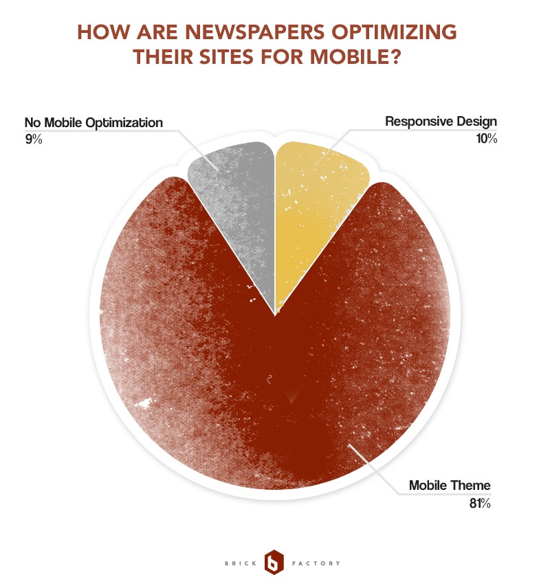
After analyzing the sites of the top 100 newspapers in the United States the answer is that it is probably too soon to tell. This graph summarizes my findings:

Frankly, I’m not sure these findings tell us much. I’m not sure totally sure whether the 10% figure represents an embrace or rejection of responsive design.
While I don’t have concrete data my guess is that the 10% figure represents a significant increase over what I would have seen a year or two ago. And as more time passes I would expect the number of newspapers that go with a responsive design strategy to increase dramatically. I suspect the current, relatively low percentage is a reflection of the relative newness of the trend and the massive amount of time it takes to implement a responsive design on a site the scale of a newspaper, rather than a rejection of the strategy.
Interestingly, none of the sixteen largest papers in the country have implemented responsive designs. The largest newspaper to have a responsive design is the Tampa Bay Times.
You can view a Google Doc of my research here. I’ll update my research again in the future to see how things are evolving.
Note: The Express-News is a Hearst newspaper. I later found out the design of the new site is a template that is also used by the San Francisco Chronicle.
Sign up today to have our latest posts delivered straight to your inbox.