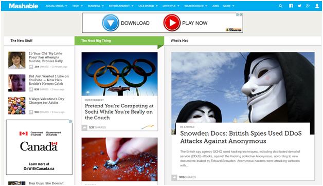
When the Mashable site was redesigned into the now familiar grid layout, I wrote a blog post bellyaching about the infinite scroll, various usability issues and somehow Jakob Nielsen. I’m still not a big fan of the grid approach to website design because it’s not design, it’s the process of dumping content into boxes that descend like fish food over time to the bottom of the page and I find that solution lacking creativity. Mashable does the grid better than most because they follow basic principles of usability and the content is presented with as much care as possible given the constraints of the layout. There is actual white space between content blocks and the text is always readable in its low contrast, smart presentation. It may not be a web designer’s favorite arrangement but it works serviceably and I never rolled back my enthusiasm for the site content when they made this switch.
NBCNEWS.com has made incremental design improvements over the last few years but hasn’t committed to a redesign for as long as I can remember. A full redesign is in place now and it’s a hefty one.
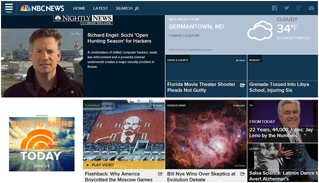
The grid is in place and the usability is out the window. As much as none of us liked that last sentence, we are appreciating this new homepage even less. The good news is the infinite scroll that some users (Me. I’m talking about me.) disliked is not part of this redesign. Also not part of this redesign unfortunately is any white space between stories, ads or my gigantic personalized weather. The only break my eye gets is where the TODAY show promo is involved (tagline: Rise To Shine. Someone wrote that). The content and in particular the photography on the site is more often than not compelling but lost in a sea of cropped boxes, garish contrasts and text overlays. The site feels as though it belongs on a bigger canvas. With some room to spread out the content would get the presentation it deserved.

Where Mashable pays close attention to readability, contrast, fonts, eye-strain and the basics of the user experience NBCNEWS came up with this slap in the puss…

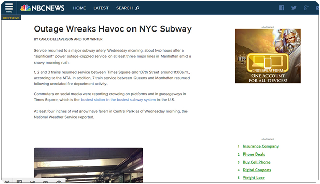
When a user clicks through to the article, things ease up of course, but in a lumbering, unfinished manner. The sub level pages look like a beta launch to me. The text is laid out in a lifeless manner. The call-outs are unpolished. The sidebar ads are sized/placed clumsily.

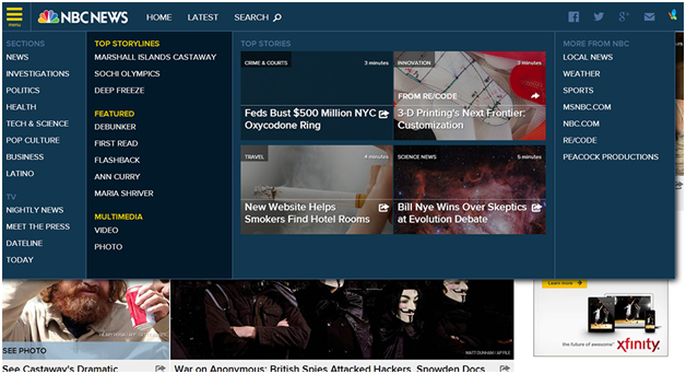
Navigation on NBCNEWS.com is plentiful. A click on the menu icon opens a nearly full screen of options which is weird but understandable given what they’re trying to accomplish here. The fact that the options look almost identical is a problem for me. Sections, Top Storylines, Featured News, local options are all treated the same and could use some variation.

I’m a firm believer in the iterative design process and I have no doubt that the team behind this redesign will be making adjustments as they go to improve usability. However, like I apparently did at our Christmas party last year, the grid layout is likely going to overstay its welcome if it hasn’t already and for web designers that’s not great news.
Sign up today to have our latest posts delivered straight to your inbox.