When it comes to noteworthy design and innovative functionality, consumer brands usually get the most recognition. Luckily, The Webby Awards, the leading international award honoring excellence on the Internet, categorizes its web submissions so that nonprofit organizations aren’t competing directly with the Volkswagens and Samsungs of the world.
In choosing winners, the Webby committee judges websites on the following merits: content, structure & navigation, visual design, functionality, interactivity, and overall experience. In 2015, the Webbys honored superior web achievements in over 60 categories.
Here, we examine winners in four categories that go beyond the consumer brand: Education, Nonprofits, Associations, and Activism.
2015 Education Winner
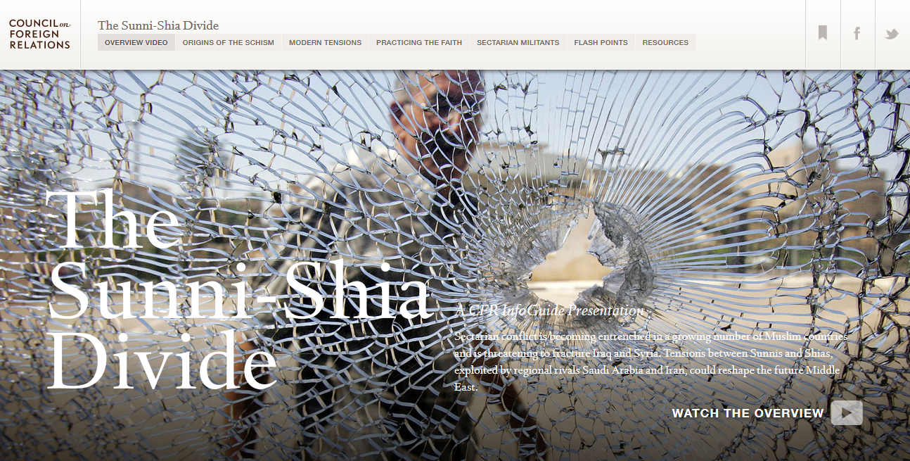
When designing this Infoguide about the Sunni-Shia Divide in the Middle East, the Council on Foreign Relations was faced with a challenge: somber, academic subject matter and a ton of it.
They deployed multiple tactics to divide and present the content, most of which were very successful. The result is a digestible and navigable reading experience.
What We Love:
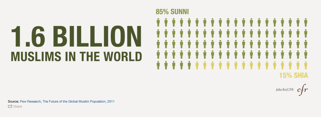
- Use of infographics to highlight important information and break up content sections.
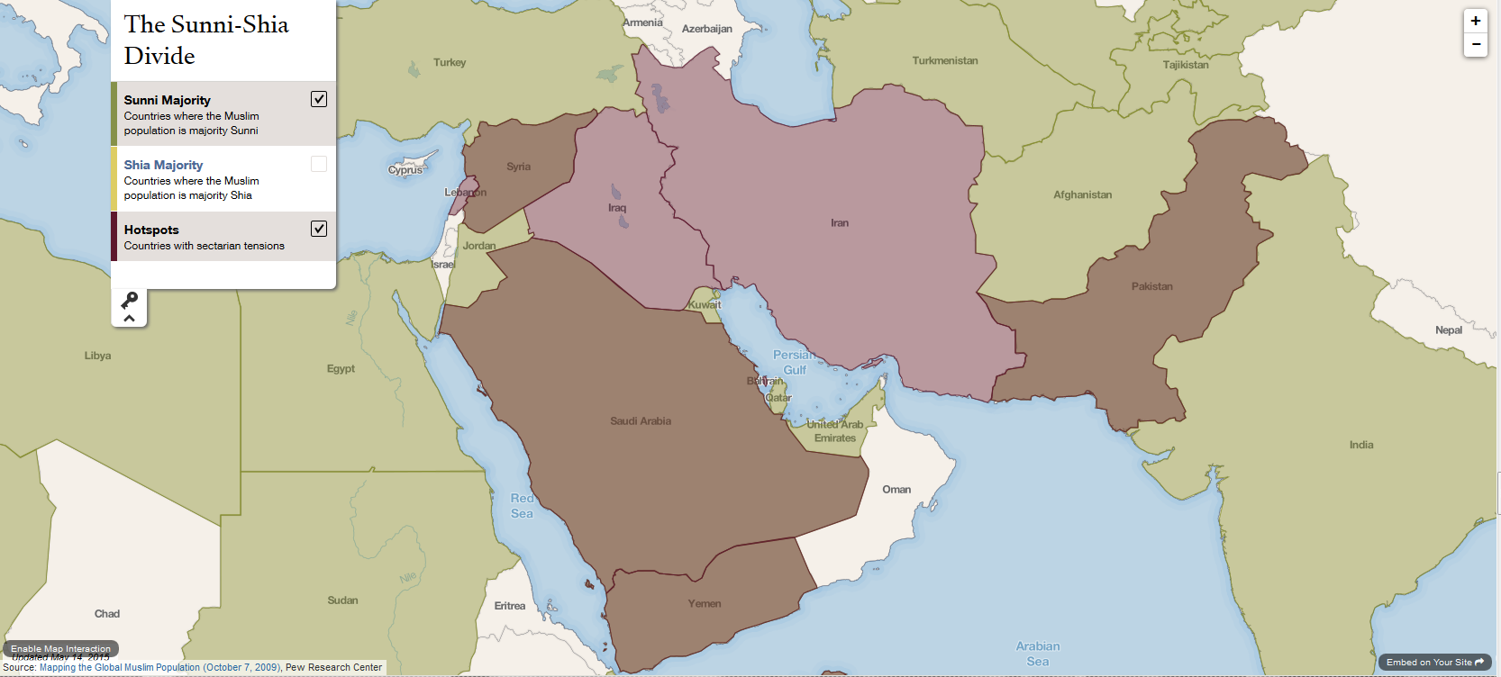
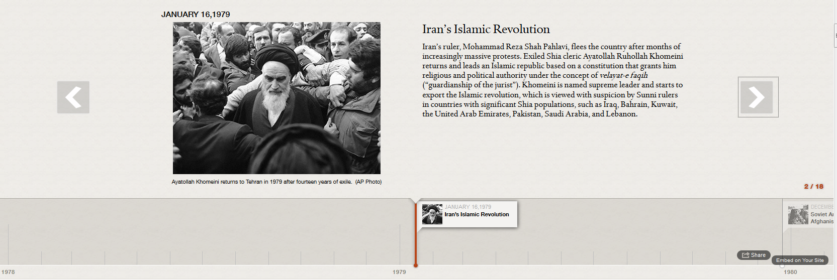
- Interactive Visuals. Upon closer inspection, graphical section breaks include an interactive timeline and map in which the user can customize their exploration of the content.
What We Might Have Done Differently:
- Fixed top navigation. We found the fixed menu a bit distracting for such a long-form piece, but acknowledge the importance of keeping the dense content navigable. We might suggest a ‘hide on scroll down, show on scroll up’ approach, or making the navigation accessible through a button like on many mobile sites.
Also Noteworthy:
- The site is built using Angular JS and utilizes tools like Timeline JS for the interactive elements.
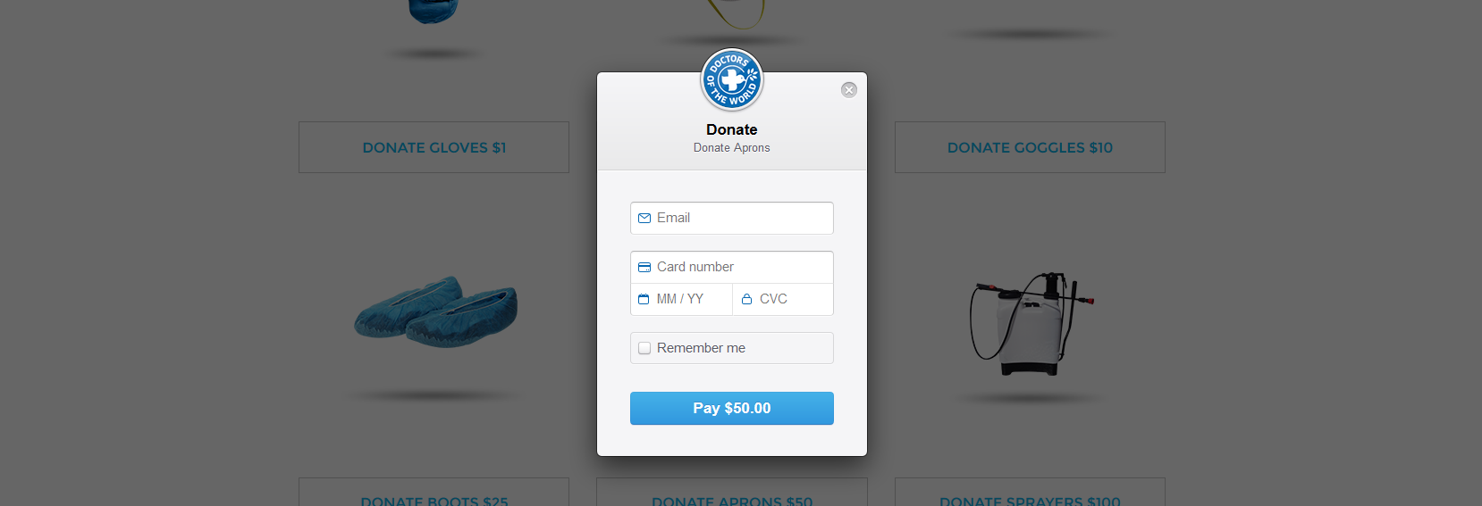
2015 Nonprofits Winner
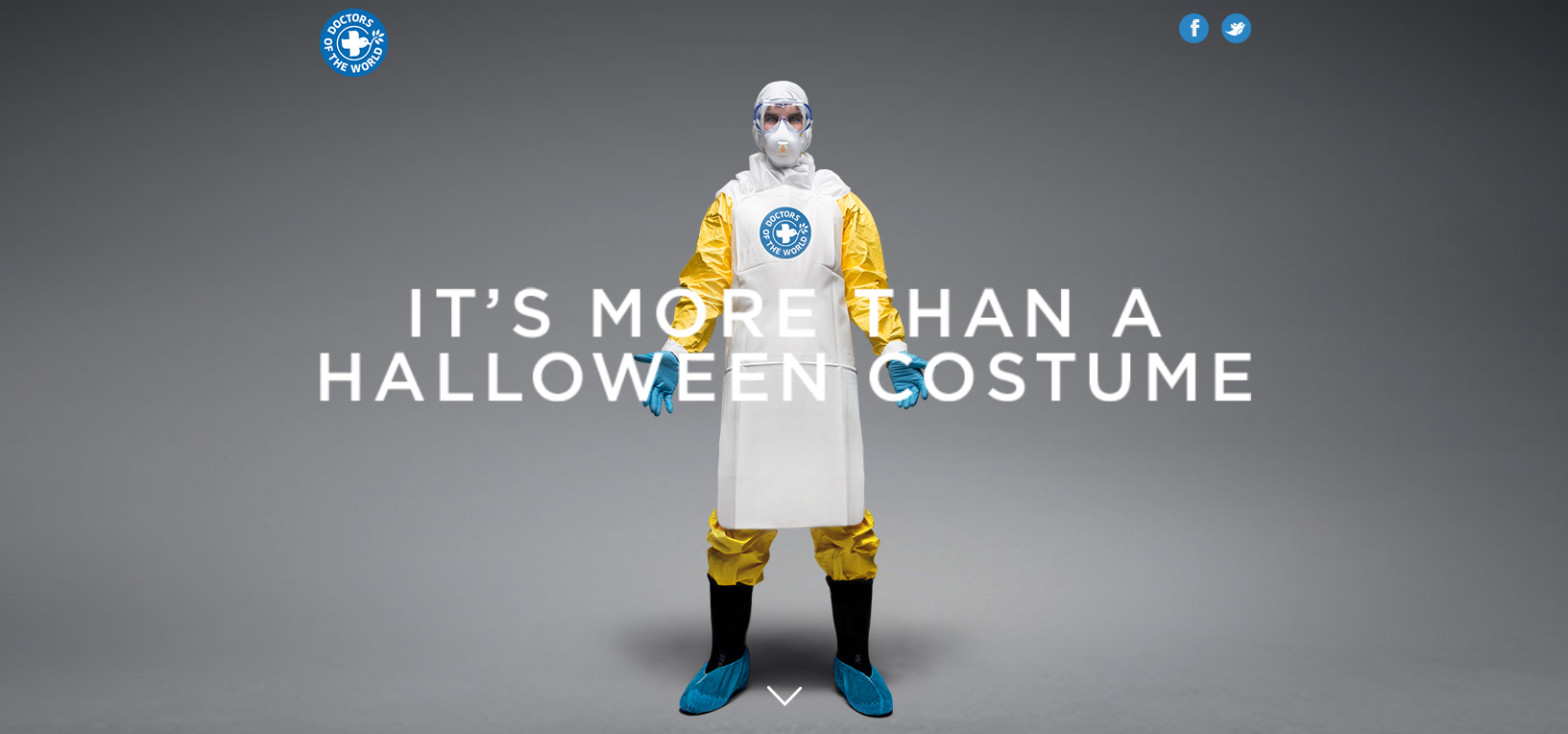
More than a Costume Ebola Campaign landing page
Doctors of the World
morethanacostume.com
There is a growing movement in the web design community toward a clean and simple aesthetic. Not necessarily toward sparseness – although without great care that could easily be the result – but rather the stripping away of information and design elements that could be considered extraneous. This site does just that, leaving the user with a clear, uncluttered journey.
Created as a piece of the integrated More than a Costume campaign, this donation site was built to give potential donors an easy portal through which to donate to Doctors of the World’s efforts to combat the 2014 Ebola Outbreak in West Africa.
What We Love:
- Clean Design. As mentioned above mentioned, this site is an excellent example of a pared down approach to design.
- Easy Donation Interface. Donations are powered by Stripe.js – It’s simple, easy to set up, and appears seamless and straightforward when integrated.
What We Might Have Done Differently:
- Kick the story up a notch. Simple design can let copy and calls to action really sing. As straightforward as the campaign is, we might have provided a bit more explanation and urgency to the narrative. This could have included an introduction to the cause and an appeal to donate.
Also Noteworthy:
- The site uses Foundation, a very advanced and complex responsive front-end framework, which is a bit surprising due to the simplicity of the content and the one-page layout.
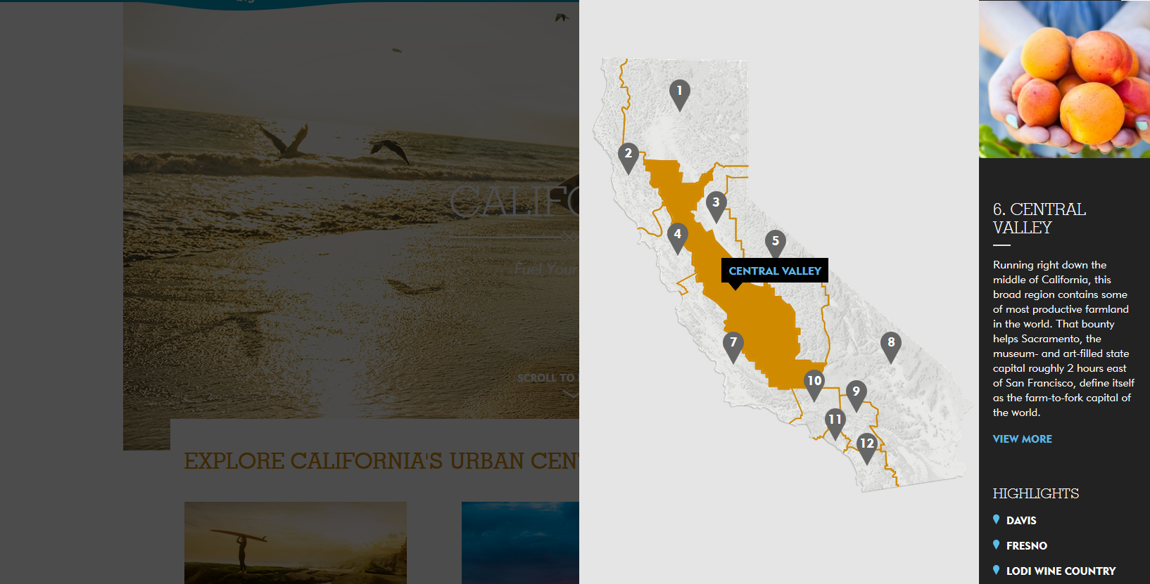
2015 Association Winner
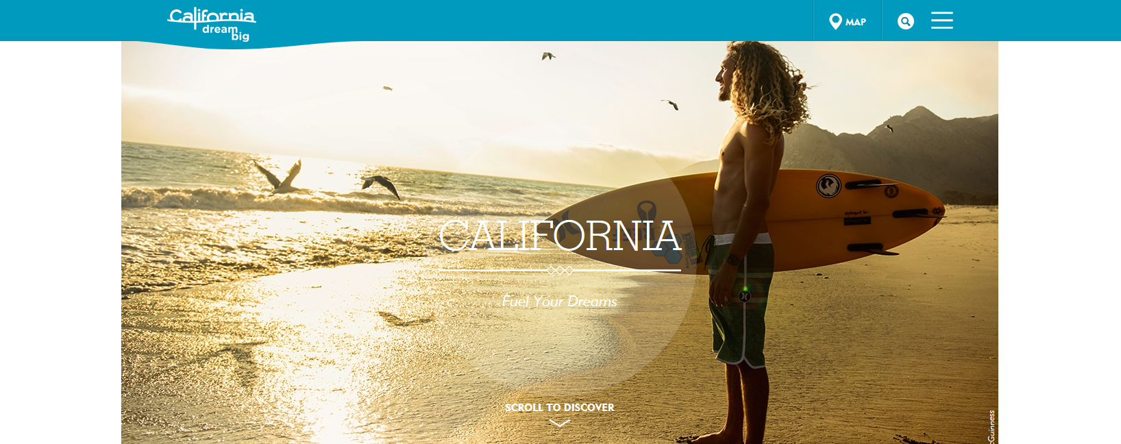
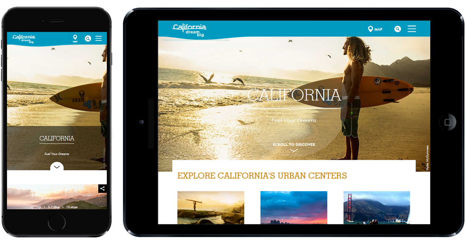
Visit California
California Travel & Tourism Commission
visitcalifornia.com
For 2015, the California Travel & Tourism Commission set out to create a digital home for their “Dream Big” brand marketing platform.
Created in Drupal, the site emphasizes beautiful photography and conveys a light, airy feel – an excellent fit for the subject matter. Most noteworthy, perhaps, is the top navigation style. The site was almost certainly designed mobile/tablet first, and the designers made the bold choice of keeping a mobile-style navigation even on the desktop version.
What We Love:
- Interesting Functionality. The only content featured in the top nav is an interactive California map. Clicking a region unveils background information and clickable content.
- User Experience on Mobile & Tablet. Designed with these users in mind, the site is suitable and intuitive on smaller devices.
What We Might Have Done Differently:
- The mobile-style navigation is slightly problematic here. The navigation is both the gateway to the content and the only way for the user to filter what otherwise feels like an infinite scroll of information. It would have been beneficial to customize the navigation for desktop users.
Also Noteworthy:
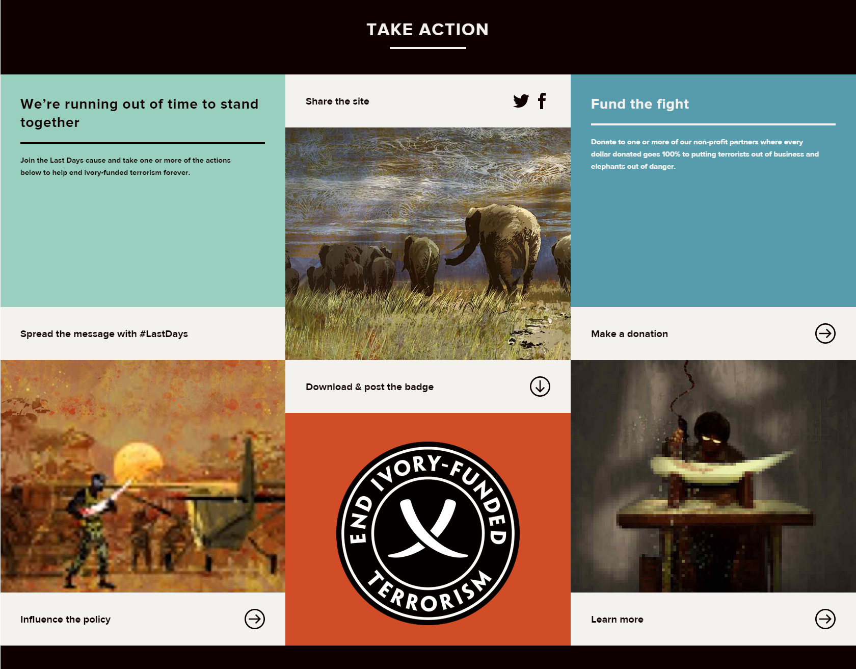
2015 Activism Winner
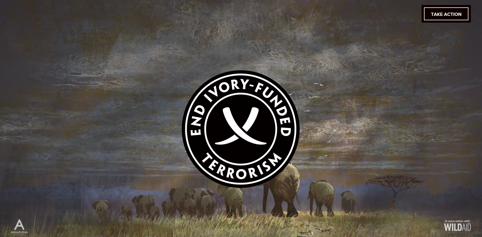
Last Days’ End Ivory Funded Terrorism campaign page
WildAid
lastdaysofivory.com
When Oscar-Winning director Kathryn Bigelow partnered with WildAid to create a short animated film exposing the connection between elephant poaching and terrorism, they also decided to create an online home for the campaign.
What We Love:
- It’s all about the art. This site relies heavily on the visual to do the talking. The hero area features clips from the film, and the motif (which manages to strike the very difficult balance of somber, but not depressing) is carried consistently throughout the site.
- The Story. Kept crisp and persuasive, the copy informs and complements the video.
What We Might Have Done Differently:
- Organize the Calls to Action. After digesting the information and enjoying the beautiful art, there are a whopping six ways for a user to take action. Presented in a tile format near the bottom of the page, the result is slightly overwhelming. We might have prioritized or focused this section to give the casual user a bit of direction.
Also Noteworthy:
- No CMS. The site appears to have been created without using a Content Management System. For one-off sites with only a few pages, it’s sometimes easier to do away with the CMS.
Learning from the Best: Key Takeaways
Nonprofit, education, activism, and associations can be tricky subject matter to translate to web. Design, UX, and programming need to be customized to address industry-specific challenges such as long-form content, serious subject matter, potentially limited budget, creative restrictions, and more.
But these challenges also provide ample opportunity for deploying of-the-moment trends to great effect. Here’s some learnings from this batch of Webby winners:
- Simplicity is good but don’t go overboard. Make sure your content is accessible and your story is being told.
- Unsurprisingly, excellent artwork will turn heads. But exercising restraint, giving it a branded and uncluttered home in which to shine is just as important.
- If you have a ton of content, break it up and allow the user to easily filter through it.
- Interactive tools, from the most simple to the most complex, can be utilized to keep the user engaged and attentive.
With the right strategy, a website in any industry can be beautiful, functional, and intuitive. If your curiosity has been piqued, have a look at the Webby winners in other categories here.