It’s been a long day. Eugene O’Neill long and there wasn’t so much as a Tylenol PM in the mix. Most of my days are like this now and it’s not because I’m getting up there according to my weird, blunt doctor. My days are long and harrowing because they are full to the brim with technology. It turns out, however, that this isn’t such a magical time to be alive after all. Most of the technology in my world doesn’t work. Not as advertised, certainly.
Take my hand and let’s begin a stroll together through my forest of UX, UI and promised technology miscues on any given day. It’ll be fine. And there’re pictures!
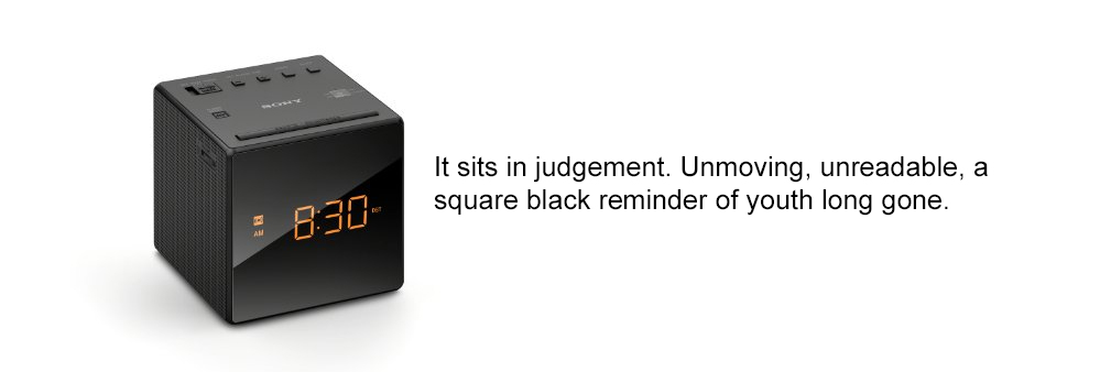
I start the day with a panic because the alarm clock has not gone off and I’m late. The alarm didn’t stand a chance really, as the UI on the clock was designed for someone with bigger eyes, smaller hands and I’m guessing a working knowledge of Braille. With reading glasses on the settings remain a mystery still. When the alarm goes off is now anyone’s guess. I quickly move on…

…to the bathroom. I can work most of this equipment as I’m a human man and this is a bathroom. My toilet however, was replaced by my wife while I was out of town or watching tv. It’s now a high efficiency, dual flush model. I don’t know what that means and I don’t know how it works. I think it has something to do with water flow which seems risky to me. Let’s quickly shuffle over to…
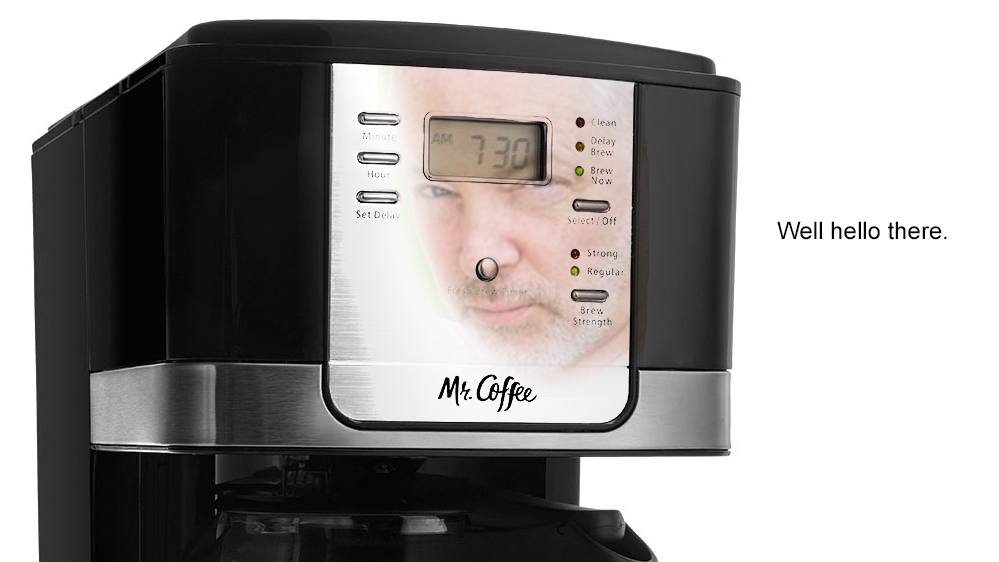
…the coffee maker. It’s a standard issue Mr. Coffee and it’s programmable of course. Once again the issue at hand is readability. A thin, black font on a mirrored surface isn’t just difficult to read…it’s not readable. It’s a mirror, with text as small as the dosage instructions on an Ambien bottle, so I have little chance of success. There will be no coffee this morning, but I suppose there will be at some point today since I have no idea what I’ve programmed. Mr. Coffee has an automatic shut off, so get those kitchen fire thoughts out of your head for now. We have to get to the…
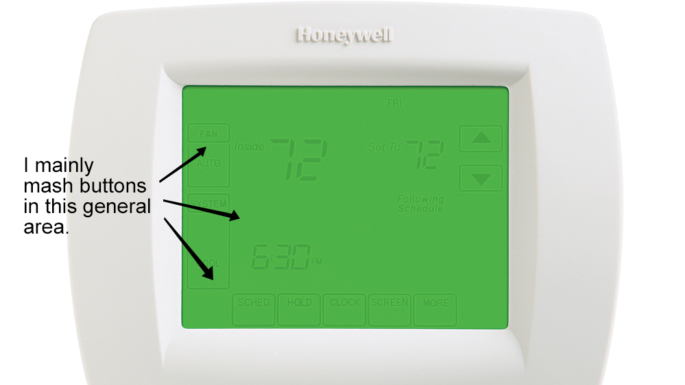
…thermostat. I can’t work the ©$#@ing thermostat. Let’s get that out of the way immediately. The interface is not designed well. The contrast is such that reading the display is difficult in any light. Also the UI is awkward with tapping commands that aren’t intuitive. Last night was 50 degrees outside, 55 degrees in the house. My wife is showing concern about my ability to complete simple tasks. This isn’t a new phenomenon, but thanks all the same, Honeywell.
I’m out of the house and into the car. The car is new and bloated with technology. Much of it is not only unused by me, but unofficially banned from my touch, according to the wife I mentioned earlier in this post.
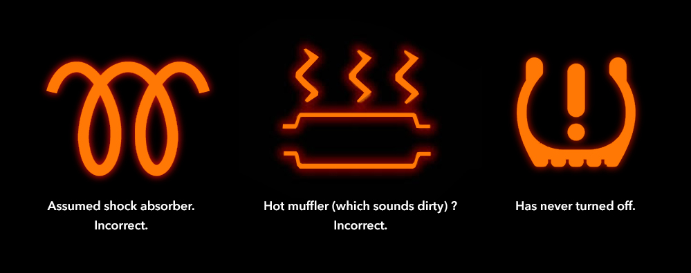
My car’s tech has two major flaws. First, the interface throughout the dashboard is tight. I have regular-sized hands (I believe I can palm a basketball if the humidity is in my favor) but you’d think I was born with catchers mitts. When attempting to switch from my wife’s radio channel (playing The Smiths) to my channel (playing something that is not the Smiths), I inadvertently start the navigation. This was funny when we first got the car but the laughter has died. Secondly, if icons in the car’s dashboard need to be understood only by reading the user’s manual, your UI failed.
Admittedly, having an alert that keeps me from hitting the car in front of me or drifting right or left is pretty useful technology. I didn’t buy that car, however.
It should be noted here that in DC, that law about not checking your Facebook likes while driving is not enforced, so use both hands and get after it. Walking through intersections against traffic with earphones in is also encouraged. Millennials. When will they leave here? They’re the best!
I made it to work. With all the technology in this place you’d assume I would be doubled over in tears and defeat, or tangled in wires a few steps off the elevator, and I couldn’t blame you for thinking that. But the truth is, with the exception of our space age dishwasher, I have few technological problems in here. Just about everything in the Brick Factory offices makes sense.
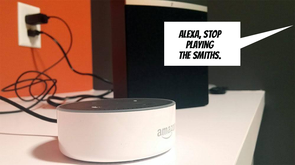
Even Alexa is on board.
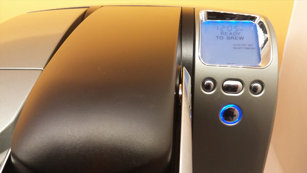
Look at me making coffee like a big, helpful monkey. I don’t even have my glasses on.
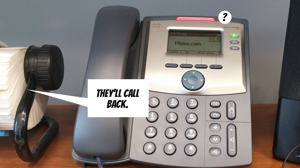
Well I flew to close to the sun, didn’t I? I can’t access my voicemail because I lost the password. If I’ve missed your call, know that I’m fine and that I’m busy that weekend but we’ll catch up. Kids are good.
The rest of the office technology and I get along fine, believe it or not, because when it doesn’t we have staff to patiently assist me.
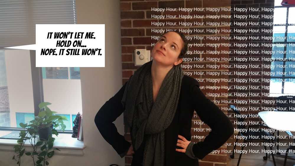
There had to be an actual point to this post and if you stuck around long enough here’s the big payoff:
Design websites (and things with any human interface, generally) for your worst case scenario user which isn’t me, by the way. If an interface is going to pose problems for me, you have to assume someone with a disability or limited technical skills will be shut out completely. Designing with this mindset eliminates problems down the road, saves time, money and helps baby boomers reclaim their place as Our Second or Third Greatest Generation.
Sign up today to have our latest posts delivered straight to your inbox.