The Barack Obama campaign has been rolling out new features on its website at an impressive clip. A campaign timeline. Headquarters pages for each of the early primary states. A mobile program. Good stuff and they are clearly doing a wonderful job online.
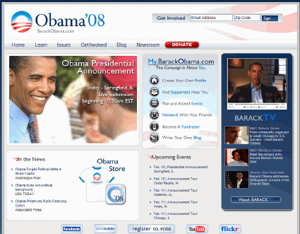
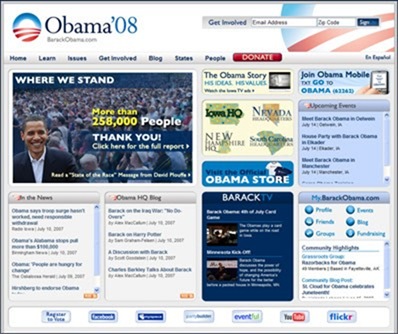
But in the process of launching this stuff, they’ve turned their clean, nicely designed homepage into a canvas on which to cram as many banner ads as possible. On launch, they had six distinct content areas on their homepage. Today they have eleven elements stuffed into the same space.
Below are the before and after pics. I cast my vote for before.
Before:

After:

Sign up today to have our latest posts delivered straight to your inbox.