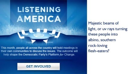
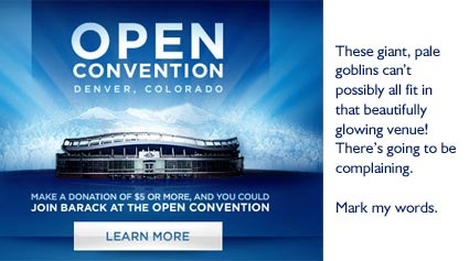
In my last post I made some remarks pertaining to the McCain campaign website team borrowing the tone of the Obama site. I thought it was a good upgrade to an already well designed site overall. When I popped over the McCain site today, however, I was surprised at the latest similarity. The backlit blue light that the Obama team uses on every page has now made its way to McCain’s latest promotion, McCain Nation, a grassroots event planning/searching tool.
When the Obama team first started using this illustration technique, I really liked it, and it’s been beautifully rendered. But they use it for every promo and now the crowd of wispy supporters that comes with it no longer look like race-less Americans supporting Barack Obama to me…they look like charging albinos. Or ghostly Skynyrd fans. They frighten me. Now the McCain gang wants to start in with the heavenly beams of light and surely the faceless zombies can’t be far behind.


The shining beams of majestic goodness have replaced the slippery, reflective floor as the new political go-to for quick design solutions. Personally, I’m ready to go retro with something I like to call the “animated gif”.
Sign up today to have our latest posts delivered straight to your inbox.